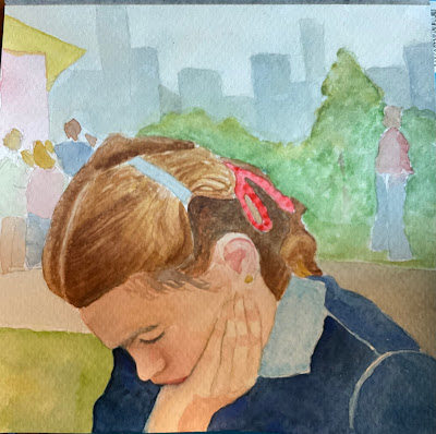
This little study turned out really well, imo. I tinkered around with her hair and a few other things — her chin was not really resting on her hand before, so I had to fix that. But I think it’s done.
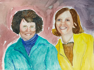
I wish I could tinker this double portrait into the same state, but it doesn’t look good. The top one I did n class and the bottom one I started in class and have been working on at home. I’m working from a bad photo with too small and blurry details and I just don’t have the confidence or imagination to jump ship and go my own way. Oh well, it’s a good learning experiment …


I liked the first one a lot and I have to say this is even better. The teeniest of quibbles, maybe you could make that middle ground a tad more sharp so that it stands out from the distant towers. I am no one to speak about painting faces but maybe if you did the features first and without as much reliance on a faulty photo. Of course I am more than pleased if my people just look like human beings.
ReplyDeleteThat first painting is a little gem. Everything is right--the hand, the hair, the weight of the chin in the hand, and the background. It says crowd and city, but doesn't overwhelm her. Parfait! Having seen the photo reference for the double portrait. I'm surprised you were able to get to where you are. Each iteration of this gets better, though--even after taking a break for a year or so. You'll figure it out, even if you have to just make them abstract shapes.
ReplyDeleteYes it has mood. What is she thinking about with that big city in the background?
ReplyDeleteIt’s done and…….it’s good. If the likenesses of the two women are satisfactory to you, I don’t know what you’re doing with the second one unless you’re being happy painting. I think the first iteration is good but I believe that painting many versions can take us places that we hadn’t considered.
ReplyDeleteWoman on left…Billie Jean King!
ReplyDelete