This is the Merchandise Mart behind two buildings that are no longer there.... the two buildings, not the Mart. That's still there! Don't you love how the lights shine against the dark background?
If you live in Chicago, you'll recognize the Clark bus. Again, look at the reflections on the street. This whole series is atypical in that everyone thinks of watercolors as pale and high key. This is dark and moody—but beautiful and very watercolory!
Here's the painting Ken began today. It's the tree in the back garden at Ten Cat. We're looking up into the leaves and branches. Again, it's evening, so this will be part of the nocturne series.
Elaine O's painting is bright and sunny—quite a different mood! It's timely, too as Oscar Mayer is looking for weinermobile drivers. Wouldn't it be cool to have this for your company car?
This term, Elaine O. is starting a new series featuring snow. It seemed like a good idea when she started, but the recent blasts of winter made her question her choice. Still, we love the peaceful quiet of this Chicago backyard. And we also love the fact that a path back to the house has already been shoveled. Maybe there's a cup of hot chocolate waiting.
Here's another snow scene. This bison sculpture stands outside the Peggy Notebaert Museum. Elaine O. wanted to capture the feel of a bright sunny day after a big snow—also she was amused by the incongruity of a bison against the skyscraper background.
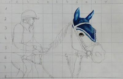
Dana was also painting animals and going big. Here, she's gridded out her drawing and started to paint the horse's head and eye. Zoom in to see the incredible detail she's achieved.
Isa boldly added a vibrant blue to her autumnal interior. This is the perfect color to complement the copper cup and autumn leaf. It also directs focus to the trees outside the window.
Another window with trees, but a totally different season and feeling. Sara painted another version of this scene. The colors may be different, but the lazy, sun-drenched vibe remains.
And then, Sara begins a new series featuring Baby Nora... and her parents. She begins with a lively sketch...
...before starting to work on a watercolor version. She's hoping to capture the energy and freshness of the sketch in the watercolor, while keeping a "watercolory" feel. She's well on the way, so come back and see how this ends up. We especially like the composition on this.
We thought that Steve finished his study below. This is a poster featuring Nijinsky in Debussy's Afternoon of a Faun ballet. But he wanted to go back and work on the background and the musculature. The changes may have been minor, but the painting looks great.
Especially after seeing some fading on a previous painting using opera (a bright pink/fuschia color that Steve glazes to add warmth to skin tones), he's determined to perfect opera-free skin tones. The torso below is all skin, but so abstracted that it looks like a landscape. We can't wait to see how Steve works through this color exercise.
Susan's working in a series, too. She's revisiting some of her previous Australia/New Zealand paintings. Here, she's deepened the sky, adding more focus to the Sydney Bridge.
This beautiful landscape features a mountainous tourist attraction.We love the impressionistic use of color.
Finally, Susan was dissatisfied with a painting where she described some of the activities at this Maori village in a sidebar. She decided to paint the scenes instead of describing them and this is the result. We love her use of space.
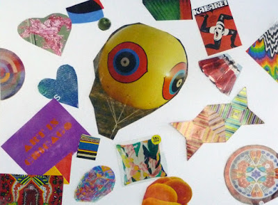
It's a new year with new color exercises. Our newbies were directed to use three primary colors and play with them.... mixing and blending and seeing what they can do. Then, they each created a collage of colors/images they liked, like a personal palette.
Hedda has already achieved some great color gradations...
... using the bright happy colors she chose in her collage.
In contrast, Richard played with glazing and the way water reacts with paint.
Even his preferred palette leans towards earth colors—exactly what you'd expect from a potter.
Emilia's focus is on the curves and shapes in landscapes.
Notice the clear, sophisticated colors she prefers.
Maddy's colors and subjects are graphic and exuberant.
She's using those same bright colors in this swirly collage.
Join us next week for more fun... and new color exercises that'll take your mind off the snow and cold!


