Saturday, December 16, 2017

December 16, 2017

It's our last session of the year and what can be more appropriate than Susan's holiday wreath? It's not yet finished (she wants the reds to really stand out), but it definitely conveys the feeling she intended.


As for the rest of us, our thoughts turn to family this holiday season. Sara paints this lovely two color study of two of her favorite people—her husband and her granddaughter. We knew she couldn't resist painting this little sweetie for too long!


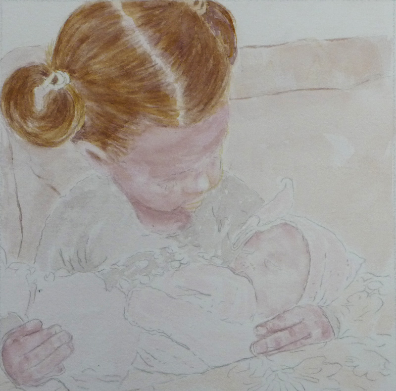
Another painting that makes you go "Awwww!" is Ellen's painting of her granddaughters. It's as soft and sweet as the subjects. The hair is just perfect, isn't it? She's captured the baby fine texture of little girl hair. Come back and see how it turns out.


No babies here but expect to see a lot of this New Orleans jazz scene. Alan sketched this intricate scene, then transferred it to sturdier paper. From here, he's tracing off smaller scenes to do studies. Once he's intimately familiar with all of the parts, he'll do a full painting on Yupo. Sit back and enjoy the journey!


Greeta is also enjoying painting people. Here we get a peek into her sketchbook at some people from the bus and a catalog.


And then, Greeta moves out of her neighborhood for this moody Chicago bridge scene. It's minimal in color, but each of the neutrals is rich and varied. The shadows and light patterns really create a mood and even the masking taped edges contribute to the feeling.


Madeleine follows the same people/architecture split as Greeta. She begins with a still life of intricately carved stone and a Yemeni doll. Okay, it's not technically a person, but the doll has a distinct personality. And we love the softly flowing fabric.


Madeleine did some thoughtful pondering before finishing her abstract building from last week. The addition of the patterned lines at the top is the perfect finishing touch!


Elaine is also combining people and architecture—sort of. This pediment of New York's Grand Central Station features Mercury and some other figures, but they obviously aren't real people. Still, it fits our recent themes. 


Isa is right on point with this house painting. The house is in Colorado and we love the elegant composition and judicious use of color. This is another one we are eager to see progress.


Bill's painting is of an outdoor shed, some trees and a faithful dog. But we're still counting it as architecture! Notice how he uses warm colors and distinct values to describe the scene. 


Bill is still on his botanic series. He's layered watercolor washes and added his houseplant in water soluble oil pastels. The colors on this are richer and warmer than in the photo.... just so you know.


Ken's picked his next series, too. And he's going botanical as well, returning to tomato plants and morning glories. But this time, he's doing them in mosaic style. We love the stylized morning glories behind the lone tomato blossom. Keep watching as he adds sky and fine tunes the elements.


Crazie is still doing extra credit work. No wonder these new students are so good. They claim to be true beginners, but each of them is incredibly good. Here, Crazie is experimenting with a solid wash for the sky. Of course, she's chosen the hardest color to get a smooth wash; blue is notorious for granulating. Also, see how she's used the right side of the page as a sacrifice sheet to test colors and brush strokes?


This is last week's class assignment for Crazie. She's added a squash and tomato to the eggplant. The composition is beautiful, as are the rich colors and expressive brushwork.


This is today's assignment. We love the richly colored and modeled fruits nestled into a stylized, almost 2D fabric. This is so very interesting!


Yi has chosen delicate fabric, neatly folded, to accent her fruits, which are almost identically colored. This high key painting has a lovely graphic quality and we applaud Yi's choice to feature the folds of the fabric at the bottom.


Yanna didn't get the message to bring fruits and fabric, so she had to make do with leftovers. Despite that, she's done an amazing job with a very difficult subject. The fabric is velvet and we can feel the plush softness as it cradles two fruits that are nearly identical in value to each other and to the fabric. This low key painting exudes warmth, softness and coziness.

We had a great class today! We saw the year out with fun paintings, happy chatter and good food. Ken brought cupcakes, Greeta make faux Turtles and her fabled kolacky—and Sara not only made peanut butter cookies, she brought watercolor books as gifts. It can't get much better than that!

We wish you and your families the happiest of holidays and a happy, healthy new year. And we look forward to seeing you in January.


Saturday, December 9, 2017

December 9, 2017

We had snow this morning...which may be why some of us didn't make it to class. But for those who did, we were definitely feeling festive. Ken passed out holiday candy kisses, there was a lot of baby talk (new grandchildren, of course!) and we seem to have found some great new themes—babies, botanicals and buildings.  We begin with Ellen's sweet painting of her new granddaughter. Zoom in for a closer look, but we remind you that the real painting is softer, more delicate and subtle than the screen image.


We'll be looking to Sara for baby pictures in the new year, too. But for now, she's doing sketches of the trees outside her window. She's doing different small views.... the typical view she always sees, a view from the treetops, a dreamscape and another straight view. Here's another one you have to look at closely to really see how beautiful it is.


Bill is all about the second "B" theme—botanicals. He's carefully observing and painting leaves and plants. For now, he's concentrating on his houseplants, but he's engrossed in the subject and is even considering 2018 being the year of botanical painting.


Here's Bill's second painting. This is a corn plant—not the same kind of corn plant we saw from Ken, but you can see how it got its name by looking at the leaves. We also love the complementary color background Bill chose.


You'd think Ken would be all about corn, too. But no—he's back to mosaics and he's painting tomato blossoms. We like the colors and the composition of this one and are eager to see how it progresses.


Susan dropped by on her way to a holiday party to share her holiday painting and some gift calendars. Right on trend, she is painting plants too. We can't help but notice how all of us are fascinated by the veins and shapes of plant forms.


Alan is concentrating on botanicals, too. This water lily is painted on a small scrap of Yupo and features more plants—different colors, different season, different background—but the same fascinating shapes and forms.


More plants from Alan. This is on a scrap of printmaking paper and Alan details the way leaves grow on oaks in the South. We love the values, the composition and the trees. We couldn't decide if they were more Matisse or Cezanne, but we settled on "french trees" and loved them.


As if that weren't enough, Alan began a sketch of a New Orleans scene. He plans to use this as the basis for several smaller vignettes and a later masterpiece on Yupo. Look to see more of these in the days to come.


Madeleine's painting feels like New Orleans, doesn't it? But it's not. This is an abstraction of a grey building in Chicago's Ravenswood industrial corridor. But here, the corners have been combined, colors and decorative touches added, and it becomes a jazz tower.


Not too far away (geographically, not stylistically) is Elaine's church tower. She's added the final touches to the slate roof, accentuating the sloping shape. The tree leaves that frame the scene are within our botanical theme and the structure fits the last of our "b" themes... buildings!


 And from there, Elaine finished her still life with an unlikely subject. This is a pair of socks with a message. Elaine's calling them her "retirement socks," but the message isn't limited. Notice the cute caterpillar on the front and the stylized butterflies near the heel?


Our newest artists have been painting still life studies, too. Crazie takes things a step further, by beginning each assignment with a sketch. First, her homework. The assignment is to Paint an egg... a white egg on a white dish and/or background. Here's the sketch.....


... and here's the watercolor. Carefully observing the egg reveals all kinds of colors in the white.


The class assignment was to paint several fruits or vegetables. Again, Crazie begins with a sketch....


... before starting to paint. This eggplant is rich, shiny and beautiful.


In contrast, Yanna's egg is soft and subtle, but just as colorful. The lighting she chose makes for a single, delicate shadow. Despite the delicacy of color and brushwork, this egg has a monolithic quality. 


We love Yanna's multi-fruit composition. The way she's composed them gives them distinct personalities. And notice the shadows. The orange bounces some color onto the apple, as does the lemon. And the cast shadows ground the subjects, yet unify them and make them seem to dance.


Yi's egg is the most monochromatic of the three, relying on value more than color to model the egg. Yet, if you look closely, you'll see soft greens and blues in the egg and the background brushwork.


Yi's painting of fruits/vegetables shows just how good she is. She chooses textured subjects in complementary colors. She models the cucumber with both color and value and adds highlights, spots and bumps. The cast shadow isn't finished yet, but it is also very carefully observed. These new students are incredibly good!


Next week is our last week before our holiday break, so be sure you come back then! Meanwhile, you still have a few days to catch the exhibition below and to mark your calendar for our upcoming group show.

Food.  Alan and Greeta are featured artists in a group show about Food. The show runs through January, so there's still time to catch it. If you attend, you are asked to please bring a donation of non-perishable food for neighborhood food pantries.

      4243 N  Lincoln Avenue, Chicago, IL

     When:
     Exhibition: September 16–January 13    


Save the date

We'll be having a group show at the Ten Cat starting in mid-February. It's the perfect time to meet and greet us, see some good art and anticipate spring. Mark your calendar and bring your valentine to our opening reception!

Sunday, December 3, 2017

December 2, 2017

We hope you had a wonderful Thanksgiving. We did. And, just as many Thanksgiving parades traditionally end with a Santa float ushering in the rest of the holiday season, we pick up with our version. Greeta has painted this masterpiece. It features our very own Ken, as seen last year on the front page of the Chicago Tribune. It's beautifully rendered, and Greeta has managed to capture the essence of both Ken and the season.


Another seasonal painting from Greeta, this one features a lion from the Art Institute, wreathed and with a light coat of snow. She's used masking fluid to reserve the white of the snow. This truly says Christmas in Chicago.
 

And then, of course, Greeta returns to her book and paints this, her favorite of the Houses of West Graceland.  It really is beautiful, isn't it? We aren't joking about doing a walking tour when she's finished.


Madeleine is also inspired to paint a stone edifice. Unlike Greeta's, this is in Ireland. Like Greeta's though, Madeleine has added a lot of color to the cold grey stone. She noted that the more she looks at the stone, the more colors she sees. It's an experience many of us have shared!


Look closely at Elaine's painting, particularly the stonework. It may look grey, but it's really a mixture of colors. If you look closely, you can clearly see blues and reds and oranges. This may or may not be finished. After discussion, she may be revisiting the slate roof. Tune in again and see.


Meanwhile, Elaine has moved on to a still life, albeit a rather unusual one. These are her "retirement" socks. She may have bought them to reach a free shipping threshold, but she truly loves the message. Come back next week to see what they say. These socks are not just for retirement!


You may recall how we were obsessed with painting trees last week. The love-fest continues. Bill began this cabin in the woods while waiting for another painting to dry. The evergreens are carefully observed and the greens are very natural.


You can tell Bill's been concentrating on natural greens—probably the hardest color to mix well. This is a houseplant and the leaves look beautiful.... as do the bowl and roots!


Isa is painting flowers too and she's also using lovely varied shades of green.  Look closely and notice that she's removed the masking fluid she used to reserve the paper white. She's used pencil to add birds to her garden.  Doesn't this just say spring?


Sara's painting her favorite subject—trees. Here's she's tried to capture the movement of a grove of trees in the wind as a storm rolls in. She's succeeded, and she's perfectly captured the peculiar light before a storm as well.


Ellen's group of trees is completely different, but equally beautiful. She's finished this today after she had an epiphany during the week about the value of value. See how she's added the dark trees against the softly colored sky? And, of course, this is also a fine example of complementary colors, gradated washes and fine brushwork.


This is the painting that sparked the "values" realization for Ellen. This is Bryce Canyon and she noticed that it seemed a bit flat. With nothing to lose, she added the dark watercolor outlines. No, that's not ink! And yes, it really makes a difference, doesn't it?


Armed with her newfound knowledge, Ellen returned to another painting, adding dark values to the fur and the shadow and adding texture everywhere. In the process, she's made it come wonderfully alive!


Susan's ready for the holiday, too! She's put the finishing touches on this synopsis of her vacation in the Canadian Rockies. It feels like an old time postcard, doesn't it? Portraits of her fellow travelers surround the central image. And just in time for her annual calendar! What a great remembrance.


Ken's finished his tomato painting and we love it. The tomatoes and greenery are on theme for us today, but he's added a rigid grid to the background and colored the whole thing in a tropical color scheme. Chicago as Margaritaville.  


Ken's hard at work on his annual holiday card, as you can see. He's working the wreath and background in his favorite techniques and it's coming out beautifully—despite a slight technical glitch with his paper.


Remember how we discussed value? Cesar is one of our newer members, but he's a firm believer in value studies, as you can see below. Having done a value study of the apple before moving to paint, he's able to quickly and confidently paint a fully realized apple.


As you may have guessed, it's "big fruit" day and all our newbies were up to the challenge. All of them brought in challenging subjects with lots of texture. Look at Yanna's beautiful pomegranate. The colors are even richer in the painting than on screen. And we love the lively brushwork she's used to capture the markings. Unfortunately, we didn't get a picture of Yanna's shadow homework. Know that they were beautifully soft and luminous.


Yi's homework was to paint a shadow of something. Here, she's gone one better by adding the object as well. Notice how well osbserved this is. You can see the translucence of the pump in the shadow and the soft edges all around.


Yi's giant fruit is a richly textured green apple. Again, the color is spot on and the
markings and brushwork capture the very essence of a green apple.


Crazie also upped the game on the shadow homework. She did three versions of the same shadow with different light intensities and added background stars. (Incidentally, Yanna also did several versions of her shadows. This group is incredible!)


And, of course, Crazie's giant fruit is interesting and richly textured. Take it from those of us who saw both, the colors and markings are dead on. We love the spatter and the added shadow.


As if that weren't enough, Crazie did this extra credit painting. The topic of value came up again as we discussed the color and value choices Crazie made in the shadow area to draw focus to her subject.


Somehow, we missed getting photos of Alan's work (and Yanna's shadow work, as mentioned before). We'll be more careful next time! Meanwhile, you still have a few days to catch the exhibition below and to mark your calendar for our upcoming group show.

Food.  Alan and Greeta are featured artists in a group show about Food. The show runs through January, so there's still time to catch it. If you attend, you are asked to please bring a donation of non-perishable food for neighborhood food pantries.


      4243 N  Lincoln Avenue, Chicago, IL

     When:
     Exhibition: September 16–January 13    

Save the date

We'll be having a group show at the Ten Cat starting in mid-February. It's the perfect time to meet and greet us, see some good art and anticipate spring. Mark your calendar and bring your valentine to our opening reception!