Saturday, July 22, 2017

July 22, 2017

It's our last session and we painted up a storm...probably to hold us over for the summer break. Grab a tall cold drink and follow along. If you do, you'll be rewarded with several invitations—an exhibition, sketch club and more. We begin with Susan's newest series of food paintings (you may want to grab a snack, too. This will make you hungry). She's added a border to the platter of the sweet and sour fish.


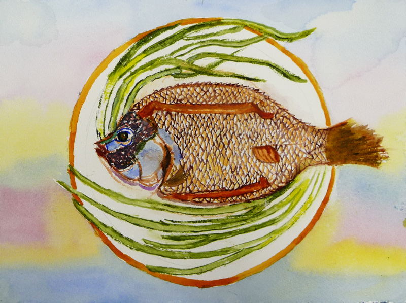
Here she paints bitter melon. Notice how she uses a complementary color for the plate? And look at the backgrounds. This features bitter melon leaves and tendrils to complement the food.


Susan does love her complementary colors, doesn't she? Notice the purple shadows and background around the mango, banana fritters and pastry.


Here's the noodle dish from last week. Susan's added a suitably ethnic background... the Great Wall of China.  If that isn't the name of the dish, it should be.


Can you tell that Tony's been to the Art Institute? Like many of us, he's seen the Gauguin exhibit and painted this homage to Gauguin.


Greeta painted these tropical-looking lantana blooms....


... using her new set of Mission paints. Here's  a swatch card of the nine colors in the set. They are as vibrant as they appear here. But Greeta feels they dry paler and less saturated, although she wants to experiment a little more.


More experimentation. Greeta is using a home-made easel to paint this at a slight angle. This is a scene from Graceland cemetery, reflected in a pond.


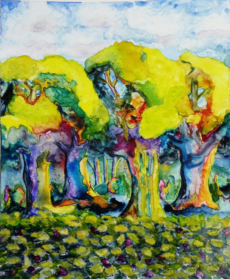
This is Greeta's lovely garden at night. The strings of lights, lush foliage and rich colors make this scene magical.


Alan finished his landscape from last week. This is definitely a daytime scene as you can see by the sunshine on the trees and the shadows in the foreground. Still, Alan isn't quite satisfied...


...so he made another attempt. This one uses less realistic colors and textures. He's also made the cabin smaller to draw more attention to the trees.


Sara has added more color to her portrait below, slowly modeling the people. While she's concerned that there is a lot of beige, we're not seeing the problem.


Elaine added the final touches to her painting below, part of her People I Don't Know series. She also successfully fought off critics who wanted her to add a background.


And then, Elaine moved on to architecture. We're not sure if this is an end to the portraiture or if she's merely taking a summer break. Interestingly, like Greeta, this is from a Chicago cemetery, Rosehill.


Madeleine has also finished her painting which hits all our favorite subjects.... stone, brick, texture, portraits and perspective. Here's how to do Ireland without much green paint.


 And then, Madeleine goes right back to Dublin to begin a pen and ink cityscape.


Remember how we mentioned using sketches before painting? Here's one from Bill where he explores the shapes of a cityscape as seen from above.


And here is the watercolor painting. Notice that he's changed from portrait orientation in the sketch to landscape in the painting? He's definitely achieved his goal of simplification.


Bill's also done this exploration of line and color.


Bill does another B&W sketch to color painting below.


And remember these sketches. Bill is planning to add color to these, but not by filling in the spaces. 


Watch and see what he plans to do.


Maybe he'll even add a layer of mosaic, like Ken has done to his cat's eye. Yes, those are tiny little mosaics, but join us in Fall. Ken assures us the entire painting will be done by then.


Upcoming events and important announcements

Sketch Club. Our sketch club is back—and you are invited to join us! Our first sketch club will feature Sara's amazing garden. But mark your calendar—we'll be meeting on Sunday afternoon, not Saturday morning. Here are the details:
  • Who: You! This casual meetup is open to anyone with a pencil and paper and an urge to sketch. And this one is even open to non-sketching partners.
  • When: Sunday, July 30, 4:00–7:00 pm
  • Where: Sara's back yard. 2553 W. Fargo, Chicago (near Touhy and Western)
It's fun, relaxing and casual—join us if you can.

Save the date! We know it's early, but we also know how quickly your calendar fills up. In September, Ken will have a show opening at Ten Cat. The exhibit will probably open mid-September and will feature (what else?) corn and cats.  There will be an opening reception and you'll all be invited.Watch this space for details!

Our class schedule. For those of you who wondered when the next classes begin (perhaps you want to join us?), here's our schedule.
  • September 9 — October 21, 2017
  • October 28 — December 16, 2017
  • January 20 — March 3, 2018
  • March 24 — May 12, 2018 (off March 31)
And with that, we say goodbye until our next class begins on September 9. See you then!


Saturday, July 15, 2017

July 15, 2017

Last week, we mentioned how many of us use sketchbooks in our painting process. To be more specific, we don't just do sketches—we do value sketches. Here, for instance, Alan begins with a value sketch of a landscape. He learned this in a class and has found it useful ever since.


Notice how the values he established in the sketch translate in the painting? And how values, even more than colors here, focus the viewer's eye?


Alan has finished the painting he began on Yupo last week. Again, he uses value to define the center of interest.


Another painting on Yupo. Alan revised this to remove the pink "Peeps" from last week. In the process, he's added more depth to the forest and drawn attention to the beautiful tree trunks.

'

See what we mean about sketching? Bill did this value sketch to clarify his intentions around his pigeon painting. While the values are closer together than Alan's, the sketch is just as important.


Notice how Bill used his value sketch to establish the pigeon as the center of interest among all the leaves? Subtle—yet it allows us to enjoy the soft colors in this gentle scene without getting confused.


Bill did this low-contrast abstract too. It's different than the low key painting above, but he started with a sketch here too.


Even Ken started with a black & white sketch of this jewel-toned cat eye. Yes, no matter how many times he's painted Annie's eye and how well he knows it, he finds value in a preliminary sketch. No matter that the end result is a riot of color as far removed from grayscale as it can possibly be.


 Like Ken, Beth concentrates on texture in her painting below. The watery background and foreground wall really makes the tulips and vases stand out on the shelf. The vases and shelf sparkle as the sun streams through in this lovely painting of light. 


Madeleine has a bit of a series going.  She's added a lot of layers, texture and depth to this walkway in Ireland.


And this scene, also from Ireland, uses the same technique to draw us to the light in the distance. Here, though, the shapes are arches instead of squares. Still the feeling of depth and movement is the same.


Greeta paints her beautiful garden. The scene is at night so the final painting will have a totally different feel, but we love the texture and layers. The blue wall and greenery reminds us of Ireland... but it's really Chicago!


Also in Chicago is Greeta's granddaughter, playing soccer in a park with skyscrapers in the background. This is the last painting in her Book of Faces. As you recall, it's a single sheet of paper, folded into a smaller booklet.


This is what the booklet looks like, unfolded (well, not completely unfolded, but enough to give you the idea). You'll notice that it's a single sheet of paper.


Pat has a similar book, but it's much smaller and made of sketch paper instead of watercolor paper. She's been doing a collage spread each class. Here's today's homage to Magritte. 


As you know, Susan's been painting a food series—and making us very hungry in the process. She found the perfect background for her platter of crabcakes and lemons in the pattern on Pat's dress. The color and pattern were perfect, wouldn't you agree?


Here's another of Susan's favorite subjects... a fish! This fried fish was styled by her husband Tony on a bed of  shaped green onions. Don't they look like waving seaweed? And notice the background. It's a flying fried fish!


Here's the same fish after it's been cooked in a sweet-sour sauce with peppers and pineapple. Look closely at his eye. This fish has some serious personality!


As if that weren't enough, here's a dish of noodles with chicken, pork, vegetables and shrimp. Susan doesn't have a background yet, but come back next week to see what she decides on.


We had a very special event last week, but we didn't have a photo commemorating it. Susan sold a painting and, as part of the transaction, she received this lovely painting by Sara. It's of Susan at one of our exhibitions, standing in front of a group of her paintings. We love this—the paintings, the brick, Susan and the stripe of Sara's signature lilac at the baseboard. It's just like the Impressionists who often gifted each other paintings of themselves. So very cool, isn't it?


Sara's begun a portrait and already, we're in love. There is so much personality in this painting of her husband and sons. The formal composition heightens the humor of the subjects' interaction. And the soft blue and beige colors (someone called them manly colors) make for a perfect background.


Elaine is using those same manly colors in the portrait below, but with higher value contrasts. While we confirmed the identify of the subject today, it still counts for the People I Don't Know series. It's very close to being finished too.... the portrait, not necessarily the series.


Come back next week for the last class of summer. Then, we'll be off for a while, so you'll want to keep up with us until we return in fall.

Sunday, July 9, 2017

July 8, 2017

Once again, we have a theme going—sketches! Most artists carry sketchbooks. In fact, John Singer Sargent once said, ""You can't do sketches enough. Sketch everything and keep your curiosity fresh." Same with us. Today, you'll get a glimpse into some of our sketchbooks and see how we use them. We begin with Tony. He's maintained a sketchbook for years, but has kicked the habit into high gear thanks to a class he's taking at the Art Institute. Here's an action-packed pencil sketch.


Can you tell that Tony's been at the Art Insitute? This is the beginning of his take on a Gauguin from the current exhibit. We love the composition and the colors—which are completely Tony's, but with a heavy Gauguin influence.


Alan's works on Yupo have the same Fauvist flair. He's finished his trees from last week. We debated the addition of the hot pink figures. What do you think? Do they enliven the painting? Or do they distract from the wonderful trees and forest floor?


At any rate, Alan isn't finished with trees. So he did this sketch to clarify his intentions around his next treescape....


... and began to paint. Look for more to come on this!


Of course, if you have trees, you need something in those trees. Like Alan's finch. Done on watercolor paper, we love the way the center of interest pops out from the watercolor-y background.


And if you have a bird, there is bound to be a cat nearby, eyeing her prey. In this case, Ken's unabashedly exuberant cat's eye sparkles with its jewel-like mosaic treatment. Ken also had a preliminary sketch of this; we just didn't get a photo.


Susan is still painting food, but balancing her lovely desserts with a decorative background. Like this pie and drink in banana leaf serving dishes, with a small custard tart to complete the scene. All of which is presented against a dynamic background (in a complementary color, of course!).


Susan's found her niche—painting delicious food and making everyone hungry. Look at this beautiful fruit salad and note how the colors are mirrored in the layered background stripes. 


 Bill is also a prolific sketchbook user. Here's a page from his sketchbook of Jacob's dream....


... and here is the finished painting he developed from the sketch. Isn't it interesting to see how his idea was refined?


Moving from the dark nighttime scene above, Bill sketched this high-key pigeon.


... and began a painting from the sketch. We're eager to see how this develops.


 This Michigan scene has been finished from last week. As you recall, it was also a result of an earlier study by Bill.


Nothing says summer like "green." Madeleine used green for this lovely foliage covered walkway in Ireland. All the soft leaves and vines and the textured gravel path contrast beautifully with the square framework.


More Ireland.... but this time, it's blue. Madeleine paints an energetic gathering of clouds, reflected in the shimmering water below. And then, it's perfectly complemented by the shoreline, the grass and the road.


Sara is known for carrying (and using) a sketchbook. Go back and you'll see how she progresses from sketches to studies to paintings. She's also known for her color sense and this scene from her back yard proves that point. The picture doesn't do this justice, but she's juxtaposed red and blue in the foreground to achieve that luminous, electric blue that some blue plants (lobelia, for instance) exhibit in shadow.


Greeta is finishing up her watercolor sketchbook. It's made from a single large sheet of watercolor paper, folded to be a book. The entire book is dedicated to learning to paint faces. So the pages are diverse, the only qualification being that each page must contain a face. Here Greeta finished her
friend's sweet portrait...


... before beginning the last page with a portrait of her grand-daughter in her soccer uniform. Like most of us, Greeta is saving the face for last as it's the hardest part.


Greeta painted this lovely memento of a house/shop in Ocean Springs. It's now a tattoo parlor and Greeta plans to present this to Myrtle, the  former owner. She's going to love it!


Elaine wasn't satisfied with her Terra Cotta Warrior from last week. And so, in a bold move, she added a dark wash to the entire background. It certainly adds to the drama and draws focus on the subject. And while she likes the way the underlay colors peek through, she wishes she used a less separating blue in the glaze.


This is the beginning of another portrait in Elaine's People I Don't Know series. Come back to see how it turns out.


Meanwhile, Beth did some urban sketching. This is a scene at a diner where she stopped for waffles and it totally captures the energy of the place. We love the movement, the coffee and the beautiful wood. And yes, it was a quick sketch that didn't require a long camp-out, but Beth still tipped well. 


What better way to leave than with these beautiful flowers in raffia-tied bottles? Beth's loose style is perfectly suited to watercolor. We love the composition, the colors of the bottles and the way the light caresses the backlit flowers. Welcome to the Old Masters Club, Beth!


See you next week.