
Notice how the values he established in the sketch translate in the painting? And how values, even more than colors here, focus the viewer's eye?

Alan has finished the painting he began on Yupo last week. Again, he uses value to define the center of interest.

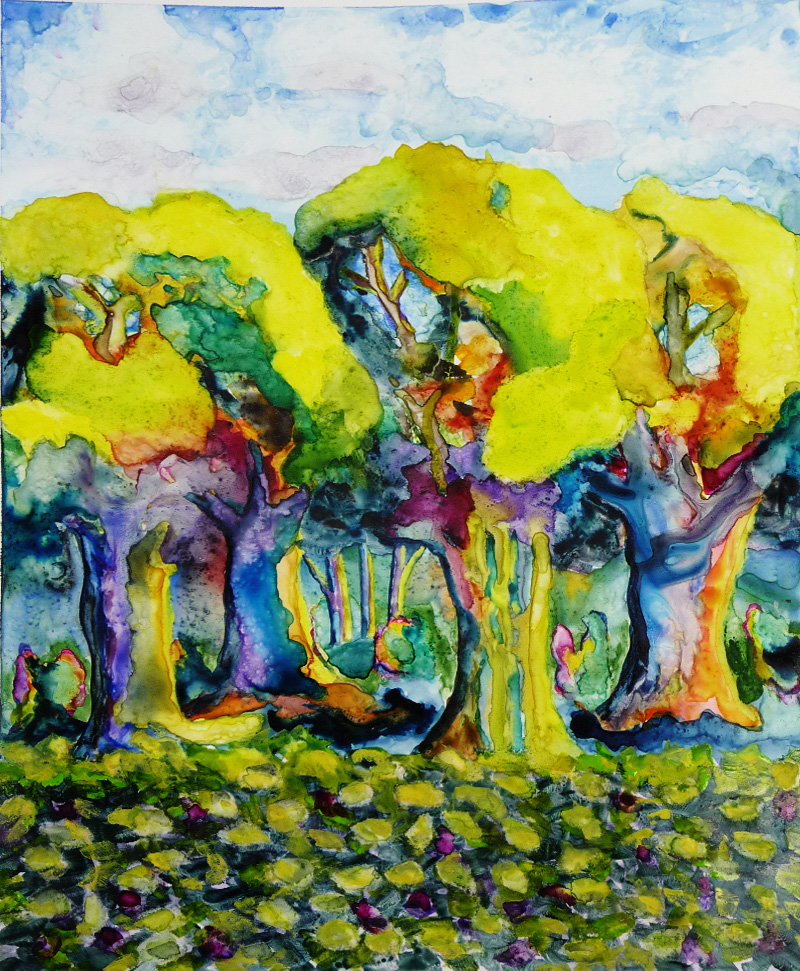
Another painting on Yupo. Alan revised this to remove the pink "Peeps" from last week. In the process, he's added more depth to the forest and drawn attention to the beautiful tree trunks.
See what we mean about sketching? Bill did this value sketch to clarify his intentions around his pigeon painting. While the values are closer together than Alan's, the sketch is just as important.

Notice how Bill used his value sketch to establish the pigeon as the center of interest among all the leaves? Subtle—yet it allows us to enjoy the soft colors in this gentle scene without getting confused.

Bill did this low-contrast abstract too. It's different than the low key painting above, but he started with a sketch here too.

Even Ken started with a black & white sketch of this jewel-toned cat eye. Yes, no matter how many times he's painted Annie's eye and how well he knows it, he finds value in a preliminary sketch. No matter that the end result is a riot of color as far removed from grayscale as it can possibly be.

Like Ken, Beth concentrates on texture in her painting below. The watery background and foreground wall really makes the tulips and vases stand out on the shelf. The vases and shelf sparkle as the sun streams through in this lovely painting of light.

Madeleine has a bit of a series going. She's added a lot of layers, texture and depth to this walkway in Ireland.

And this scene, also from Ireland, uses the same technique to draw us to the light in the distance. Here, though, the shapes are arches instead of squares. Still the feeling of depth and movement is the same.

Greeta paints her beautiful garden. The scene is at night so the final painting will have a totally different feel, but we love the texture and layers. The blue wall and greenery reminds us of Ireland... but it's really Chicago!

Also in Chicago is Greeta's granddaughter, playing soccer in a park with skyscrapers in the background. This is the last painting in her Book of Faces. As you recall, it's a single sheet of paper, folded into a smaller booklet.

This is what the booklet looks like, unfolded (well, not completely unfolded, but enough to give you the idea). You'll notice that it's a single sheet of paper.

Pat has a similar book, but it's much smaller and made of sketch paper instead of watercolor paper. She's been doing a collage spread each class. Here's today's homage to Magritte.

As you know, Susan's been painting a food series—and making us very hungry in the process. She found the perfect background for her platter of crabcakes and lemons in the pattern on Pat's dress. The color and pattern were perfect, wouldn't you agree?

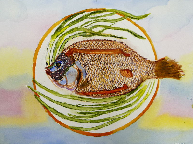
Here's another of Susan's favorite subjects... a fish! This fried fish was styled by her husband Tony on a bed of shaped green onions. Don't they look like waving seaweed? And notice the background. It's a flying fried fish!
Here's the same fish after it's been cooked in a sweet-sour sauce with peppers and pineapple. Look closely at his eye. This fish has some serious personality!

As if that weren't enough, here's a dish of noodles with chicken, pork, vegetables and shrimp. Susan doesn't have a background yet, but come back next week to see what she decides on.

We had a very special event last week, but we didn't have a photo commemorating it. Susan sold a painting and, as part of the transaction, she received this lovely painting by Sara. It's of Susan at one of our exhibitions, standing in front of a group of her paintings. We love this—the paintings, the brick, Susan and the stripe of Sara's signature lilac at the baseboard. It's just like the Impressionists who often gifted each other paintings of themselves. So very cool, isn't it?

Sara's begun a portrait and already, we're in love. There is so much personality in this painting of her husband and sons. The formal composition heightens the humor of the subjects' interaction. And the soft blue and beige colors (someone called them manly colors) make for a perfect background.

Elaine is using those same manly colors in the portrait below, but with higher value contrasts. While we confirmed the identify of the subject today, it still counts for the People I Don't Know series. It's very close to being finished too.... the portrait, not necessarily the series.

Come back next week for the last class of summer. Then, we'll be off for a while, so you'll want to keep up with us until we return in fall.
No comments:
Post a Comment