Saturday, February 23, 2019

February 23, 2019

We had a respite from the snow today—although it promises to be short-lived—and we took advantage of the day before wintry weather returns. Ken took a respite from his rainy November day series to return to his Not That Damn Cat Again series. This time, though, he is concentrating on the actual paint application more than on the subject. We still know it's a cat, Ken!


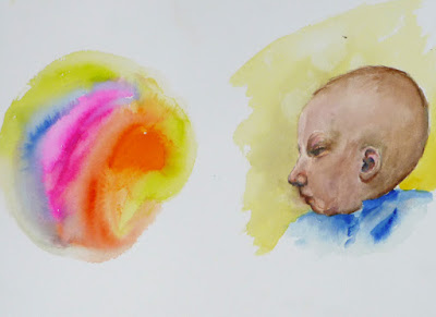
Elaine T. has also been focusing on paint application. We love this loose abstract... and especially the happy vibrant colors.


Below, Elaine T. did some color testing (do you see what we mean about those colors?) before dashing off a direct watercolor of her new grandbaby. Congratulations, Elaine T.—both for the lovely grandson and the lovely painting! Looks like we'll be seeing some new baby paintings soon.


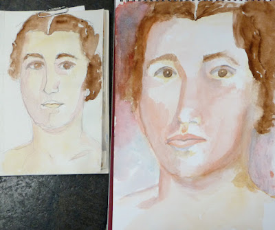
Sara, who, up until now held the record for the newest grandbaby, continues to work on her latest portraiture series. First, she does a "watercolor sketch," where she adds watercolor to a minimal pencil sketch. Then, she does a direct watercolor, painting the portrait without any prior drawing or pencil outlines. We're showing the latest in her series; the sketch is on the left and the direct painting on the right.


 In this one, you have to zoom in closely to see the wonderful color mixes on the left and how Sara is using value on the right to describe the form.


Sara isn't finished with the painting on the right, but it's going to be good! Notice, too, how she uses complementary colors in her palette.


Isa used the same complementary color pair in the following painting. She's removed the last of the masking fluid and darkened the window mullions, strengthening the inside/outside contrast and drawing the eye to the focus of the painting—the delicate snowy branch.


Isa is continuing her "window" series—and continuing to use complementary colors. This time, she's using both the red/green pair and the blue/orange. She also plans to contrast the indoors/outdoor sections via temperature contrasts. Come back in two weeks to see more.


Elaine O. is still painting snow, but this is different than the crisp clean impressionist paintings of the past few weeks. It's nighttime in Chicago and this is the view down her street. The streetlights are responsible for the color cast on the freshly shoveled snow. Come back next week to see how this comes out.


Our newbies didn't bring fresh fruits or vegetables, so they resorted to strange glass and plastic substitutes. Still, they did an incredible job. Look at Emilia's giant fruit. We're not sure what her model is supposed to be, but her painting is beautiful.


In contrast to the soft, watery washes above, Emilia has also been working with gel markers on black drawing paper. Just look at that peacock! We're intrigued to see how (or if) she'll combine these two different graphic styles.


Maddie combined a lot of exercises on this one page—the complementary color tests at top left, the skin color at top center, and the paper towel at the bottom left. She's even managed to get the texture of the towel!


Then, Maddie did this exercise where she cut a clipping from a magazine and painted around it, expanding the clipping. She's not finished, but already she's got the soft colors and feel of the subject.


As if that weren't enough, Maddie moved on to the three-way fruit today. Admittedly, it was a plastic fruit, with a paint smear on it, but you'd never know it to see these lovely paintings. Below is the wet-on-wet painting, complete with cast shadow...


...and here's the combination version. Can you see the blue paint smear on the left of the pear? Maddie is still working on the dry version. Oh, and did we mention that Maddie dressed in complementary colors today? Complementaries do look great together.


Richard began his "expand the magazine clipping" exercise and he's created an entire locale from just a tiny snippet. Once again, notice the use of complementary colors?


Then, Richard began working on the three way fruit. Like the others, he had to use an unnatural plastic model. Here, he's perfectly captured the color and translucency of his model and is now working on getting the paintings wet and dry enough, respectively.


Upcoming events and important announcements

And now, get your calendars handy. It's time to plan the final flurry of activity before the snows end and we all head outdoors to enjoy spring.  You are invited to the following ... in date order.


Open Sketch date
It's an open sketch/photography session on Saturday, March 9 from 12:00–3:00pm at St. Gregory the Great Church. This is a great opportunity to see a magnificent architectural treasure and enjoy sketching, so bring your cameras, sketch pads, pens and pencils. A docent will also be on hand to answer questions if you have any.

     Where:
     St. Gregory the Great Church
     5545 N. Paulina
     Church entrance is on the corner of Gregory and Paulina;
     one block west of Ashland and one block south of Bryn Mawr

     When:
     Saturday, March 9
     12:00–3:00pm


OneSight Vision Care Clinic
As artists and art aficionados, we know how important vision is. Here's some great news—if you're a Truman faculty, staff or student with a valid ID, you're eligible for a free vision exam and glasses. If you haven't had an exam in a while, this is the perfect chance.

When:  March 11, 13 and 14, 2019

Where: Truman College, Chicago

You can just walk in, but pre-registration is available (and strongly recommended). Pre-register in person in the cafeteria on the days and times mentioned below.


If you have any questions about the vision clinic, please contact Angie Hill, Facilities Coordinator, at (773) 907-4457.

Come back and see us next week!


Saturday, February 16, 2019

February 16, 2019

We had another small group today, but (mostly) for the best of reasons. We send best wishes to our vacationing artists, congratulations to our new grandmother—and we also send good wishes to our recuperating artists. Meanwhile, we're either celebrating winter or denying it. Isa paints an idyllic winter scene, looking out her window at a snow-covered branch. There's so much to commend in this painting—the sun-drenched palette, the skillful use of complementary colors, the composition. This is truly the best of winter.


From there, Isa goes for a more spring-like feeling with this impressionistic painting of roses. Come back and see how it comes out.... but we're already impressed with the use of analogous colors in the blossoms.


Elaine O. continues to paint snow in this copy of a Monet painting. Like Isa, she's using complementary colors to focus the viewer's attention on the sun sparkling on the snow.


More complementary colors! Dana uses blue and brown (a dark orange) as she races to the finish on her horse and rider. Look carefully at the attention to detail on every bit of this painting—the hair, the fabric, the metal and leather—and then notice how the horse is looking closely at you! 

 
Sara is working away at her new series of portraits. Already an accomplished sketcher, she is trying to get the same confidence and energy in her watercolors. So she's selecting a person; and then, she has been exploring the model's face in a pencil sketch, Then (on the right below), she does a pencil sketch, but only an outline for the paint. And finally (in the larger painting on the left), she does a direct watercolor... no drawing first, she just boldly goes in with her paint and brush.


Here's a friend of Sara's. The painting on the left is still unfinished, but we are impressed with how valuable this exercise is turning out to be. The faces have the energy of the sketches but use  watercolor well. Sara's already so much bolder and more confident  and she's capturing the essence of the sitter with the minimum of strokes. 


Ken's almost finished with the latest in his newest series. Here's a great example of using watercolor in an unexpected way. Most people think of delicate, watery washes when they think of watercolor, not these dark nocturnes. We love the texture and deep, rich colors. And Chicago looks great, doesn't it?


Emilia has achieved the same festive night feeling in this exercise where she "paints outside" a magazine picture. Her goal was to practice color matching, but she's gone far beyond that!


Today, Emilia's exercise was the three-way fruit. She brought a fruit, but it was so good looking that she ate her model before starting to paint. So she used this apple to paint it three different ways—very wet, very dry and a combination...


...but she wasn't sure she'd achieved the extremes, so she began this really wet-in-wet painting of the apple. Look at the movement on these, especially the shading on the bottom apple. This is lovely!


Richard has finished his advanced color wheel below. Not a bit of wasted space here—notice how he's tested colors in the margins?


And here's Richard's exploration of complementary colors. His favorite is the orange/turquoise pair (just like the colors Isa used in her winter scene!) because of all the range of colors he can mix from just those two.


These newbies are such over-achievers! Richard has been playing with colors and brushstrokes on this abstract. There's such a lot going on here, isn't there?


We hope you had a wonderful Valentine's Day and look forward to seeing you again next week.

Saturday, February 9, 2019

February 9, 2019

We were a rather sparse group today. There were heater outages, vacations and health issues—but we couldn't use the weather as an excuse. Still, we have some great paintings and drawings to share. We begin with Dana's horse and rider. It's a large painting (for Dana!) but it's coming along quickly. Look closely at the incredible detail Dana has been able to achieve...with a small water travel brush at that!


In a completely different vein, Elaine O. eschews detail to create an impression of snow. Yes, she's still working on her "snow" series and copying old masters to get a sense of how they were able to paint snow so successfully. Here's a sketch of Childe Hassam's painting of snowy New York.


And she's also painted this version of a scene by Monet. While both of these sketches feature the same kind of snow event, Elaine O. is surprised to see how a tiny color difference makes a big difference in the perceived temperature and feel of the snowy day.


Ken is also working on a series (A Day in the Life of Ken), but his day is darker and more colorful  and reflective than Elaine's. He's finished his tree from the Ten Cat Beer Garden, using complementary colors to great success.


Then, Ken began this view of part of the LaSalle St. Bridge. There's more to come—it's a dark, rainy night—so come back for more lights and reflections and a sky to rival Van Gogh.


Sara was under the weather today, but she is certainly not a slacker! Like all of us, she loves a good series. She's working on portraits from photos, starting with small pencil sketches, then moving to small watercolor sketches, and from there, to larger freehand watercolors.


While they look different from photo to sketch to watercolor, Sara feels it's a great learning process—especially for someone like Sara, who is a skilled sketcher and eager to try direct watercolor without sketching first. 


Today's series is only partly finished, but we love the progress she's made.


Our newbies are painting (and drawing) up a storm, too. We begin with Emilia. She's completed her advanced color wheel with hues, tints, shades and tones.


From there, Emilia used fun little icons to test complementary color theory and do some  color matching.


From there, she began an exercise where she takes a magazine picture and extends the picture in watercolor. The goal is to match color, but Emilia has done more than that. She's captured the feel of the palm tree and achieved some fine brushmarks and edges.


We also got a look at Emilia's sketchbook. Like Sara, she's an avid sketcher. She uses old style ink pens to get the crisp line and detail you can see here...


...not to mention the detail on these larger cityscapes...


... and the textured fur and feathers on these animal sketches. The last cupcake seems a bit smaller than the others because Emilia ate it! :-)


Hedda did her color plaid a little differently, using water for the cross bars. In the process, she's really been able to see what each color can do and managed to get some lovely color blends and blooms.


Here's Hedda's original color wheel. She's only using three colors to get this entire range of vibrant, happy colors.


And then, she begins her advanced color wheel. We love the way she's gotten such a smooth spectrum and look forward to seeing the tints, tones and shades.


Maddie's plaid is bright, structured and clearly gridded. Look at the intersections to see some lovely color interactions.


Here's Maddie's first color wheel (the one using only three colors). It's so soft and watercolor-y!


From there, Maddie finished her advanced color wheel, with tints, tones and shades. We are always amazed by some of the colors we can get.


Finally, Maddie experiments with complementary colors (getting some exquisitely soft and Monet-like colors) and with color matching. It's wonderful to see how each of us can do the same exercise and get such individual results.


We missed some of our artists today and look forward to see them again soon—healthy and warm and safe! Dana's especially eager to compare Steve's painting of last week with an image she found on the internet. It looked a lot like his painting, except this was an actual loaf of bread, with cellophane wrap and all.