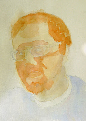
Today, we are all about people... family, friends, strangers, alone or in groups. We begin, appropriately enough, with Melissa's portrait of a 17-year-old victim of gun violence.
This is for a project called Faces Not Forgotten, which gives a face to the youngest victims of gun violence and honors family wishes that their children not be forgotten. Artists paint the portraits of children, 20 and under, who have died as the result of gun violence. The portraits are donated to the family. Copies of the original portraits are then printed on canvas and tied together in groups with black ribbon to create quilts for display.
Follow this link to learn more about how you can get involved—either by donating money or painting a portrait.
So, now that you know what it's all about, we'll revisit Melissa's painting so you can see the way she skillfully uses color, line and especially value to draw focus to her subject.
This may or may not be the final painting. Especially with a subject this important, we want to be sure to get it right. And the way to do that is with studies. Artists do several quick studies to familiarize themselves with the sitter's face. In the quick study below, Melissa nails the color and value she wants. She decides she needs to work out the facial structure in another study to capture her subject's youthful face.
Sara is another big believer in studies. Here she's on her second study for a dual portrait. She's focusing on each head separately here. We love the way she uses color, rather than strong value shifts, to subtly model her subject. This one looks great....
... so she moves on to a study of the second face in her painting. Already we see recognizable facial structure.
More people! Vivian begins a dual portrait by blocking in broad shapes. The composition on this painting is wonderful. We love the angles, the way the subjects move back into space, and the way their position visually describes their close relationship.
We're all feeling brave enough to essay dual portraits it seems. Here Elaine begins to develop two faces. It should be interesting as one head is slightly tilted to catch the light and the other is slightly inclined away from the light.
Ellen's two flower girls are facing away from the audience, but have very definite personalities. We especially love the use of texture in the background and on the tile floors and the brass and wood of the stools, all contrasted with the tulle skirts. Interestingly, Ellen experimented with Blending Medium on the purple background.
Steve's also doing a figure against a richly textured background. And he's also used Blending Medium. Like Ellen, he's amazed by how long it extends the drying time. This week, he's begun the water, using saran wrap to add texture.
Doesn't the merman above remind you of Tony's swallow (below)? We love the graphic quality of the bird against the simple background, especially the beautifully shaped edges.
Tony's also mounted some of his "sacrifice sheets." These are scraps used to test colors or blot brushes. Many times, they turn out to be more interesting than actual paintings! Look at some of Tony's. He uses very absorbent paper and his sacrifice sheets look like Monet's gardens.
Speaking of flowers, our newbie Nicola uses water to create watercolor blooms that perfectly describe flower petals.
With this flower, Nicola creates an entire landscape with a very distinct mood.
And here, she uses complementary colors and an intriguing composition.
Rosemary used three basic colors to paint a portrait of a single calla lily. Notice that she turns to complementary colors, too?
Here, Rosemary begins a still life with lemons and limes. We love the saturated color and sparkling highlights.
Nicola is again using blooms, this time to create a cloudscape. Notice the color gradation in the purple mountains.
Like Steve and Nicola, Madeleine is drawn to water. In this case, it appears in the foreground below a soaring bridge.
In this marine scene, Madeleine channels her inner Manet. Basically a two color painting, this painting uses minimal colors and elements to convey a lot of movement.
No water here as Madeleine sketches out a street scene with an extreme perspective.
Steve and Ellen were experimenting with blending medium, as you recall. Below, we can see Tony experimenting with paper. We show the deckle edges of the paper as they are integral to its charm. This landscape features Tony's distinct color palette and a handmade paper from Cuba.
As you can see, the format works equally well for a Cuban cityscape.
Bill has finished his Dutch night scene. The landmark is lit against the night sky and also features a streetlight in front of it. This is difficult to do in watercolor, but he's managed very well indeed.
Halfway across the world, Bill paints a winter scene of the Chicago River. There is nothing we don't like about this—the color, the composition and especially the brushwork.
Ken continues his stained glass inspired abstract. Notice the use of complementary colors? They just never get old, do they? And keep reading to see some photos of Ken's opening at the Ten Cat. If you didn't get a chance to come to the opening, you can still drop by and see the paintings. Keep scrolling for the address.
Ken's show. Here are some of Ken's paintings in the windows at the front of Ten Cat. Notice how well the paintings coordinate with the bar's mosaics? Keep watching to see the front windows and then some photos of the artist greeting his fans.
Want to see more?
Ken's retrospective will continue until March 22. Drop by if you are in the neighborhood.
Where:
Ten Cat Tavern
3931 N. Ashland AvenueTen Cat Tavern
When:
Exhibition:
February 6–March 22, 2016


 c
c


