We begin with Vivian's painting of a single red maple leaf clinging to a branch in a snowstorm. We love the composition, the shadows on the snow, and the subtle sliver of background. This is the very essence of winter.
Isaac has added layers to his background, making it even deeper and richer—and worthy of his flower.
Rosemary's still life uses complementary colors to great effect. Notice the pairings below.
Bill has finished some vacation paintings. Here is a hillside village in Istanbul, as seen from the water.
And here, he has finished a night painting—an ambitious undertaking in watercolor.
Notice below how Bill tackles the same subject in two different ways. A totally different feel, isn't it, depending on the style?
Madeleine is painting vacation scenes, too. Below, she precisely details a building in pen and ink before adding color.
More architecture—and more complementary colors. There's a lot going on despite the limited
palette.
Madeleine returns to water here—another difficult subject.
And Steve has started adding color. Here he's painted in a sunny blue sky with fluffy white clouds billowing by.
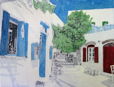
Tony continues to paint on theme. First, blue Mediterranean skies and architecture...
... followed by another take on a dual portrait.
Ellen's flower girls stand out perfectly against the deep starry background and wonderful wooden floor—perfect contrast to the delicate curls and floaty tulle skirts.
Sara is still working on one of the two heads in her dual portrait. The modeling of the facial structure is delicate, but definitive. She must be getting close to the final painting.
And we have a third theme going... color, pure and simple. We begin with our first exercise for beginning painters—the plaid. In Joann's initial stripes, the colors stand out clearly against the pure white of the paper.
Melissa has moved on to later exercises. The top swatches all come from complementary colors. This is one of the most useful of the exercises. Below, she uses her color skills to match local colors of various objects.
Glenn uses the new W&N markers for the fine details below. More importantly, he uses a basic triad of the primary colors. How classic!
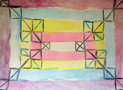
Hector features solid fields of color too. Notice the same primaries in the center block? Quite a different feel though when they are tints instead of pure colors.
Ken's stained glass abstract features color, too. In fact, he's using complementary colors here. (Told you that was one valuable lesson!)
Finally, Ken's cat eye is finished. Once again, he uses complementary and analogous colors, but subtly. And speaking of cats....
You're invited!
Ken will be having a show at Ten Cat Tavern. The show is a retrospective, featuring his recent Ten Cat paintings as well as hits from previous exhibits. You're invited to the opening reception on Saturday, February 20. There will be good art, good company and pizza! You'll surely want to be there.
Where:
Ten Cat Tavern
3931 N Ashland AvenueTen Cat Tavern
When:
Exhibition: February 6–March 22, 2016
Reception: February 20, 2016, 3pm


 c
c


No comments:
Post a Comment