
Can you tell that Tony's been at the Art Insitute? This is the beginning of his take on a Gauguin from the current exhibit. We love the composition and the colors—which are completely Tony's, but with a heavy Gauguin influence.

Alan's works on Yupo have the same Fauvist flair. He's finished his trees from last week. We debated the addition of the hot pink figures. What do you think? Do they enliven the painting? Or do they distract from the wonderful trees and forest floor?

At any rate, Alan isn't finished with trees. So he did this sketch to clarify his intentions around his next treescape....

... and began to paint. Look for more to come on this!

Of course, if you have trees, you need something in those trees. Like Alan's finch. Done on watercolor paper, we love the way the center of interest pops out from the watercolor-y background.

And if you have a bird, there is bound to be a cat nearby, eyeing her prey. In this case, Ken's unabashedly exuberant cat's eye sparkles with its jewel-like mosaic treatment. Ken also had a preliminary sketch of this; we just didn't get a photo.

Susan is still painting food, but balancing her lovely desserts with a decorative background. Like this pie and drink in banana leaf serving dishes, with a small custard tart to complete the scene. All of which is presented against a dynamic background (in a complementary color, of course!).

Susan's found her niche—painting delicious food and making everyone hungry. Look at this beautiful fruit salad and note how the colors are mirrored in the layered background stripes.

Bill is also a prolific sketchbook user. Here's a page from his sketchbook of Jacob's dream....

... and here is the finished painting he developed from the sketch. Isn't it interesting to see how his idea was refined?

Moving from the dark nighttime scene above, Bill sketched this high-key pigeon.

... and began a painting from the sketch. We're eager to see how this develops.

This Michigan scene has been finished from last week. As you recall, it was also a result of an earlier study by Bill.

Nothing says summer like "green." Madeleine used green for this lovely foliage covered walkway in Ireland. All the soft leaves and vines and the textured gravel path contrast beautifully with the square framework.

More Ireland.... but this time, it's blue. Madeleine paints an energetic gathering of clouds, reflected in the shimmering water below. And then, it's perfectly complemented by the shoreline, the grass and the road.

Sara is known for carrying (and using) a sketchbook. Go back and you'll see how she progresses from sketches to studies to paintings. She's also known for her color sense and this scene from her back yard proves that point. The picture doesn't do this justice, but she's juxtaposed red and blue in the foreground to achieve that luminous, electric blue that some blue plants (lobelia, for instance) exhibit in shadow.

Greeta is finishing up her watercolor sketchbook. It's made from a single large sheet of watercolor paper, folded to be a book. The entire book is dedicated to learning to paint faces. So the pages are diverse, the only qualification being that each page must contain a face. Here Greeta finished her
friend's sweet portrait...

... before beginning the last page with a portrait of her grand-daughter in her soccer uniform. Like most of us, Greeta is saving the face for last as it's the hardest part.

Greeta painted this lovely memento of a house/shop in Ocean Springs. It's now a tattoo parlor and Greeta plans to present this to Myrtle, the former owner. She's going to love it!

Elaine wasn't satisfied with her Terra Cotta Warrior from last week. And so, in a bold move, she added a dark wash to the entire background. It certainly adds to the drama and draws focus on the subject. And while she likes the way the underlay colors peek through, she wishes she used a less separating blue in the glaze.

This is the beginning of another portrait in Elaine's People I Don't Know series. Come back to see how it turns out.

Meanwhile, Beth did some urban sketching. This is a scene at a diner where she stopped for waffles and it totally captures the energy of the place. We love the movement, the coffee and the beautiful wood. And yes, it was a quick sketch that didn't require a long camp-out, but Beth still tipped well.

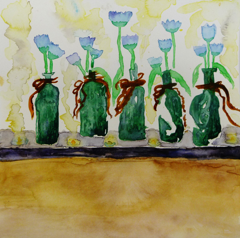
What better way to leave than with these beautiful flowers in raffia-tied bottles? Beth's loose style is perfectly suited to watercolor. We love the composition, the colors of the bottles and the way the light caresses the backlit flowers. Welcome to the Old Masters Club, Beth!
See you next week.
No comments:
Post a Comment