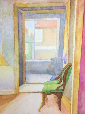
Started this in class and worked on it at home last night, and I like it. It’s photographing lighter than it actually is, but I like the effect of the light from below. I always include Steve’s building b/c it is classic Chicago 8-flat with a lot of interesting decorative touches that I always end up leaving out. I’m going to have hire Elaine to paint it to do it justice….
I painted two versions of this a million years ago. The bottom one is the one I recently repainted, muting the colors, etc. it looked much more like the top one before being repainted….oh, and aren’t they nicely photographed… no curling edges….


I really liked your tree. The way you painted the trunk is artistic and true to how a tree actually grows. I liked the lighter version better. And congrats on the chair. We all know how difficult those curved furniture pieces are.
ReplyDeleteYou totally got that underlighting! No need to add details to the background since that tree is the star. The two chairs remind me of Monet's series—same subject, different light/season/time. The top one is a morning light and the bottom one is late afternoon. Both work beautifully.
ReplyDeleteWho's Steve?
ReplyDeleteI like the lighter shade of the green chair better, it feels much more open than the somewhat claustrophobic and gloomy second version, But you know me, I like a bright, bright, sunshiny day.
I like the first sunny one. The chair looks like a two seater? Interiors challenge my perspective skills. You do well w/them.
ReplyDelete