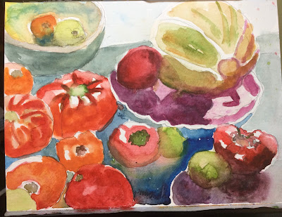
The big tomato painting, 11x15. I like the way the peaches are painted more than the tomatoes. I liked the composition, but I wasn’t really happy with it, so I did a smaller quick study below. Well it wasn’t so quick, as I was trying hard to emulate the paintings of Walter Anderson. He leaves a lot of white space, which gives his paintings energy imo. So I like the feeling of the little one below, which is 6x 9. He also does a lot of color mixing on the paper, which adds drama imo. He also went crazy, but who doesn’t eventually….
In between I did this little beach study from our trip to South Haven. I combined images from 3 different photos. I tried sketching actually on the beach, but I just couldn’t do it. People move too much…


I'm in love with that beach sketch. It's the very essence of sun-drenched vacation fun--it reminds me of Sorolla. And I like how you've included all the members of your family. I like both of the produce pix —I can't choose a favorite as they seem to have very different intentions. One feels like an indoors Renaissance painting and the other is outdoors on a sunny picnic table. It's more like the beginning of a series than an either/or choice for me. Although, I have to agree with you about that white space adding energy.
ReplyDeleteSomething’s happening here. Although I’m not crazy about the entire composition I’m very interested in several components of it especially the color mixing. I think that the use of white space adds energy like you said. Maybe because it allows you to keep painting without waiting for the paint to dry. I think maybe you have to be crazy to paint like that but it might be fun too.
ReplyDelete