Well, I took Pat’s suggestion and just painted the girls freehand without any sketching. They look much older because my proportions are off, but overall it’s not a terrible effort.And it was good practice for working on the hands and faces. Again this is on cheap Strathmore paper, so I can’t get too many layers in before it starts to shred…
Here’s the sketch which still needs some work. Nora’s head looks too big, but it matches the proportions of the grid…
And here’s the final version of their house remodel. I painted it a third time to match the style of the sketch of the original facade, because they want to hang both of them together. I painted the original sketch back in 2013!


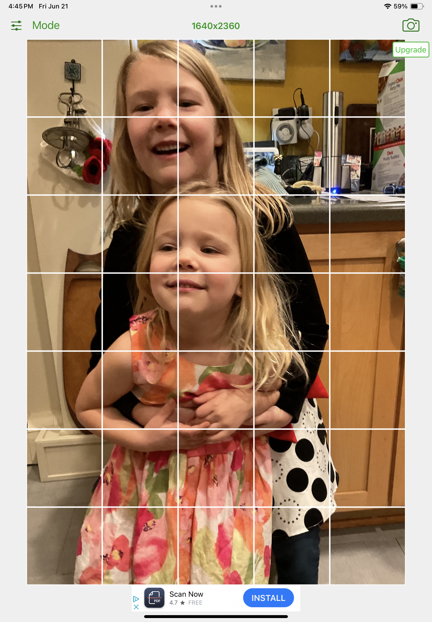

The older one's chin ends before the horizontal line in the gridded photo, but in the drawing it goes below it. Grids can take you only so far. The subconscious mind knows things that it never tells that snooty left brain.
ReplyDeleteThat direct watercolor has Nora's laugh down perfectly. She looks so spontaneously happy. Ken's right about her face being too long in the sketch. The eyes are higher in the photo, too. All's right in the direct watercolor. There's a lot to be said for just going in and doing it. Those house portraits look great next to each other like that. They're going to love them for a very long time.
ReplyDeletePeople are a bitch. Every once in a while your line is off a tiny bit and that changes everything. Only specific I have is that their noses are too pushed up and it makes them pig faced when they are not. You’ll learn something different from each approach but your style is still emerging and I like it. I know so little about painting people I shouldn’t even say anything.
ReplyDelete