OK. It might not be much but I spent a little time adjusting this sketch. I was trying to put the second limb clearly in the background. I liked most of the other elements in the sketch especially the ramp and the foreground

I mislabeled this as abstract where it is really not. It’s more of a minimalist observation of reality. I called this 15 Pebbles and a Twig. Saw this in my alley (source of so many fine paintings) and decided that it would make a cool little painting.

Here’s a little exercise from my sketchbook. I have a handful of small flowcharting templates from my IT days. I like to work out the geometry and perspective in light graphite because I don’t like being so far off from the very beginning. But I don’t like the look of rulered lines. So I use these templates to set the basis for the sketch.
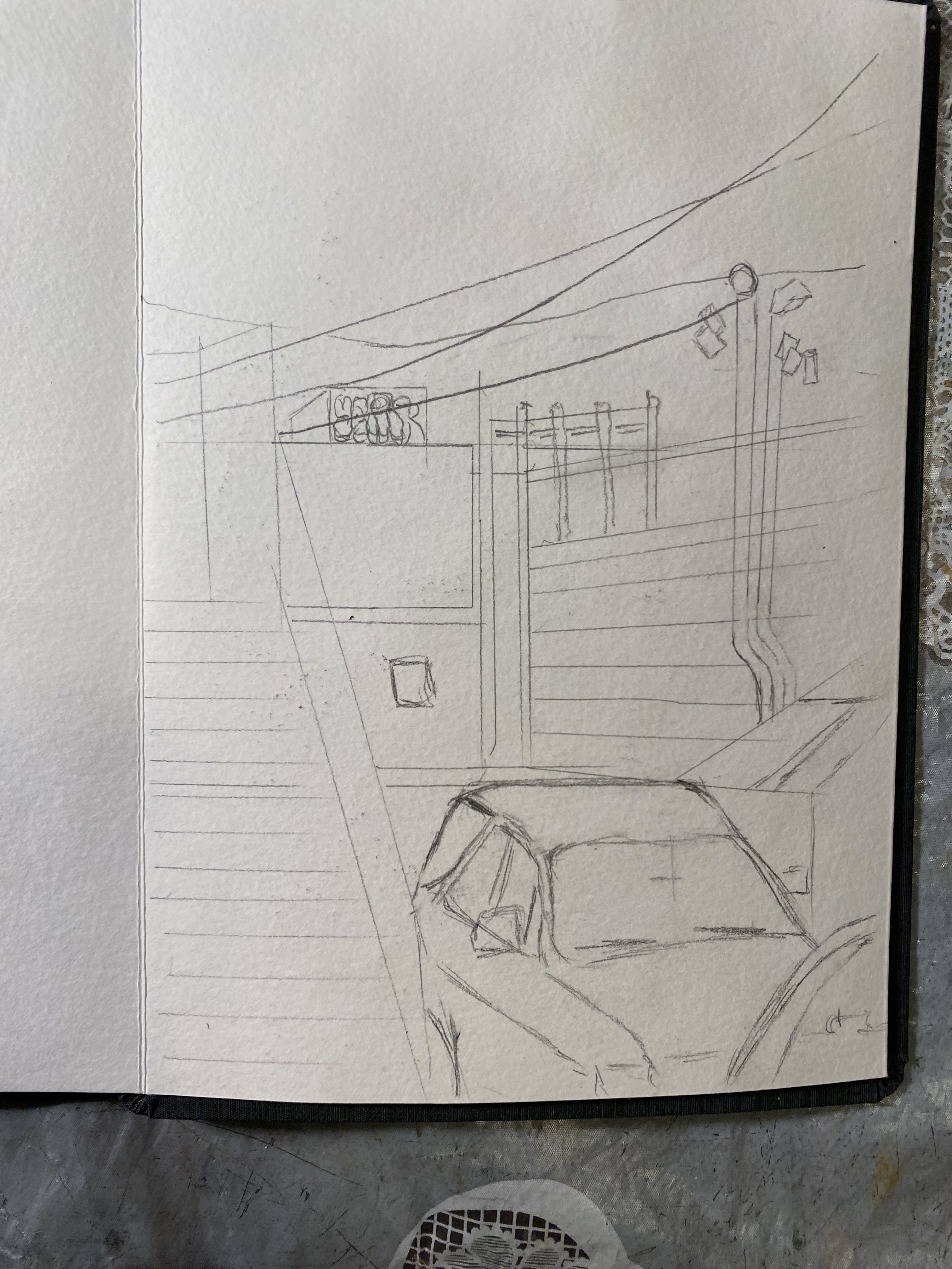
Then I sketch using India ink or fine black marker feeling free because I don’t worry about the structure. When I’m done with this, I erase everything so there is no lead marks on the paper.

Then I can masque certain things and wash with watercolor. Easy….Peasy. At least when I know that I have objects in the right place I can freely add the color.

I've got to say I really appreciate the process you depicted in the final sketch of the alley/car. It starts off looking a bit stiff in pencil, surprisingly looser in ink, and than finally glorious after masque and watercolor. Also the yupo painting. Stunning with the contrast between hyper sharp and amorphous colors. Has a prehistoric cave painting look about it. I like seeing through all the stuff into the deep interior space of the first sketch. But all that ink on the tree bark seems distracting.
ReplyDeleteCorrect!
DeleteAbstract or not, I really like that pebbles and twig painting. That background really makes it. As you know, I'm a big fan of seeing the "process" so naturally, I like that last series. It's really interesting to see it develop and get better with each layer. I think my problem with the first one is that the ink texture on the front trees isn't consistent with the other elements, but I wouldn't suggest adding to the rest--I like that very much as it is.
ReplyDeleteLooks like some kind of mountain road in the southwest as spring begins to bloom. Is what I said last week, not far off. And if you didn't notice that the pebbles looked like pebbles and even if they were poorly done, it wouldn't make the painting any better or worse.
ReplyDeleteI think i would leave out those two linier white things at the top. I can't make out what they are and as abstract composition elements they just distract.
What I like best is that granular orange 'plain'. What I like least is, oh, those linear things at the top again.
Did you do this from a photo? If you did, how close did you try to get the painting to the photo?
Again. Not an abstract. Saw something in the alley, took the photo, edited the photo, cropped the photo, then painted the photo as close to real as I could.
Delete