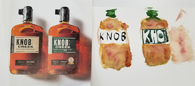
We went back to the original exercise this time—we take 5 minutes to flip open a magazine to the first photo we see and paint it. Ken starts us off with a toast...and lovely, rich colors.
Susan went right for the cover, and also concentrated on the color.
Sara continued Portraiture Week, but with an emphasis on the whole figure—two of them, in fact.
Elaine's subject was a wolf—not much color in that fur, is there?
Jet's reference was easily the most complex of the lot, but she made a great start with the brightly colored vehicle.
Martina and Karen shared a reference—and they were the only artists not to use a National Geographic reference. Martina (top) began with bold color, while Karen (below) went for the details. Isn't it interesting what different artists emphasize?


No comments:
Post a Comment