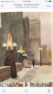
The first version painted maybe 5 years ago is framed and in a place where I look at it all the time —-and see it’s glaring error. The base of the lamp in front is very wrong. Decided to try it again larger the first is 10x13.The second is 14x20.
The images are reversed as usual. So the one on top is new🤦♀️.
Lesson learned:. Washes are so much easier on smaller pieces. And my color choices were granular Daniel Smith. NG. So the whole mood was lost because then I had to make the buildings on the left opaque and too solid. I will say you can make out the image from a long distance and the colors are more garish in the photo.


First off, the original painting is one of my very favorites. The mood and atmosphere alone could inspire a book that would use this as a cover. I'm not seeing any glaring error either. The new one does have a different feel but I think it's more from the color choices than the granulation of the paint. And it's more close-up, which also changes the feel. I look at these like Monet's haystacks...they are the same site but at different times of day/year. On both, though, I love the globes and the way the light pierces the gloom.
ReplyDeleteI like both of them. The older one is a little moodier, but I like the way the sidewalk and bridge pops in the newer one. There’s a lot more contrast and tension between the foreground and the background. It’s very Hoppersque…
ReplyDeleteI like the older one because it looks older and more serious.
ReplyDeleteYeah, I don't notice any glaring error. The older one really captures a sense of atmosphere this is moody and almost nostalgic. The newer one has a totally different vibration, almost jazzy. Maybe a hip-hop one could be next?!
ReplyDelete