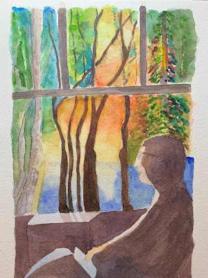
Here’s my second attempt at this portrait and it’s much closer to my original intent: man silhouetted in darkness ignoring his iPad and finally noticing the beauty of nature right outside the window! Still needs a few tweaks but pretty much done. This is painted on great paper — Stonehenge 300lb 100 percent cotton. Very absorbent, but allows lifting and scrubbing with no damage.
Subscribe to:
Post Comments (Atom)

I see that you kept that much-praised shadow on the table top and even made it more sinuous. And speaking of sinuous I like the contrast between the straight lines of the window and those curvy trees. Joe looks cartoony but that goes with the artificial vs real world thing.
ReplyDeleteI like this a lot. I particularly like the way you did that window. It has all the right proportions without being static. Just good framing for the soft and colorful scene outside. It always distracts me when the architecture is too wrong or too perfect unless it is intentionally wacky.
ReplyDeleteI like the contrast between the flat indoor world and the exuberantly rich outside. The rim of light around Joe and his iPad add to the separation and only that soft reflection on the tabletop connects the two worlds. Brilliant!
ReplyDelete