


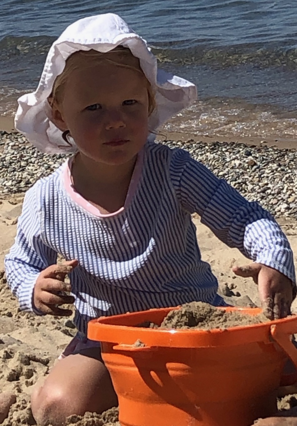
So here’s a project I started yesterday. I actually did the small sketch first, then the freehand value study, then the bigger sketch, then the painting. You can see in the photo below the beautiful colors in her face, but the values are very dark, much darker than I achieved. I’m going to do another one on heavier paper, so I’m open to advice for improving it. I just love the look of determination on her face that says “Can’t you see I’m working here?!”
Happy painting!
You should have more rainy weeks! I like your porch painting. You can feel the sun. I'm not sure that you emphasized the baby at the expense of your face. The sunlight highlight on the hair links to the baby and keeps my eye moving between both faces.
ReplyDeleteYou certainly are rocking your pen sketches. I am having fun looking at them, anyway.
Finally, I love the last painting. You learn something different with each exploration. Even if the final value on the face isn't as dark as the photo, I like yours better. You've completely got her expression and you've got the sense that her face is shaded by the hat and there's bright sun all around. It feels like Sorolla's beach paintings.
When it rains, you pour out drawings. Way to go, Sara! The color choices are great with the violet and yellow combinations. Even though it's overall a similar value, the use of complimentary colors keeps a visual tingle going on. Also interesting are the soft value shapes against the structured patterns of perspective. (phew, what a mouthful, but you get my drift?) So it really works well compositional too. (And is not just another pretty picture!)
ReplyDeleteYour pen drawings are terrific. It almost looks like they're made with one continuous line.
I like seeing how each one of your sketches shows a different approach and a different aspect of capturing the image. Each one would be interesting to develop further, I think. And they each would be completely different, but still good.
Kind of a story on that porch with the gramma and kid. The kid certainly has an expression but I can't read gramma.
ReplyDeleteWhat's a coptic? Looks like it might be one of those drafting pens. I like the first sketch because it is so solid.
I like the sketches of the kid. In that painting you have put sunshine in her forehead and her chin, and her cheeks are shadowed. Maybe if she was looking into the sun. well it doesn't matter. It looks good.
The porch portrait has an almost pensive feel to me, like maybe you're watching to see if the weather turns.
ReplyDeleteI love your sketches! They are like contour drawings, as Pat said.
The final beach portrait is fun to watch in its evolution. That expression reminds me of my grandson when he's on a mission.