This is 5x7. I saw lovely shadows on the apt building across the street, but I just didn’t get the contrast I want. I think I’m going to try again. Not sure if the window frame helps or hurts… or maybe I need more framing on the sides…
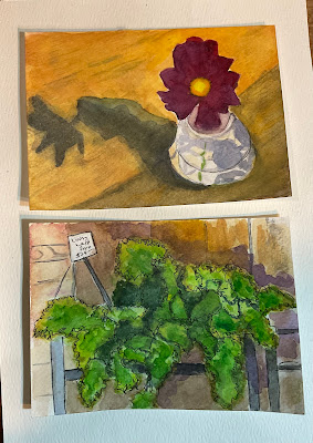
A couple of postcards, again working on contrast, but a normal kind of contrast that provides structure more than drama….
“Lazy Fruit on a Picnic Blanket Before the Storm.” Another old sketchbook painting repainted. It cracks me up! I’m going to try to visit next Saturday. Will my ID work when im not registered?


Like the composition of the first one. The top right really draws my attention. Always love your “window looking out” paintings. They would make a nice grouping. I see you’ve also done a 3 color background - very dramatic. The work on the lazy fruit is excellent. Love the color blending.
ReplyDeleteThe first painting is your best version yet. Love the cropping. You can see just enough to experience the moment she notices you are there and glances up at you from contemplating the baby. Beautiful! I also love the picnic fruit in a storm. Perfect name! You really have that impending storm lighting, along with the glow of the fruit. I am a big fan of your window views. I don't know if your window frame needs more on the sides, but I do notice that the dark trunk stops when the window frame hits it. Maybe extend the leaves below the sash, or darken the trunk a little above it? Your shadows really contribute to the composition, especially the flower extending across the polished table.
ReplyDeleteYour ID will probably work. As long as it’s fairly recently updated…maybe 2024.
ReplyDeleteI like that big pink face only partially shown at the top like in the last one.
ReplyDeleteThe pears are nice. I get the feeling that they fell from Christina's basket before she laid down in the wheat field. There is something unique about the way a postcard's dimensions effect the painting.
You don’t need more framing on the sides. A little difference from some of the other ones.
ReplyDeleteThe double portrait is edgy and divinely painted at the same time. The tree out the window just needs to be clarified a bit where the trunk meets the window pane and they look like they either merge or get cut off. Either bring the trunk up further, or bring the branches and leaves down some on the right side. The postcards look fun. Especially the shadows. And the reworked sketchbook fruit. So moody, so luscious.
ReplyDelete