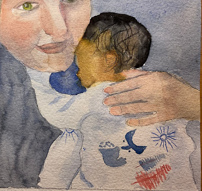
Have had this image for a long time…..imagined how when I painted it, the paint would smoothly flow between skin color and shadows. Instead she’s looking bruised. I think she’s in despair at how I painted her. Time to play around with the skin color section of of Watercolor Painter’s Pocket Palette.
Monday, September 30, 2024
Variations on a theme…
Well, you know when you get an image stuck in your head and you keep thinking I can get this, just one more try…overall I probably like the one from last week best as well as the bottom one here. I didn’t put the window frame over it because I really like the way the top half is painted. Actually I like the way the top half is painted in all of them…it’s just the shadow that I haven’t quite mastered…
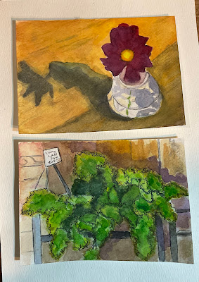
Here are two other paintings I’m working on. Actually the top one is done, it’s 6x10. The bottom one is 5x7 and still a work in progress. But I do like how those figs are painted…
Sunday, September 29, 2024
September 28, 2024 — Elaine O.
We Have Visitors!!
Guess who dropped by today? Bryan and Allison...along with Baby Holly! She's absolutely adorable and, as you can see, her parents are happy, healthy and glowing with joy. It was wonderful to catch up and, for those who missed them, they promise to be back. We can't wait to see them again and foresee many baby paintings in their future.
Wednesday, September 25, 2024
Monday, September 23, 2024
Alan Fall 1
Inspiration can come from the damndest places. When my friend in Michigan came over to work on our cottage opened the hatchback of his SUV I was amazed by the pile of tools and cords. So…I took a photo of it and turned it into a painting on Yupo. I just liked the chaos of it. It’s 11 X 14 on Yupo
Sunday, September 22, 2024
Not quite perfect….
This is 5x7. I saw lovely shadows on the apt building across the street, but I just didn’t get the contrast I want. I think I’m going to try again. Not sure if the window frame helps or hurts… or maybe I need more framing on the sides…
A couple of postcards, again working on contrast, but a normal kind of contrast that provides structure more than drama….
“Lazy Fruit on a Picnic Blanket Before the Storm.” Another old sketchbook painting repainted. It cracks me up! I’m going to try to visit next Saturday. Will my ID work when im not registered?
September 21, 2024 — Elaine O.
It's back to slow painting. Portraits and architecture seem to need more care than landscapes or still lifes. After all, if you move a tree or a piece of fruit... no big deal. Displace a column or a nose, on the other hand, and the whole building or face collapses. That said, here's the slow beginning of a beautiful Parisian church facade.
 |
| 14" x 11" |
Sunday, September 15, 2024
A Hodgepodge of Subjects…
I did this before but I like this one much better. I used neutral tint for the shadows. I might have to frame it. It’s in a sketchbook, maybe 6 x 10?
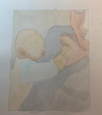
The top study is small, may 4 x4.. the head and hand look a little disembodied, but I like the way the face is painted. The second one is larger, maybe 8x10. I like the pose but there’s a lot of grays and browns in the clothes. I may have to jazz it up or mute the whole thing except for the two heads…
I’m going thru old sketchbooks and repainting unfinished or bad looking sketches. This was once a giant pear on two blocks,. Now it’s a squash on two books.. this is an old Arches sketchbook and the paper is so Lucious to paint on. It just absorbs layer after layer of color.
Oh look, I even did an abstract this week, although really it was more of a color study…this is on Fabriano sketchbook, which isn’t bad,but not nearly as absorbent as the Arches. Neither claim to be 100 percent cotton but you can clearly see the difference between the two papers. The color kind of sits on top of the Fabriano.
September 14, 2024 — Elaine O.
After a week suffering through the world's worst cold, I barely managed to sketch out my next painting. But when I went to start adding color, I found my mixing area full of old paint. Time for some palette cleaning! Hence, this sketchbook piece of some dead flies. As you can see, they aren't symmetrical or perfectly formed because the little nuisances have been squished. Still, they do have a lovely sheen and exquisite wings, don't they?
 |
| approx. 8" x 5.5" |
Friday, September 13, 2024
Alan Summer 12
Another attempt at gouache resist using a different technique.
First I painted a simple still life. I liked it except for the bad bananas
Here’s the one that starts out with the painted gouache still life and puts the india ink on top of that. It looks kinds like a woodcut.
I learned a lot from this technique but it’s really time consuming (a lot of waiting for things to dry) and when you make a mistake with the ink there’s not a lot you can do about it. I would do it again while I was painting other things or as a way to change a painting I don’t like.
Going small.
Those viney things are too dark and indefinite, but otherwise I think it is okay.
And here are some postcards I have been working on.
Wednesday, September 11, 2024
Alan Summer 11
OK. Another stab at gouache resist following Elaine’s technique.
First a simple still life painted with gouache on 140# rough.
I think this woodcut looking style would be better suited for older buildings or some landscapes.
I am going to try this again using a different gouache resist technique. It’s a lot of work with lots of decisions to be made. We’ll see if it’s worth it.
Monday, September 9, 2024
Too much?
On Saturday I was really perturbed by those curvey vertical lines trailing viridian, so today I put risky turquoise on the viridian side and raw sienna on the the other side, and gave both sides a lower left to upper right drift and now I think it has a stronger foreground/background look which gives it more order which it needed. Almost done I think.
Sunday, September 8, 2024
Copy catting….
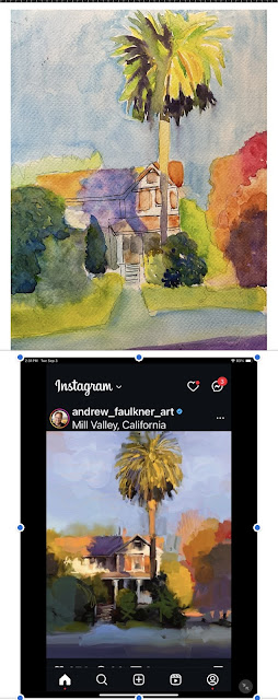
I’m spending my recuperation time copying paintings that I like, mainly for their color and sense of contrast, which creates great drama imo. It is really hard to get the dark darks in watercolor, and maybe watercolor doesn’t lend itself to that sense of drama. So what are the traits of watcrcolor that can be exploited to create that sense of drama? Besides trying to answer this burning question, I’m doing fine. It’s amazing how they can stick a bunch of metal parts in you and it feels no different, except it doesn’t hurt to walk anymore!
September 7, 2024 — Elaine O.
I still haven't decided on my next painting, so I'm searching for inspiration in my sketchbook. I've played some more with separating/granulating colors, using the honesty plant and just trying to create some of my own mixes.
...and a cityscape. This is a church door in Paris. I loved the bright red against the stone facade, with the black accent in the iron fencing. I'm considering doing this as a full painting.
It was good to be back painting with the group! Oh, for reference, all of the above are about 8" x 5.5".


