I just subdued the basket shadow, which seems to make the painting work a little better. But this doesn’t have the ethereal nature of the earlier sketch. That seems to be the problem— I can’t capture the immediacy of my sketches in more thought-out paintings. But that’s probably a universal problem….I think I’m going to paint it one more time.
This is done. Since class I lightened the background and added more color to the flowers and stems and added the pattern to the white space. I like it.
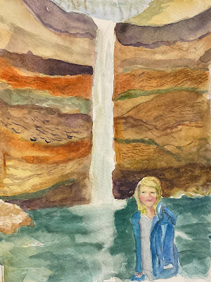
I think this done too. I painted this in response to the painting above, which I did years ago. The earlier one is a better painting imo. Maybe I will think about this one of Nora and see if I can paint it again to that level —or maybe I just need to frame it!


These are beautiful, Sara. The reflection and polished wood in the first painting are exquisite. And adding the lace pattern in the second floral was just what it needed. That whole bottom half is perfect! As for Nora--frame it! It holds its own with the other waterfall painting and they make a fine pair to display together!
ReplyDeleteI think that problem with sketch spontaneity and painting formality is inherent. Sketching, it is you and the pen, painting you have to choose the brush, the color, the wetness. You may as well be packing for a trip to Paris. With the pen you are popping off to Walgreens with a couple bucks in your pocket to buy some gum.
ReplyDeleteA lot of nice things in the potted plant and I like that strip of lace tablecloth the best.
I liked the lady by the waterfall when I saw it last week, but seeing the previous, I have to say I like that one much better. The rock wall on the right is slanting inward and the one on the left is standing there straight on and solid as well, a rock. And that narrow stream between them brings them much closer and that creates a tension. In the later painting the lady looks like she is standing in front of a giant layer cake. And both paintings vote Uncle Ken's First Rule of Composition: No People!
VIOLATE Uncle Ken's first rule. I don't know why blogspot won't let you edit a comment. Oh you can delete it but then blogspot lets the whole world know you did something incorrect and had to change it.
ReplyDeleteIf you can’t paint people don’t paint them. But you have progressed so much in this that I enjoy your people. Those paintings would be boring without them. I like the Nora one better.
ReplyDeleteThe first painting just lays there for me, but the daffodils are very nice and feel finished to me. And Ken’s right about that doily. Well planned and lightly executed.
Yea, the first painting lost its freshness and became H E A V Y. I think a lot of that is from the dark browns. Ruin it more and see what happens. Your daffodils really shine. Lightening the background, brightening the flowers and adding to doily is magnificent. Everything works well. Good to see the 2 rock portraits together. Seeing that, I think the Nora one is just too symmetrical. Even if the waterfall stays central and just the rock layers radically differ, it would help (like the ptg. above).
ReplyDeleteFor some reason the bottom dominates in the first one…and then I see toast as in buttered slices🙄 I like that u so often get a window in the story. Love the perspective and colors in the second.
ReplyDelete