Did some sketching the early part of this week. This first one is a self portrait from life done in 20 minutes.
A little severe but apparently that’s what I look like these days...these next two are another portrait at 20 minutes and 40 minutes. (Also done looking in a mirror)
Gotta say, I kind of impressed myself! I didn’t totally follow the Loomis method but I adapted parts of it to place the features. Yes one eye is bigger than the other, but I managed to get some volume in the face around the mouth, which is what I’m trying to do - create volume so the features don’t look pasted on...
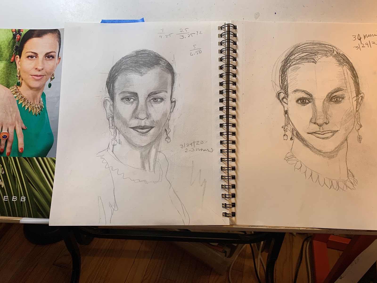
Using a photo reference, I spent a couple hours on one and about 20 or 30 minutes on the other.
Not a great likeness in either, but it’s bizarre studying a face for that long...
I worked on this double portrait again! Clarifying the moms face and painting and painting the background. Ken, I have new respect for your background planning and painting skills. It’s really hard...
And finally, I’m working on a landscape tree painting. Here’s a prelim sketch and my pencil drawing.
Gotta say, I’m not as upbeat as I felt last week, but working on these projects helps a lot. They’re totally absorbing for a few hours each day.And obviously I’m happy for the chance to share —it gives me a sense of progress. Hope everyone else is doing well!


Wow! You really are doing a lot—and making a lot of progress, too. Your portraits are impressive. They've always been very lively, but you're capturing the likeness very quickly. I noticed this on the Making A Mark blog and thought you'd enjoy it. Here's a link to digital portraiture resources from the UK's National Portrait Gallery. Haven't investigated further, but it looks promising (https://makingamark.blogspot.com/2020/04/portraits-portraiture-digital-learning-resources.html)
ReplyDeleteThe double portrait is coming along nicely and I always love your trees and street scenes. They have Hopper's sense of place, with the colors of Kahn--probably why they don't feel cold, sterile or foreboding.
I like the background more than the foreground. I think that's why I stumbled with those women, I wasn't much interested at all in their faces. They were just something I needed to do so I could get on to the background, and then that's all anybody was interested in when what I was interested in was the background.
ReplyDeleteI like the severe Sara the best. Not as flattering or beautiful, but more interesting, I will take interesting over beautiful most of the time.
Again, you are really working. The portrait drawings from life are so full of energy. I do like the first one because of that energy and the intense looking involved. People's faces aren't symmetrical anyway. It's hard to draw someone who has a face that's photoshopped so flawlessly that there's not much to latch onto structure-wise. Nevertheless you did a good job with shading what little info was there. Your background is wildly interesting in the double portrait. Eeek, you might have to go into their clothes a bit to sync it with the way the background is painted??? hmm. Your watercolor sketch of outside looks wonderful and so does the drawing.
ReplyDeleteRemember art making saves the soul, etc.
Good point about the magazine face being photoshopped! It took me about an hour to realize that was why there were no landmarks on her face to grab onto...
Delete