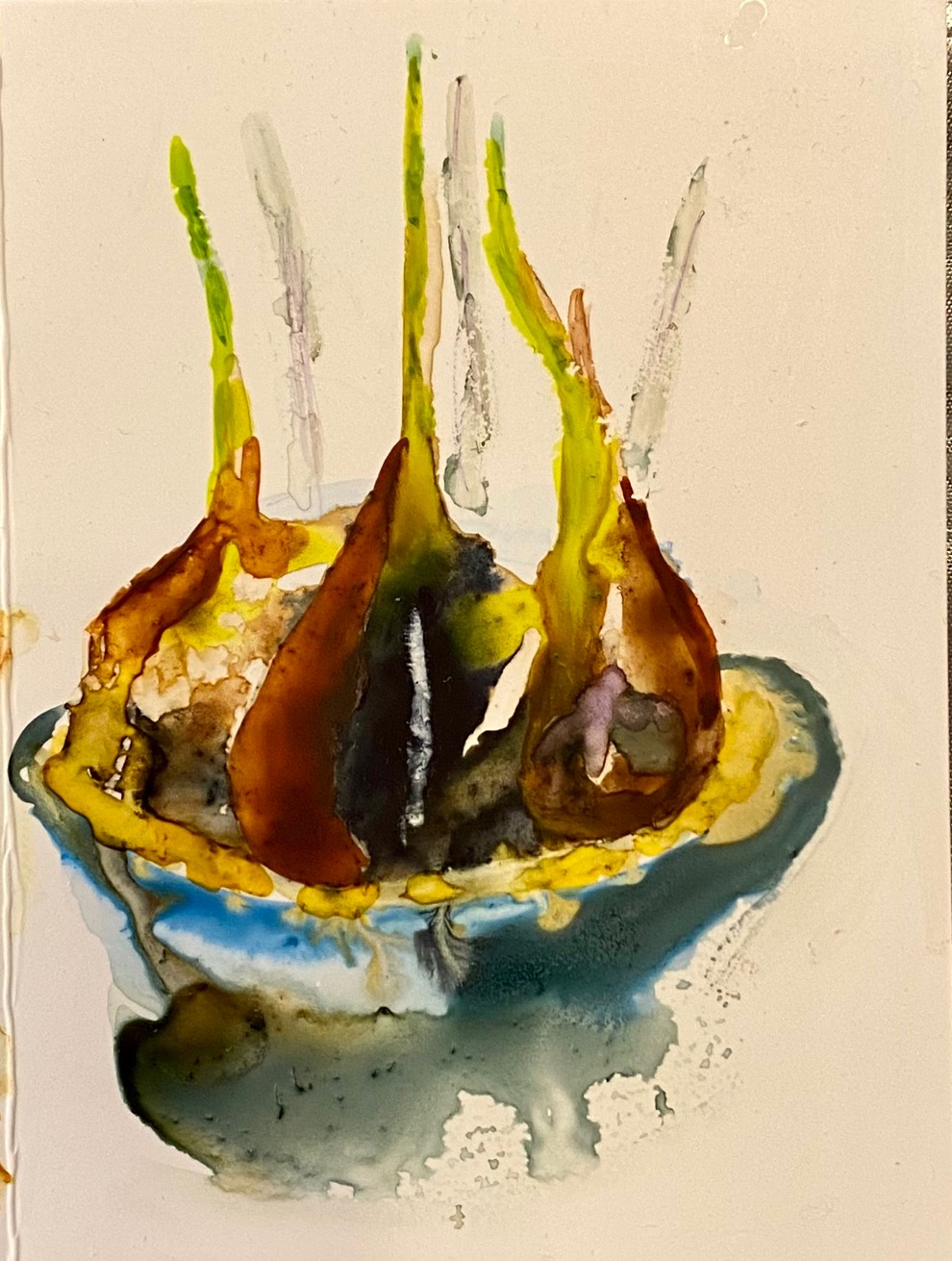
My paper white bulb is coming along. Not as well as Greeta’s but then I’m not a natural mother. Watercolor on Yupo.
Here’s all of them on a strip of Yupo. They’re very small But a lot of fun.

I may have completed my 4th hole dogleg left painting with Chicago in the background. I couldn’t get Marina City in there. I can now see the shot shape now and I like the trees better. Watercolor on 140.

Looking forward to seeing you all in class Saturday.