Tuesday, October 15, 2024

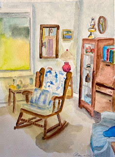
Alan Fall 2


 Inspired by Sara’s in-to-out paintings I tried to paint this interior of my cottage living room. 


I’m not thrilled with it although everything is in the right place. I think that it lacks value. Greeta bought me a set of watercolor brush pens that I’ll use to update this painting. It’s 8 1/2 X 11 on cold press. 

This is our bountiful heirloom tomato crop. It’s in my 5 X 5 sketchbook on hot press. 

A little bit of everything….


Here’s my ode to fall. It’s almost exactly the way I wanted it! That doesn’t happen very often!


Last of the summer produce, beets and turnips. I actually like this one too! I really enjoyed painting both of these, maybe because I didn’t have expectations about how they would turn out. I just went with the process.


A triple portrait— am I crazy or what? I just liked the reference photo because my sister and Nora illustrate my family’s sense of fashion—bright colors! — and Quinn is dressed by her mother in muted grays and blues! I also like the difference in Nora and Quinn’s poses: Nora is in classic school picture pose- stand up straight and smile! Whereas Quinn is her natural beautiful self. I like how my sister is painted, but Quinn needs a little color to her shirt and maybe Nora needs a little more face definition. Maybe a darker background to make them pop? 


Here’s a little less irritated Brittany…I think I need a better reference photo…does anyone know how to make this font bigger while typing? I am going blind trying to correct my mistakes. I can’t tell a comma from a period…

Monday, October 14, 2024

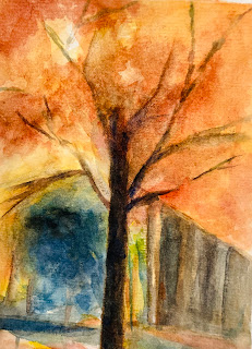
Pretending There’s Fall Color

 Attended a workshop at Bill Bartelt’s studio. The plan was to walk around and take photos, then work in the studio. No color, so we worked from his photo collection.. I love Bill’s work and his method of doing short demos and roaming around with advice and then displaying and discussing the work was effective.  Google him. However his studio is small and there were 10 students!  Had been to his studio during art walks, so I was thinking his limit must be 5 tops.   

Maybe I’ll devote this fall  to painting trees.   Looking at this photo I can see some branch work to be done….and leaves ….where are the leaves. 

Order and chaos


 This is postcard size. It was originally just an abstract of green, yellows, and darks, but as I finished it the Florida hurricanes hit CNN and I thought it looked a bit like palms flailing in the wind so I added those dark shapes that could be seagulls or debris caught in the deadly winds.


I like the contrast of order and chaos (broken patterns).  In this one I started out with those vertical, horizontal, and diagonal lines and at one point it had a nice chaotic look, but as I kept on (Everytime you paint over you lose what is beneath) the order was just too strong.  I still like the rusty crusty center though.


Here I started with a less symmetric set of lines and chaos was able to hold its own.  Out of control I thought this morning as I was finishing it up, but then that yellow explosion held everything together I thought.


This are croppings from that last painting.  See this is what I like where stuff is painted over and over the whole thing looks scraggly and dirty, but I don't know if anybody else likes that stuff. 

Sunday, October 13, 2024

October 12, 2024 — Elaine O.

There are paintings and there are "learning opportunities." This is the latter, and it's been a good one. The reference was a pale flower in clear glass against a pale background. I missed some contrast, so I put in a deep dark background. That did not work, so I scrubbed it out to this, which is also not quite right. I do like the vase and stem, though.

12" x 9"


Monday, October 7, 2024

Working Small at the Cottage


 Had big plans to work on exercises in Portrait Painting in Watercolor by Charles Reid. Instead, did two little 3x5s in moleskin book. Little cottage on our road for sale. 

Sunday, October 6, 2024

Low energy paintin I


 These are small, about 4x6. I like how I painted the vase in the top one.And the composition is somewhat interesting. The bottom one just didn’t turn out as well. These sort of satisfy my need to go in with a lot of paint, but they end up looking heavy, but sometimes I kind of like that look. I think I’m trying to paint like Greeta. Her colors always look so vivid and luminous but solid.


I’m working on a portrait of Brit, my daughter in law. I finally found a photo where she is not smiling, altho she doesn’t look particularly happy either. I drew the top one freehand just to get a feel for her features and the bottom I ttraced the photo off my iPad I like how I painted he eyes but her face is a little ruddy.That shadow on the top one is just me taking the photo. I can’t decide if the pose is worth pursuing…is she just going to say I look so sad?

Nice to see everyone on Saturday— several dedicated newbies!

October 5, 2024 — Elaine O.

Finished! I had some serious doubts when I sat down to do the fine straight lines of the wrought iron. Did I want to attempt this? Do I even need it? But I pushed through and I really do think I needed them. That fence adds a real sense of space and weight (and I really don't care if the lines are a bit wobbly!).

14" x 11"

The finishing touches took much less time than I allotted, so I had time to kill. I zoomed in on a group of tourists to do this direct watercolor. 

12" x 9"


Saturday, October 5, 2024

Working at home


 Did quite a bit of work on this over the week, chiefly working on those dense patches in the upper right and lower left so they wouldn't dominate so much.  Strangely those thin stripes seems to have made them look not so dominating and oppressive.  


This is my favorite postcard from few weeks ago.


This is a 9x12 version I did today, not quite finished need to lighten up the shell of Chicxulub, which I am calling this.  Chicxulub (Chick-shoo-lube) is the meteor that smashed into Yucatan and wiped out the dinosaurs.  I may do a little series on this, or maybe not.


Tuesday, October 1, 2024

Then and Now


 Before I joined the watercolor class in the fall of 1989 I was doing things like these.  They were markers on typing paper  9x9"

So this is the same thing only it is watercolors and 18x24" and the triangles and rectangles are studies in how different paints mix. but also I hope that they are attractive little designs in themselves and that the whole thing is pleasing to the eye.  There is a little more work to be done on in but this is substantially what it will look like when I am done.