Sorry, no cats this week.


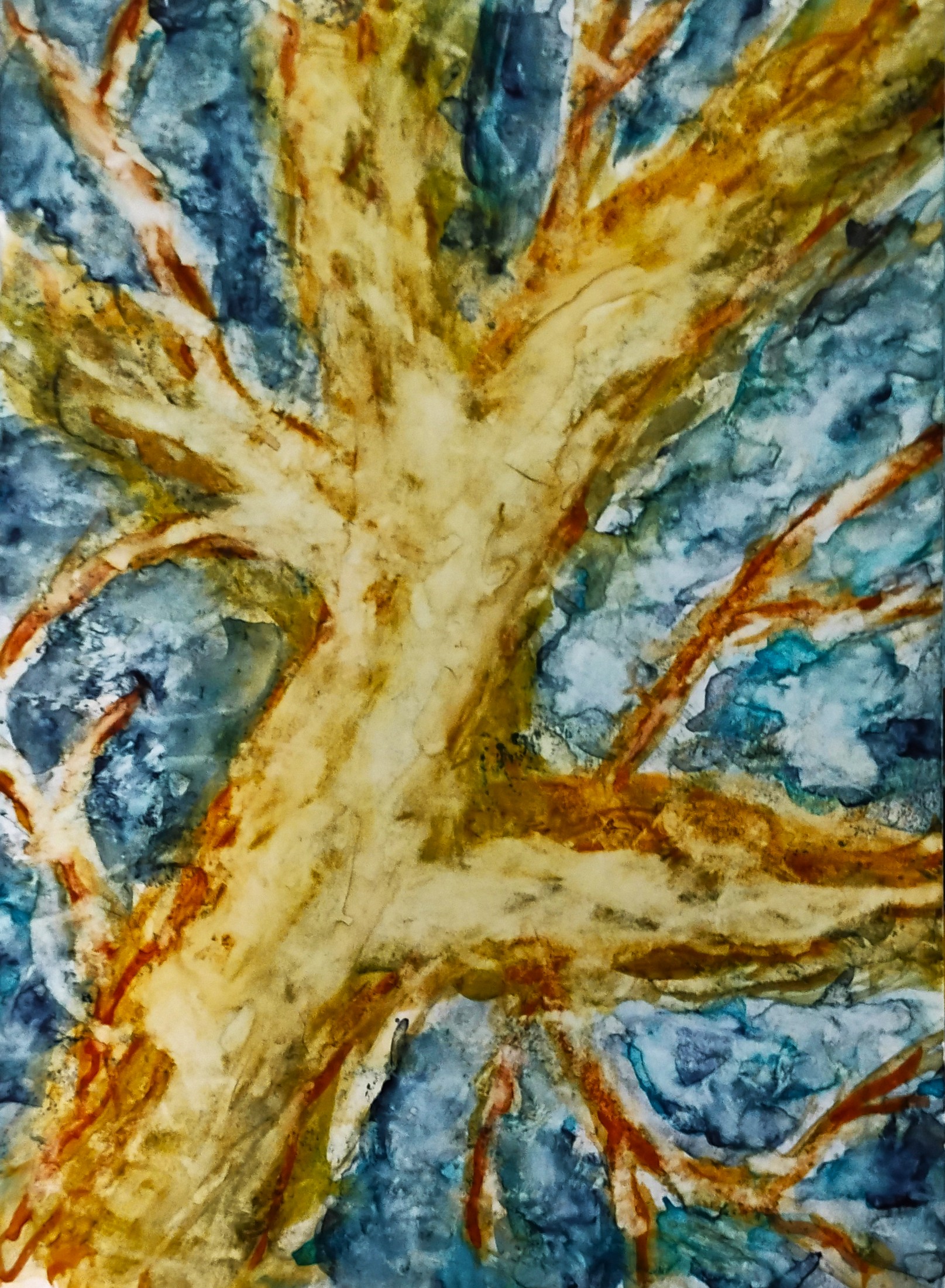
I was putting paint down and adding water and blotching with a Viva towel, repeat and repeat, and at some point it looked like that, and I thought that looks pretty good, so I stopped. 5x7.
I took a cropping of the previous image meaning to apply the same treatment as above, but you never want to repeat yourself, and I think I have gone astray, but I haven't given up on it yet. 5x7.
I realized just now that I'm not so much seeing trees as some scientific thing (does dendrite sound right?). So they seem to be more of a pattern than an actual thing and flatter. I like the depth you achieve with layering on yupo and it seems like you're not getting that with this series. They are interesting--I like the feathery branches in the first and the snowy branches in the second--but I want even more.
ReplyDeleteThe middle painting is the star of this group. It has lots of texture, good interplay of light and dark, lots to look at. The top one has too much contrast between the trunk and the background. Those wispy green marks are lost. The bottom one needs a few more marks or another color on the trunk.
ReplyDeleteI like the background of the first. Have to view it on a large screen to appreciate it. If the second is a tree, I think that there is still something wrong with the proportions. Other than that, I kind of like it.
ReplyDeleteI did like the turquoise in the second one. A color not used enuf imo.
ReplyDelete