I like these. In particular, I like the color in the middle painting. Is that the same two color palette you used for the first one? Why do they look so different? At any rate, I prefer the second one. I also like the composition on the last one. The undulating lines make me feel like I'm seeing a prairie with wind blowing the prairie grass in waves.
The top of the first, the bottom of the second, ho-hum on the last. If you strengthen the middle of the first to connect the trunk and used the same technique on the bottom as you did with the second, you’d have something. Also liked the blue in the second.
Whoa, Ken. You got something going there. I actually like the first one. Nice that you spared it the nit-picking. The second one hopped back to a bit too much of the nit-pick look, or maybe overdone look. I like the new colors you've used. The third, the sweeping back and forth is nice, but the nit-picking is way overboard.
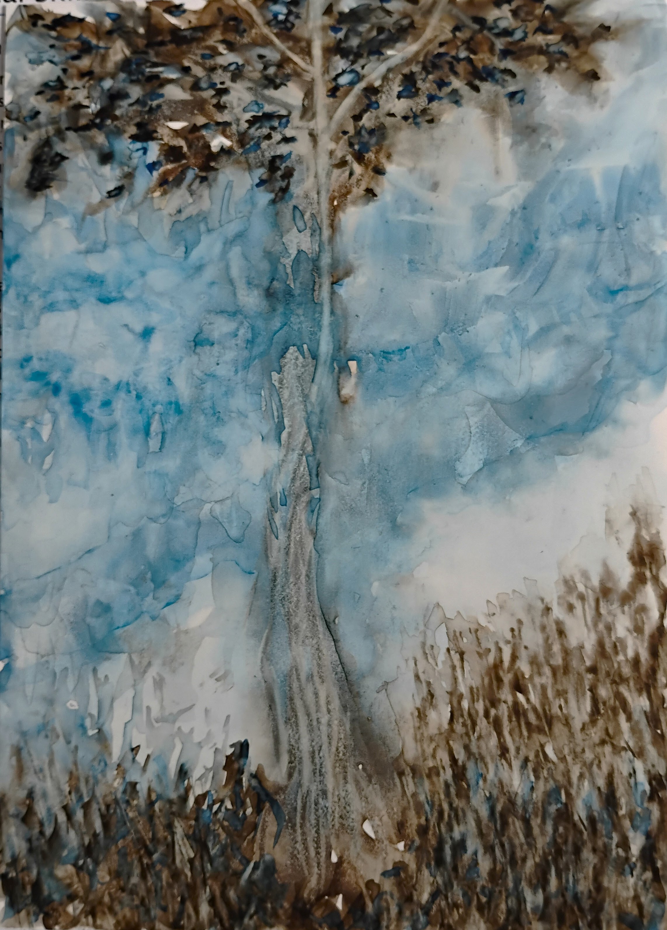


I like these. In particular, I like the color in the middle painting. Is that the same two color palette you used for the first one? Why do they look so different? At any rate, I prefer the second one. I also like the composition on the last one. The undulating lines make me feel like I'm seeing a prairie with wind blowing the prairie grass in waves.
ReplyDeleteI added indigo to the mix to give it more body.
DeleteThe top of the first, the bottom of the second, ho-hum on the last. If you strengthen the middle of the first to connect the trunk and used the same technique on the bottom as you did with the second, you’d have something. Also liked the blue in the second.
ReplyDeleteWhoa, Ken. You got something going there. I actually like the first one. Nice that you spared it the nit-picking. The second one hopped back to a bit too much of the nit-pick look, or maybe overdone look. I like the new colors you've used. The third, the sweeping back and forth is nice, but the nit-picking is way overboard.
ReplyDeleteLike the first…disconnected in a good way.
ReplyDeleteReally like first two, especially those little blue flowers in #2. I think your subject is sky…trees are just a framing device….
ReplyDelete