Susan's also painting changing foliage, but in a totally different way. Her leaves are on a bush near Ashland and Catalpa (Ashland Avenue seems to be the epicenter for beautifull fall colors this year!). This is another "field" painting and Susan began with the negative space, then proceeded to paint leaves as she imagined them, rather than trying to exactly duplicate a photo. Beautiful!

Debbie is a visiting artist, a guest of Ken. She's used watercolor and oil pastels to paint this moody abstract scene.

Speaking of abstracts, we were! Yes, the topic has been popular lately, as evidenced in Alan's painting below. He began with color and shapes and added texture. The resultant scene also looks like an eerie landscape. Look closely—it's different (but equally interesting) close up than from afar.

And now for something completely different. Alan has switched from Yupo to traditional watercolor paper for this architectural sketch. His plan is to do a tight ink rendering of the Chicago church, followed by a loose watercolor wash. And keep reading to the end, when we interview Alan, asking one of our sporadic art questions. This time, we want to know how art (and particularly watercolor) have changed our lives.

Bill continues to work on his Irish street scene. Here he has unified the emphasis between the buildings, people and cars. (We love the light building on the left side).

Here, he's painted the same scene, but from a slightly different vantage. So far, the architecture is most prominent, but he'll be adjusting emphasis as the painting progresses.

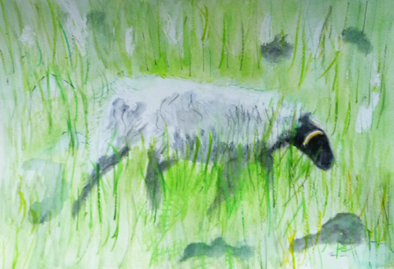
Glen has finished his painting of a carousel horse's bid for freedom. We love the sky, the musculature of the horse and positioning of the carousel. We also applaud the use of fine brushwork in the free-flowing mane and the foreground grasses.

Madeleine has begun to add color to her sketch from last week. In this perfectly composed painting, her two grandsons are learning falconry in Ireland. The foreground is all about the relationship between the slightly apprehensive would-be falconer, the falcon and the encouraging falconer. His brother looks on in the background, perfectly framed and creating a pyramid of interest.

John's sketch is also about a story. Bystanders are watching a play rehearsal. This is a much larger, more populous cast; yet, if you look closely, you'll see each of them as individuals. We are trying to encourage John to finish this with watercolor instead of colored pencils. Look at the next painting that John did and see if you don't agree.

This painting features a large cast of birds, beautifully watercolored. John has a fine hand with watercolor and we'd like to see him do more. 'Enuf said.

If you've been following us for any length of time, you know how we love our still lives and our produce. Witness Isaac's pearscape. The color choices are beautiful and we are very impressed with the subtle modeling. But our favorite part may be the drawing. The stems seem to be alive.

Speaking of produce, we love Ken's corn series and are a little sad to see it near its end. This painting features a fine balance between the flat, patterned husks and the lush golden kernels.

Did we say how sad we were to see the Corn series winding down? Not so fast! Today we were thrilled to see that Ken has another painting planned. This is Autumn corn, with dried, crispy yellow leaves. We're anxious to see how this comes out.

Continuing in our seasonal trend, Luciana does four winter scenes. There is a snowman against a beautiful winter sky, a pine tree against a spattered background, and three ornaments against a festive spattered background. We love the soft color blending in the ornaments, the edges on the tree and the minimalist snowman and are awaiting the fourth in this series.

Elaine also used the spatter technique in her small self-portrait at Kensington Gardens. You may recall this was a experiment using three Sennelier paints (a yellow, a rose and a blue). While Elaine wasn't sure she liked the honey-based paints for travelling (they are very slow to dry and tend to run unless the palette is held horizontally), she is very impressed with the ease with which they re-wet.

Here's another experiment by Elaine. She's using Masa paper and a very dull earth triad (raw sienna, burnt sienna and Payne's gray). Surprisingly, those three colors yield a wide (but subtle) range of browns, grays, greens and blues. In case you don't recognize this statue, it's on exhibit at the Art Institute of Chicago.

Pure experimentation here! Elaine paid a visit to her local Blick's and bought a tube of Pthalo turquoise. She's combining it with yellows and oranges, looking for a fun triad. Looks like she has two of her three colors already chosen.

Our beginner, Michael, is also into minimalism— both in shape and color. Yet each of his paintings have a full story behind them. Below is an ant, some blades of grass, and the conversation between them.

Did you notice that Michael prefers to begin with toned Kraft paper rather than white watercolor paper? It works for him! And here's another minimalist painting of an airplane from an industrial designer's perspective. The body and wings are wood, with different color strengths depicting different material strengths. The purple metal floor is the strongest of all the materials.

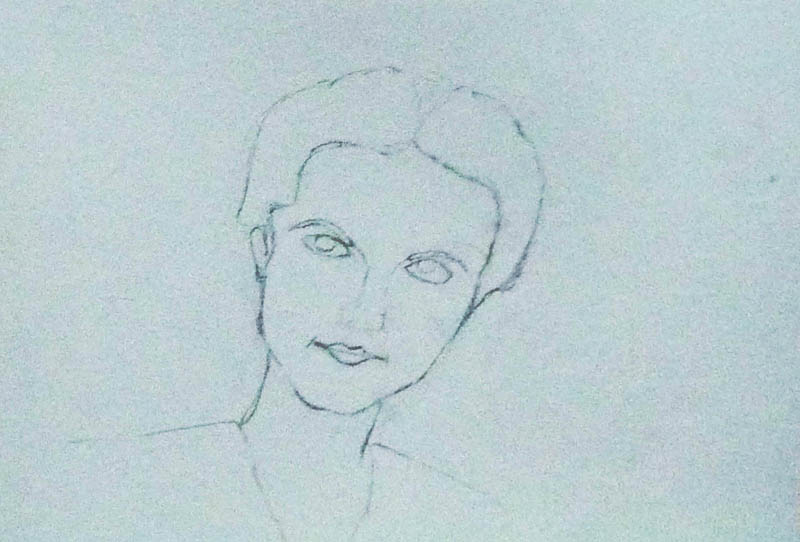
Tony is back! We're glad to welcome him and eager to see what he's been up to. Turns out it's been a lot. He's been working on portraits, like the one(s) of his mother as an adolescent.

Same subject, but a bit more stylized.

... and the beginning of another attempt. Notice that he uses gray watercolor to sketch, not graphite.
While he was in Greece, he did some drawings of friends. We are blown away by his skill... and the way he draws the viewer's eye to the important part of the portrait....

... leaving the peripheral areas fade away deliberately.

And he painted! We envy his views and admire his color choices as he documents a summer in Greece.

Love the Mediterranean blue sky and the detailed tile roofs.

... not to mention the soaring cypresses...

... especially when seen against a sunset.

Another small whitewashed church, surrounded by cypresses.

And we finish up with a sketch of a church dome. Again, this is watercolor, not graphite.

Book of the week. Sara resurrected an old tradition by bringing in this library book by Leslie Frontz. It's chock full of demos and tips. The art is both hers and that of many other artists. All of it looks great!

Art question of the day—What effect has watercolor had on your life? Pat resurrected another old tradition. She asked us about watercolor—what it means to us and how it's changed our lives. Alan bravely answered first and his response prompted a series of questions. As a result, we didn't get to anyone else, but rest assured, we'll go round the room on this one!
So.... Alan easily remembered the exact moment. He saw an exhibit of art by Walter Inglis Anderson and was immediately entranced. He loved the way Anderson saw the world and began seeing things differently himself. While his style is not that of Anderson, he's been inspired to study watercolor and look at the color and energy around him. Prior to seeing the exhibit, though, Alan was no stranger to the arts. He's already an accomplished stained glass artist and has done theater as well. It's interesting to note that stained glass and watercolor share a dependence on light and transparency. He took up watercolor as he loves to travel and envied the portability of a watercolor kit (much easier to travel with than glasses, grinders and soldering irons!).
We're so glad Alan saw that exhibit!