The Chicago Cubs—2016 World Series Champions.
And now back to the real world as we take one final look at summer—Alan's granddaughter having fun helping to wash the car. We love her expression and the texture on the trees. Of course, it's Yupo!

What follows are two paintings of barns, but with different substrates. What a difference in the outcome. Here is aquaboard, yielding rich colors and the look and feel of watercolor paper.

The same barn (at a different angle) looks rather different on canvas. The canvas soaks up the paint, making for softer and more muted colors. The paint lifts easily, producing intricate details.

Alan goes back to Yupo for this abstract. You really need to zoom in to see all the rich texture. We love the colors, the texture and the linear rhythm.

Did you see trees and a forest in Alan's abstract painting? Maybe. Or maybe it's just the fact that it is autumn and everyone is enamored of the beautifully colorful trees. No wonder Susan stopped to sketch these trees on Ashland Avenue in Chicago...

...and to paint them. These are two differently colored trees and Susan considers them "sisters."

It's a different case with these trees (on Foster Avenue in Chicago.... in case you're checking). Susan thought they looked like twins, intertwined and looking like one. We love these trees and feel the backgrounds play a major role in how crisp and sparkly they are.

Is is any surprise that Sara is painting trees, too? She's finished the row of trees below, adding rich colors in Klimt-ian style. We are especially fond of the way the colors vibrate against each other.

But Sara found the process tedious and tried the same color palette in a wet-in-wet treescape below. Especially interesting is the contrast of the tissue-paper thin foliage with the solid building to the right.

Erika is also painting foliage, but her leaves are detached, colorful and highly detailed.

Did you notice all the paper experimentation going on this week? Look at Greeta's sketchbook as she paints a pot of plants three different ways. Bottom right is painted as usual. Bottom right, she paints directly, without drawing first. And she uses a big brush. Top left, she's using a new technique. She's added ink to her watercolor washes.

She liked the feel of that so well, she's done a bouquet in the same freehand, ink-and-wash style. We like the subtle handling of the ink in this and can't wait to see Greeta do more.

Back to standard watercolor paper, Greeta continues work on her St. Louis sunset. The colors aren't perfectly accurate here, but be assured that they are magnificent. Oranges and purples are among the hardest colors to use without getting garish and Greeta's done it here. We especially like the reflections.

Ken is hard at work on one of the last of the Corn series. The kernels are radiant and dimensional, but the leaves hold their own. We'll be sad to see the end of this series.

Did you know Chicago's Marina City towers have been likened to corn cobs? It's true! And that's our transition from Ken's corn to Bill's Irish architecture (below). Okay, sorry, that may be stretching things a bit. Still, we like the bustling feel of the cityscape and debated whether the buildings are the star or the people. Some of us even voted for the cars. Regardless, everything is interesting to look at!

Bill's finished his Jacob's Ladder painting and plans to use it as a study for future attempts. Here's another one where you have to trust us that the color palette is subtly beautiful as the photo doesn't do it justice. Notice the composition, the handling of the sleeping figure and the silvery moon.

This is also in Ireland. What diverse scenery! Here, we are in love with Madeleine's composition. The sharply painted boats against the cold gray sky.... all perfectly balanced by the green spit of land. Absolutely brilliant!

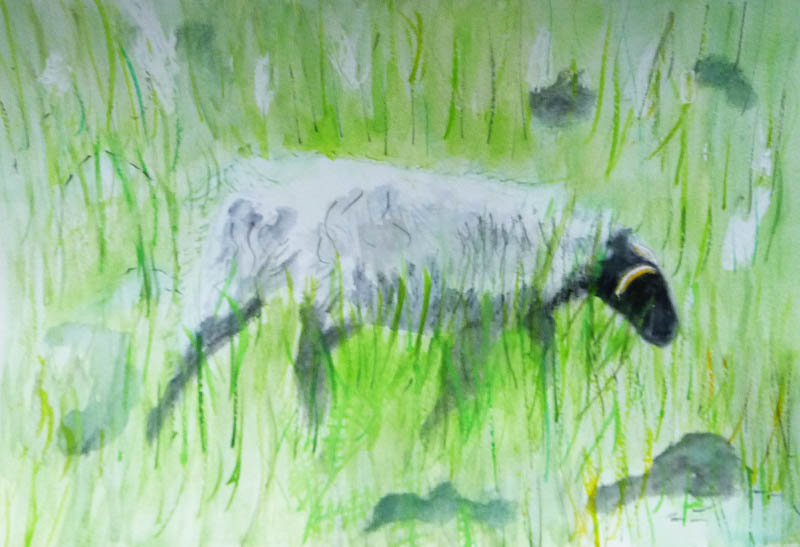
And if it's Ireland, you have to think green! Madeleine's Irish sheep is surrounded by a field of green grass. Can you see the sheep moving? And the grass too!
Back to the experimentation. As you may recall, Elaine was trying out new honey-based paints last week. Unfortunately, she forgot to bring the paints, so she couldn't finish her painting. Instead, she's trying a new triad of colors on Masa paper. This is raw sienna, burnt sienna and Paynes gray. For all the earthiness and low contrast of the colors, this Buddha (from Chicago's Art Institute) has a lot of color and value.

Michael is our newest student and is also experimenting with paper. Here, he uses tan tinted drawing paper as a background for his calligraphic apple....

... and these blades of grass. Zoom in to see all the color in each blade. Beautiful!

See you next week here in Chicago, home of the World Champion Chicago Cubs (we had to say it!)
No comments:
Post a Comment