I took some advice from Pat and Sara and did a wash of green over the whimsical and white scribbles and finished the green cottage. 12 X 14 on 140# coldpress
Then I upgraded my sketchbook entry looking out my front door. I added a lot of value to the fall colors to make it more vibrant. 5 X 5 on hot press
 |
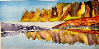
I tried a screen print from my computer. I had a lot of trouble with the softer reverse images of the reflections. Although it fell far short of my initial plan, I learned some things and it was a lot better at the end of class than it was at the beginning. This is 6 X 12 on 140# coldpress. After posting this I see things I can still fix if I want.
I planned on doing the above on Yupo but I forgot to bring it. So I decided to do a little sketch of our Ed Wood Japanese Maple. I practiced painting maple leaves without much success and tried painting a direct watercolor and ended up with a mess. But the colors were good. If this was a normal painting I’d just throw it away and use the paper as a sacrifice sheet, but it’s in my accordion sketchbook so I have to keep it. I think I figured out a way to save it. Tune in next week to see if I can. It will probably involve some kind of contour drawing.


These are all excellent. Good choice to subdue those white squiggles a bit. Also, I think adding saturation to the colors in your front yard made it feel very crisp and autumnal (That blue car is still my favorite!), while the very desaturated colors in the treescape give it a very cool, almost melancholy mood. I like the reflections on paper, but would love to see them on Yupo, too. And I think you've got a good base layer on the maple leaves. When you go in the second time and add values and details, you always save it! Carry on!
ReplyDeleteNice front yard and street but I think that front bush needs more substance, maybe more branches or different shades of color.
ReplyDeleteI like Momma tree and her five grown sons with their linearity against the minimalist clouds. Those rocks though I think they interrupt the clean horizon without adding anything.
I like the upper range of hills but then their reflections are just a blur of them and I can't quite make out those outcroppings, is on in front of the other or do they both meet? Needs yupo because then the viewer will be gobsmacked by the beauty and won't think of nagging details.
All the tree paintings have a lovely homey feel about them. They’re all different, but convey each place so well. I guess I’m saying they’re very well observed….i really like the reflection painting. The cliffs are so monumental and the reflection looks like a reflection. I like that shore of black, but the red shape is too overpowering, it needs to be toned down. This painting seems to work abstractly and realistically at the same time — no easy feat…
ReplyDeleteDownplaying some of the white scribbles in the first painting made a difference. The more colorful front yard sketch looks good. The yellow bush/tree bothers me though. Some how it looks transparent like you can see the iron fence through it, but it still completely covers up the bright blue car behind it as well as the street, yards, etc. The trees against the lake/sky are cool and moody. Those stones are so sharply squared up they almost look like coffins. The mountainscape is really interesting and changed so much for the better during class. What are you thinking of fixing in it? It's amazing how you remedied the fall leaves sketch later on.
ReplyDelete