Saturday, July 12, 2014

June 28, 2014

No video today, but plenty of wonderful watercolors. And thanks to guest photographer Vivian, we can get started. What better way to celebrate a long-awaited summer than with flowers. Here, Abla uses complementary colors to fine effect, showcasing delicate pink blooms.


And then, she continues her exploration of complementary colors in this richly patterned fall scene. 


Mohammed also is interested in water, filling his painting with wildly colorful tropical fish.


Meanwhile, Susan also paints water, but she has people, not fish, frolicking in the waves.


And Sara uses soft, but vibrant color to set a mood.


Hector masterfully uses carefully chosen colors in abstract, flat expanses.


Maybe he's so eager to move to color because he just finished the infamous "egg" assignment. One of the harder ones, but he's done a lovely job of it.


Ken continues his colorful architectural tour of downtown Chicago ...


... while Vivian gives the scene an Escher-esque twist.


Marva brings us out of the urban landscape to a softer, gentler field of colorful flowers. So beautiful, aren't they?


Mark and John couldn't resist the ultimate challenge—people. Mark uses watercolor, 


 ... while John's color pencil drawing includes people both real and imagined.


Meet the Artist. Did you think we forgot? Two weeks ago, we promised a retrospective of Marva's art. While we're a little late, we're sure you'll agree it's worth the wait. Just look at her lovely landscape above and you'll be as interested as we were in seeing her path to being the consummate landscape artist she is. Look just before (or after) this post to learn more about her!

Saturday, June 21, 2014

June 21, 2014


It's finally arrived! Summer is officially here today....the season we've dreamed of and yearned for all through the cold, dark winter. And while the pessimists among us might note that it's all downhill from here... the days are growing shorter from here on in... the rest of us are determined to savor every moment. And, as you'll see below, we do that with paint.

We have a definite theme going today. We're all painting in the warm, golden-green shades of summer. Influenced by the lush foliage around us, we reach for yellows, greens and blues today, starting with our guest artist, Debbie. That's right, while John wasn't with us today, Debbie stepped in to represent the colored pencil contingent. Here, she's beginning a mandala that features a volunteer poppy from her garden.


Also no stranger to colored pen, Sara uses our theme colors to continue her study of these sun-drenched bottles. The soft organic shapes add to the feel of a lazy summer day.


Even Mark is in the floral mood. In one of his signature visual mashups, he surrounds a high fashion model with a field of daisies in a Matisse-like painting.


Marva's dreamlike landscape stretches back almost infinitely as she uses bands of colors to move us through a field of poppies and a waving sea of grass... all the way to distant blue mountains under vast open skies.


Elaine's also into the greens, golds and blues of summer, but she adds people to the summer scene. 


Susan's added people too. She's revisiting her 15th century church from a few weeks ago, and a few small additions have added so much. The small people add to the scale and grandeur of the church, as do the trees. The line of flowers grounds it and the addition of shadows and the hint of texture fully define this incredible architectural feat.


No less impressive is Ken's architectural rendering of the view from his window. Even with a traditional subject like this, the use of color really makes us take notice.


Vivian's witty cityscape relies on a ground of yellow to unify the many buildings into one cohesive landscape... no matter which way you look at it!


Although Hector thought he was the only one of us not using the colors of the day, we have to disagree. This golden ripe banana has the same feel of summer... without a single touch of green. This is one of our favorite exercises—the giant fruit—and Hector's nailed it!


Answer to last week's challenge. As you recall, we promised extra credit for anyone who could name the blue paints in the windows on the different floors of Ken's paintings. Here are the answers. How did you do?


Starting from the top floor, Prussian, Ultramarine,
Cobalt, Turquoise and Cerulean Blue.


Artist of the Day. We had two drawing books on our library table today, both compilations of twentieth century drawing. It's amazing the variety of style and feel different artists can get using the same tools.

Meet the Artist. Are you as enamored of nature as we are (especially this year)? Then you're in for a real treat this week. Drop by within the next few days for a retrospective featuring Marva, our most skilled landscape artist. See you then!

Monday, June 16, 2014

Meet John!


Yes, it's time for another installment in our "Meet the Artist" series. This time, we're proud to introduce John. Blog followers are familiar with his distinctive style and eager to learn more about his inspirations and working methods. We're ready to oblige, so let's get started.

For starters, you'll notice that we don't have a self-portrait of John (or even a portrait). We briefly toyed with the idea of substituting one of Ken or even Santa (after all, don't all hat-wearing men with beards look alike?), but that seemed like cheating, so we went with one of John's drawings instead. Yes, you read that right. John prefers drawing to painting. He has his reasons, starting with the fact that John's been drawing since he was a young boy. This explains the speed and skill with which he produces the drawings that follow. Each intricate drawing typically takes him only a week or so.

Here we are looking at the contents of a book he put together. (More about this later)


Basically, there are three things you need to know about John.
  1. He loves fairy tales (particularly fairy tales from the French Alps)
  2. He loves to draw (and he's very good at it!)
  3. He loves his daughter (he's put together several books dedicated to her and/or commemorating vacations they've shared ... in the French Alps, naturally)
Beyond that, his work really speaks for itself. Let's let the viewing begin!

Everyone is probably familiar with his recent illustration of the "Landlord" story. We've seen the story progress through his drawings. In this case, each drawing slowly furthered the tale—like cells in an animated film. Here are a few of them from the very end of the story:


Impressive, right? We're amazed by his persistence as he immerses himself in the same story for months at a time. Each drawing is interesting, both as part of the series, and as a stand-alone piece.

But John's also accomplished at another style of illustration. Here we see some of the contents of a book he put together for his daughter commemorating her college graduation, as well as the anniversary of their trip to the French Alps. The book is a collection of fairy tales from the region and each page illustrates an entire story. Rather than using many drawings, here he distills the essence of a well-known folk tale into one picture.


Take a few moments to study the drawings. They are beautifully composed, with something interesting happening on every part of the picture plane. Here are a few, up close and personal.


And no, your eyes aren't deceiving you. Those are French captions. Yes, John speaks French fluently, having spent time teaching science at a French school.

While John has worked in watercolor (and you'll see some below), he likes the control and detail he can achieve with colored pencils. Not to mention that once he's chosen a medium, he needs to maintain consistency throughout the entire book.

Here are some pages from another bound book. This one is also from a trip to the French Alps with his daughter. This also illustrates some of their favorite fairy tales and tall tales.


Amazing souvenirs, aren't they? Certainly a step above a handful of postcards. Definitely a trip neither of them will ever forget.

So how do we sum up John through his art?
  • First and foremost, John is almost obsessive as he follows his passion. When he's interested in something, he researches and dives into it—to the point where he's a global authority on the subject. 
  • John is a a master at composition and possessed of a vivid visual imagination. All of his drawings are from his imagination. He does his research, but does not draw from a reference photo. Also, he tends to fill every inch of his paper thoughtfully and deliberately. Nothing is purposeless; every stroke furthers the story.
  • As we mentioned before, John loves fairy tales, drawing and his daughter (not in that order, of course). He's also intrigued by the devil and the strange creatures that inhabit these tales.
  • John is a storyteller at heart. In his case, though, he uses colored pencils rather than a pen or typewriter. 
Isn't it amazing? We all use color and paper, but we are each unique in what we paint and how. It's intriguing to see our individual histories, too, and how we grow and develop as an artist.

Join us next week to meet yet another artist—oh, yes, there are more to come!

Saturday, June 14, 2014

June 14, 2014


Another perfect day! Seems like we're reaping the rewards for suffering through last winter. Either that or it's in honor of Fathers Day.... or Kris' birthday.... or BluesFest ... or any of the many celebrations going on this weekend. Whatever you're celebrating—cheers!

Mark starts us off with a salute to our fathers, along with an admonition to relax (shouldn't be hard on a weekend like this one!).


While construction on the Kennedy makes it hard to get downtown to visit attractions like the Shedd Aquarium, we've got you covered! No need to look any further than Mohammed's painting, rapidly filling with wonderfully colorful and exotic tropical fish.


More in the mood for sculpture? Why not enjoy Elaine's warm golden stone head painting below and save the trip to the Art Institute for another day—one when the construction is over and the weather isn't as perfect.

 
As for the rest of us, we seem to be all about the explosion of green growing things. Hector chose two different kinds of foliage for his wet/dry/medium series of paintings instead of the usual fruit or vegetable. Notice the life models at the bottom.


And did you see the lovely spring green of the leaf above? The color of new shoots and spring seems to be our theme color of the day. Here Abla fine tunes her flowers and, unable to resist the color of the day, begins a beautiful green landscape.


Sara, too, prominently features the color of the day in her still life. Can't you just feel the sun filtering through the new leaves of the trees shading this scene? This year, everything seems to glow with the reflected warmth of that distinctive clear green, doesn't it?


Even the architecture is seen through the same golden green haze. Both Vivian's Escher-esque commentary....


... and Ken's original urban landscape. You can also see two other paintings in various stages of progress; one looking like a soft pastel Easter egg view of the city and the other with just the framework. We'll be looking for more in this series. And, for extra credit, see if you can name the blues in the windows on different floors in the second painting. One will probably surprise you (answer next week).


And speaking of series, Susan continues her tale of architecture and the effect of the typhoon on the Philippines. Here we see the devastation of the morning after. The trees and buildings have all been damaged, but the church survives intact.


Even John's icy Alpine scene can't help but include trees with new spring growth.


And we have good news for you if you like John's illustrations and want to see more. He's our featured artist in our "Meet the Artist" series. Come back tomorrow (or Monday) to see more of his work and learn about John's path to being John. Learn what influences him, how he developed his style and why he chooses to paint what he does. You'll be enthralled, so don't forget to come back.

Artist of the week. Our popular library table was more popular than ever today, brimming with a fine selection of works. The selection was so fine, in fact, that it spawned a flurry of borrowing, with some books being reserved weeks in advance. Making a successful return was the book about watercolor in America, showing paintings from early days until now (although not right-this-minute now—none of us are included! LOL). There are works by Homer, Hopper, O'Keefe, Wyeth and more.... all the way to Chuck Close. A really inspirational book. 
 
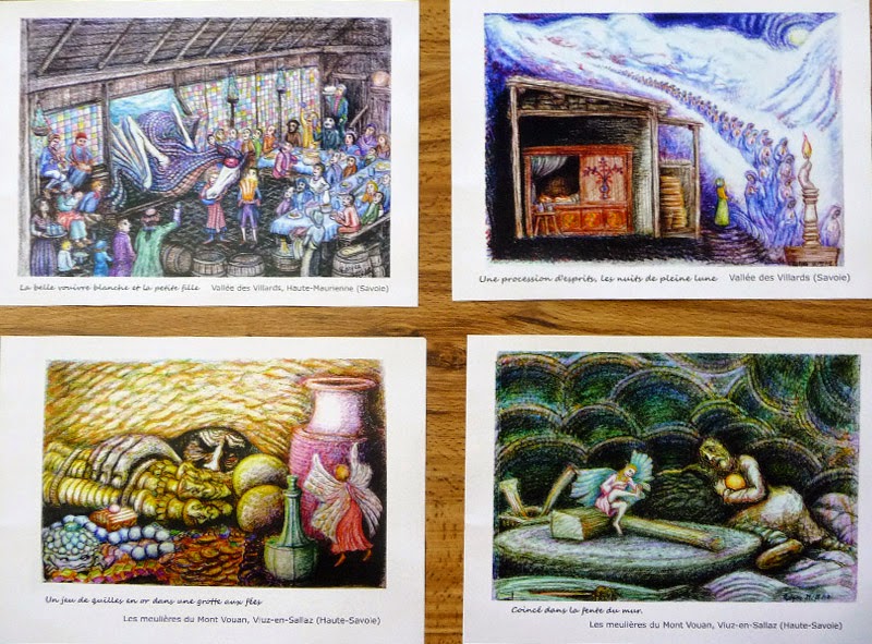
We also loved the compilation of 20th century drawings. Some of the same artists made it into both books. In fact, the drawing book contained a black & white version of the same painting shown in color in the watercolor book. Intriguing! Rounding out the selection was a book on Sufi art and several books on people from the French Alps, their costumes and culture. One was especially fine (see below), with quality plates and vellum separator pages. Of course, they were John's! No wonder he can render the details of his illustrations so authentically with these references! 


DePaul Community Chorus Concert tomorrow! Mark your calendar for June 15. The DePaul Community Chorus (featuring our very own Steve) will be presenting a concert at the DePaul concert hall at 800 W. Belden., featuring favorite selections from operas and operettas. It's fun and it's FREE—what better way to spend an afternoon?  Click here for more information. See you there!


Happy Father's Day! And remember, come back soon to learn more about John when we "Meet the Artist!"