Saturday, June 15, 2013
June 15, 2013
It's a grey and rainy day here in Chicago, but we didn't let that put a damper on our spirits. Not at all! We painted our own sunshine—sunny Portuguese islands and Rothko-esque fields of color, warm and sunny memories of people, times (and lunches) gone by. Even our beginners got into the act with bright happy plaids and color wheels.
One thing to note as you scroll through our paintings (except for David, who forgot to stop for a photograph)—all the colors in the beginners' color wheels are made by combining just three colors. Impressive, isn't it? It's not like they just squeezed those colors out of tubes ready-made. This takes skill and it's much more difficult than it looks!
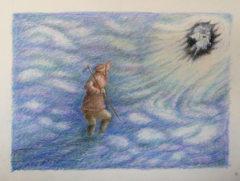
Last week, we promised you an update on John's colored pencil works. We won't disappoint. You'll see part of a series of drawings below illustrating part of a story. There will be about 50 when he's finished, but these will take you into a wonderful world of folk tales, elves, and swirling clouds. Don't you wish this was a flip book?
See you next week!
Saturday, June 8, 2013
June 8, 2013
We're back! And it looks like summer is going to be a great session. True, some of us are taking summer vacations, but we have some great returnees and a promising group of newbies—including a third Elaine (and you know you just can't have too many Elaines!)
Turnout may have been a bit sparse today (vacation season and all), but what we saw was marvelous. Marva is back and she's been painting up a storm. As has Ken—he's only been away two weeks but he's channeling his inner Rothko. As for the rest of us, we're all "people persons," including John, who's back and working in colored pencil. Join us next week to see what he's been up to since last we saw him. Meanwhile, let's get started.
What's with the round painting, you ask? That's just another in our series of experiments. This time, it's Elaine O. trying canvas and watercolor ground. She bought a small 5" stretched canvas round and coated it with watercolor ground. This is a product from Daniel Smith that claims to turn any surface into watercolor paper—wood, canvas, paper, even metal.
What's our take? Interesting...and worth further exploration. The ground accepts paint like clayboard or hot press paper. The surface can be scrubbed back to nearly white, allowing for re-dos. It stays wet and blends easily; however, dried paint tends to lift with new applications of paint, making it challenging for painters who glaze with multiple layers. In the end, the jury is still out. Watercolor ground is very promising, but calls for more testing on different surfaces.
Ken will also be trying something new in the weeks to come, "irridescent" medium, so watch this space as we continue to explore paints, mediums, paper, brushes and much, much more.
See you next week.
Saturday, May 18, 2013
May 18, 2013
School's out for summer! Well, actually only until June 8, when we'll be back for the ever-so-popular summer session. Except of course, for those of us going on exciting vacations (like Ellen) or engulfed in busy season at work (like Steve).
But we know why you're really here today. It's to see some "bad art." As you recall, we were all supposed to consciously paint a bad painting. Most of us chose to do portraits, figuring that would be easy to mess up. Some of us (Greeta, Mark, Tony and Alan) got a head start by using bad paper—or even the cardboard from the back of the pad. We tried all kinds of tricks—Elaine T painted with her left hand, Sara worked quickly and without enough paint, Ken used clashing colors and Elaine O tried a plethora of new tools and materials.
Still, as you might have guessed, we all failed! None of the "bad art" was truly bad enough. Everyone liked some or all of each of the paintings. For many of us, it was freeing to not be invested in the outcome and we got some very good results. And we all learned a valuable lesson—it's not easy to deliberately make bad art! You'll see what we mean below as we begin with what some of our artists think is the "bad" stuff (don't worry, we'll alert you when we move to good art). And we start with three life paintings of our own teacher wearing an actual work of art—a Koos dress!
And now we move on to the good stuff. (We felt compelled to tell you since the ones above aren't bad at all, are they?) But here's where we really tried. We begin with a good cat (in every sense of the word). We see Ken entering a new phase—watch for the Rothko series!—and continue through vodka, vacations and vegetation before moving on to lots of wonderful people and finishing with an unfinished sketch by Mark.
One final lesson can be learned from Susan's definition of a bad painting: It may look okay, but if it doesn't capture the artist's vision or feeling, it's a bad painting.
See you on June 8. Meanwhile, happy painting!
Subscribe to:
Posts (Atom)