
How much did you like Greeta's A Day with Manet series? We got the following image from Elle, who is also a fan of the series. It brought to mind this painting Elle did of a lecture at the Art Institute, featuring Greeta. She's the one avidly listening at the right. Must be something about the site that inspires such beautiful watercolors.

Here's another Chicago site... an alley on the northside. We apologize to Ken for posting his study upside down last week, and assure you that this one is correctly oriented. We love the textures of the bricks, foliage and sky and are looking forward to seeing the lacework of the wires go in.

Greeta's hard at work on another gritty Chicago site... the El, passing through a sunlit canyon in downtown Chicago. She's carefully masking and adjusting values to get the effect of the shaft of sunlight behind the train. Come back and see how this comes out!

And Greeta is not ignoring her sketchbook. Here's the latest spread, featuring gesture sketches of a golfer (that's Alan!) and a woman (Nancy Pelosi) rocking stiletto heels. This is a valuable resource for getting postures and balance right.

Having finished a series on People I Don't Know, Elaine O. is ready to move on to this portrait of a little girl she does know. This is only a half finished study, but already we can see the confidence gained by painting a lot of portraits. You'll probably see this one again, as Elaine hopes to paint the final on a better paper.

Elaine T. has also (at long last!) begun a portrait of a very important person she knows.... her grandson. She only has a little work to do on the background, but this perfectly captures the personality of her sitter. He's adorable!

From there, Elaine T. begins another portrait. This is of her son, holding her grandson, against the background of a lake and sky. This is going to be worth returning to see... so come back!

Speaking of grandchildren, Sara finished her portrait of her granddaughter. Despite all the beautifully distracting colors, the composition unerringly draws us to the focal point... the girl's face, with all the light, shadows and color bounce that make it irresistible.

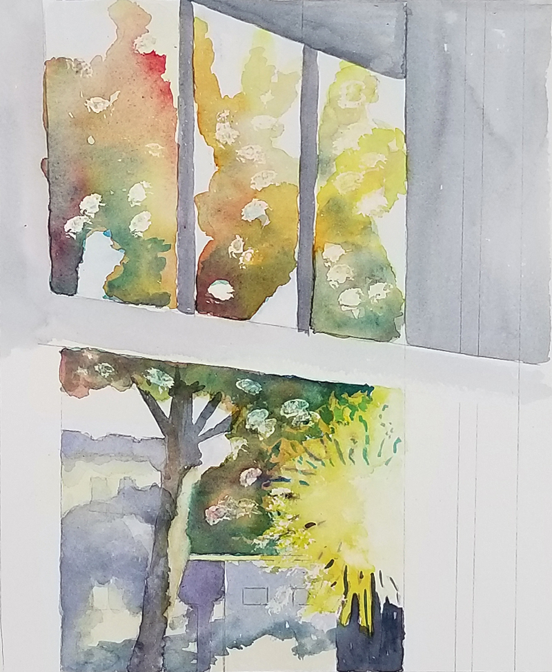
Sara also began another version of her view from her window. She's basically using two triads (a triad is a set of three colors, and she's using two reds, two yellows and two blues) to describe all the colorful autumnal glory of the trees outside her window. We really like the composition—the angles add energy and draw the viewer's eye to the colors outside.
Susan is still enthralled by fall foliage, too. Here, she's gathered fallen leaves and berry sprigs but added a vase for a more formal still life.

Alan added highlights to the fruit bowl from last week....

...before beginning another version on Yupo, a plastic paper. The colors float on the surface, adding a lush graphic quality.

Like Yupo, the gessoed canvas Alan used for this portrait has the advantage of being able to have paint lifted back to white. Alan wasn't satisfied with the face, so he wiped it away completely, re-gessoed and painted the head again. This is something that usually isn't possible in watercolor.

And what does one do while waiting for paint to dry on Yupo? Why, paint another painting, of course. Alan returned to his New Orleans street scene and it's getting better every week.

Our newbies are incredibly productive—and talented. They are racing through the exercises at different rates... and managing to do extra credit painting at the same time. Veronica finished her advanced color wheel...

... explored complementary colors and their blends....

... and still had time for this cute little bluebird. He's puffed up for winter and we're impressed by Veronica's use of complementary colors, color gradation skills and the brushwork on the twigs.

Paula also worked on complementary colors, matched some tricky colors (her skin and the famed paper towel)....

... and wowed us with this moody nocturne. The skillfully painted texture reminds us of the northern lights (but more serene).

Anna also did the complementary color explorations and matched her skin and paper towel colors. Oddly, the old master members don't recall getting the colors as quickly as this. These guys are good!

Remember the collages from week one? This exercise calls for the artist to match the colors from the collage. Lucky for Anna, she has a minimal, refined palette and easily matched the swatches (at top right). That's a lovely palette, isn't it?

And yes, Anna did some extra credit, too. We applaud her minimal touch as she paints her brothers (on the same hockey team) using only black, white and blue. The vignetted background and thoughtful composition really make this painting.

Sarah (with an "h," as opposed to Sara without an "h") used large, single puddles of paint to blend complementary colors. Fascinating to see the variety of colors she can produce as the paints merge and mingle.

And yes, these are Sarah's skin and paper towel matching exercises.

Extra credit? Sarah did this richly textured landscape. Her intent was to highlight the horizon and the horizontal features. We think she's succeeded!

Anand's complementary colors are subtle and delicate. We love how he's used a line of paint and water to blend the complements into many useful neutrals.

Anand holds the distinction of doing the first 3D collage (on the left side). On the right, he's beginning to color match. Who would have guessed these fiery, warm colors came from the same brush as the subtle colors above?

And, of course, Anand did some extra credit work, laying in a gradated background for another painting. Gradation is a sophisticated technique; yet several of our new students are already proficient. Wow!

Habti missed a week, but he's catching up with a vengeance. Here's his beginner plaid. Notice that his watercolors seem more opaque than typical. So, he experimented with watering them down to achieve transparency.

Speaking of extra-curricular, Habti brought in some samples of artwork he's done in other media, like oil pastel....

... more oil pastel...

... oil pastel with scratching...


... and even watercolor with oil pastel.

Donna did these exquisite color studies, color matching and exploring complements. We love her use of flowers and patterned dots to contain the exuberance.

Donna's extra credit work is this lovely page of flowers. Look at the skilled brushwork on these! She's adept at using single strokes to get color variations, depth and more. Amazing, right? How does she do it?

Because Donna is a professional pastry chef! She bakes and decorates lovely pastries like the cake above and the special minicake she brought for her teacher (below). We can assure you that this tastes as good as it looks, too.

Here's Donna with the spread she brought for us. We're glad we took this picture early, since the cake didn't last long at all. We can all attest to how wonderfully delicious this cake was. Just ask us—or, better yet, go to Donna's website (Habibi's Pastries) and see for yourself. You won't be disappointed!

No comments:
Post a Comment