
Tony also made some quantum stylistic leaps in the process of painting a flower. He's deepened his colors and added layers and texturing. What helped? Sketching! Tony is a great believer in sketching and is currently taking a class at the Art Institute. He's used some of his sketching style in this painting and it works!

Here's Tony's sketch. He's used felt tip markers to achieve the bold lines and deep values.

Ken added a background to his tomato flower and, again, we have a major breakthrough. This looks even more incredible in real life. We can't decide if it looks like a stained glass window, nerve ganglia or fractals. All we know is the highly complex background doesn't take away from the equally complex flowers. They both look great. And notice how much white paper Ken left?

Zoom in to see Ken's next painting. This is the beginning of an overhead view of tomato plants. The patterning is very small and complex, and we're sure we are going to love this.

Elaine is making progress on her floral painting, too. Like Ken, it's an overhead view and predominantly red and green. But these are New Guinea impatiens and not tomatoes. Gotta love those complementary colors!

We told you we are into flowers! Isa continues the trend with yellow roses (our new favorite). Look at the lovely neutrals she's achieved with turquoise and burnt sienna near the bottom. Isa is a master of color mixing by glazing, as you can see. Come back to see how this progresses.

Isa painted her Colorado home, decorated for the holidays. Despite the cheery yellow color, it feels like it would make a lovely Christmas card, doesn't it? Especially the candy cane pillars!

Madeleine is painting more of our favorite subjects.... vacation memories featuring architecture. In this scene from Turkey, we love the way she handles bricks and stone and the depth she's conveyed by the composition.

Bill is also painting vacation architecture. He's using line and wash here to great effect. The sketchy style of the lines and the loose washes make this the very essence of travel illustration. And don't you love the composition with the group of onlookers with their umbrella?

Bill had a little time to spare after dashing off the illustration above, so he went back to painting plants. We may have influenced him a bit—after all, he made this the year of the botanical and he didn't paint any?! He's using complementary colors here, with touches of red outlining the leaves and highlighting the veins.

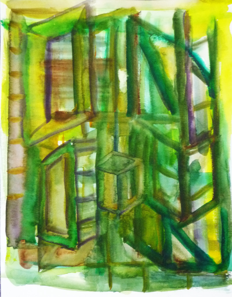
And if that weren't enough, Bill still had time to spare and used the leftover paint on his palette to paint this geometric abstract. We thought it looked like a stage set.
Yi finished her portrait from last week and we are most impressed! The hair is beautiful and the shadows around the features are elegant and subtle. We think this looks like a Byzantine icon.

Having done a lovely portrait, Yi is trying a floral. Like Isa, she's chosen yellow roses. So far, she's drawn her subjects and begun to add color. Even with a light color like yellow, she's handling the values perfectly. Is there nothing these newly advanced old masters can't do?

Even the brand new newbies are impressing us. Lilith finished this soft and watery color wheel....

... before moving on to an extra-curricular painting of a pineapple. Yes, Lilith is on the botanical bandwagon, too.

Basan finished an advanced color wheel, with hues, tints, and shades...

... and then began this still life, another of our favorite themes. You can see she's had prior experience!

Sarah also finished a delicate, watercolory color wheel....

... and moved on to an ambitious cityscape. Look at the composition and the perspective and the gentle rolling clouds. Sarah can really draw!

Which brings us to Sara, a prime example of the value of drawing—and the inspiration provided by a sweet new grandchild. We begin with a study of baby Nora with her uncle.

And we move to another study of the same subject. Sara has perfectly drawn focus to the important bits—the connection between the two as embodied by his loving gaze as he cradles the new baby.

Sara then began painting another family member (the prop baby is the same!). This time, though, it's the baby's father holding her. Sara's perfectly captured the casual, familiar relationship between the two. And look closely at Nora's sweet baby cheeks as she sleeps draped across Daddy's arm.

How does Sara manage these exquisite Mary Cassatt-like paintings, you ask? She sketches! We're sharing some of the wonderful pages from Sara's sketchpad. She uses various media to capture the same subjects again and again in different poses. We begin with several views of the inspiration baby herself. It's obvious that Sara's really observed her subject to be able to draw her so well.

And then, Sara moves on to sketching the new baby meeting her uncle. First in pencil....

... then in ballpoint....

... felt tip....

... and even charcoal...

...before exploring the subject's shapes with color blocking.

And then, Sara begins sketching her latest subject. Can anyone doubt the value of sketching?

Save the date
We'll be having a group show at the Ten Cat starting in mid- to late-February. We'll each have two paintings in the show. It's varied and casual (no theme!) and we'll be having our usual fun opening. It's the perfect time to meet and greet us, see some good art and anticipate spring. Mark your calendar now!Reminder to participants:
- For everyone—choose your art (up to 2 pieces) and be prepared to furnish your name, along with the title, dimensions and price of your art in advance so we can print placards.
- For our newly advanced old masters (or anyone interested in a brief memory refresh about matting watercolors)—feel free to Google "matting a watercolor painting." If you have more questions, we'll review in our next class.
No comments:
Post a Comment