You can tell it's fall and back-to-school season. We have a full house and some of the fastest, most productive newbies we have seen. Not to mention there is news of upcoming exhibitions. So let's get started right away. First off, we have to apologize to Marvelous Marva. She's back and painting a beautiful, peaceful beach scene. Unfortunately, we don't have a photo. Come back next week.
Meanwhile, in a similar peaceful, quiet vein, here is Steve's snow scene. We hope we aren't frightening anyone. There is still some time before we have to worry about facing this. But from where we are viewing this, it's beautiful, isn't it?

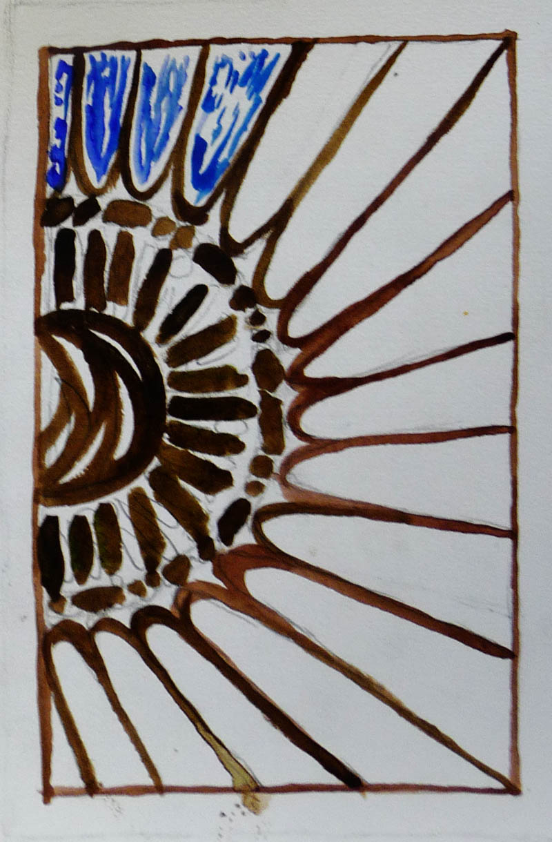
As for the rest of us, we are busy documenting our summers instead of looking forward to winter. Ken Ten continues working on his corn series. Here he finishes the quartile progression. We love how he's integrated his interest in mosaics into his watercolors.

More quartile cornstalks; here they are so abstracted they almost look like a bamboo forest.

In this beautifully delicate painting, Ken patterns the corn leaves with stripes and fills the background with a mosaic pattern that looks like a conservatory.

More stripes, more mosaic patterns, complementary colors. Who would have guessed corn stalks could be so interesting?

Closing in on the end of his series, Ken begins another striped leaf painting. The stripes really work to emphasize the undulating nature of the leaves.

If there's corn, can cows be far away? Greeta begins this sweet-faced cow against a hazy summer sky. We love the cowskin and can't wait for the face to appear.

Another quintessential summer scene by Greeta. Can't you feel the fun running through the sprinklers? We love the water, the concrete and especially the position of the boys as they dodge water droplets. Greeta's favorite part? The shoes! And we like them too.

In this portrait, Greeta was inspired by the shadow cast by the subject's hair on his shirt. Remember that shadow exercise? This is what it's for!

Turning our attention back to Ken's corn, we can't help but noticing how closely corn stalks resemble onion leaves. We love our produce, don't we? Here Alan begins a series inspired by an onion field. Can you believe the incredible detail he manages to get using Yupo? These onions are on a table.

These onions are hanging from the ceiling. We love the details and the complementary colors. And yes, that's Yupo!

Although he is truly a master of Yupo, Alan painted this portrait of his grandson on regular watercolor paper and proved he's equally adept using this ground. We love the fun expression!

To shake things up a bit, Alan switches to a landscape. We are in awe of the texture he is able to describe on Yupo. Zoom in and see what we mean.

Ellen continues to fine tune her gondolier. There is so much to see here. The complementary colors, the composition, the shadows. She's also officially the first to try the Winsor & Newton watercolor paint stick for the stripes on the shirt. She's used them to great effect and inspired others of us to try them soon.

Susan found an old sketchbook and repainted a view of the Yangtze River below. We are all about complementary colors today. Look at the sun against the purple mountain. Lovely!

And here is Susan's original Yangtze River painting from five years ago. It's smoother and less textured, but what's interesting is that both were painted from a line drawing in her sketchbook, not a photograph. So both are equally valid remembrances.

Bill is also documenting his vacation. Here's an Irish street that inspired a bit of debate about color saturation and balance, as well as how the success of a painting (in terms of accuracy) can ultimately only be decided by the person who was actually there.

Another sketch inspired by a shadow! Bill painted this Irish building because he loved the shadow it cast. He's calling this a sketch and we hope to see it again.

Madeleine is also documenting a vacation in Ireland. This intimate, texture-filled shrine is all that's left of a church dedicated to St. Bridget. We're eager to see this finished.

We do love to remember our vacations, don't we? Sara finished painting a cottage in Northern Wisconsin. This is small—the size of a postcard—but exquisite. She credits Pat with pointing out the mauve in the roof. We love the way Sara uses greens and purples throughout this little gem.

Another vacation painting, more complementary colors.... Elaine paid a visit to the Art Institute of Chicago (which just so happens to be the world's best museum) to see After the Fall. Before she entered, she happened to look up and see a pigeon sitting on the lap of one of the stone carvings. This is merely a sketch—she's not thrilled with the results of wet-on-wet on Masa paper.

And did we mention our newbies? They are speed demons! Each of them finished both of the first exercises... and managed to do some extra credit paintings to boot. Fast and good... they will be worth watching. We'll start with the exercises. Here's Elizabeth's color wheel (done with only three primaries)...

... and a color wheel/plaid spectrum as she explores hue, tine, tone and shade.

Erika uses waves on her plaids, giving an easy feeling.


And here's Erika's color wheel. Yes, those are only three colors!

Luciana added a twist to the color wheel. First, she used the tube colors for the secondaries. Then, she went back and mixed from the primaries. The mixed secondaries are actually much richer and more beautiful. And to the right, she's added water to full strength paint. This feels so very watercolor-y—and she's discovered blooms!

Here's Luciana's plaid. Notice how she's beginning to experiment with wet and dry?

Pia's plaid and color wheel are on one sheet. We love the richly saturated way she paints. Zoom in to see the way the colors move in the plaid.

Finally, Pia's exploration of hue/tint/tone/shade. Lovely, isn't it?

Following are Luciana's extra explorations. We love the wavey color tests...


... as well as these delicious, watery swatches.

These stripes look like a flag.

Luciana only used one color (well, turquoise with a touch of rose in the lower right) to describe these misty mountains.

Elizabeth did some watery explorations, too.

... as well as painting observed details from windows, doors and more.


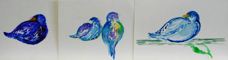
And as if that weren't enough, she moved on to animals and birds.

Upcoming events!
See who inspires us.
As you may recall, we planned to bring in paintings, books or screenshots of artists who inspire us. Many of us did, but we just didn't have time to discuss. So come back next next week and see who we admire. This should be very interesting!
You're invited to.....
Sulzer Library. If you are near the Sulzer Library on Wednesday, September 21, drop in to see a group show featuring Erika.
 Autumn Open Sketch date.
 It's an open sketching/photography session on Saturday, September 24 from 1:000–3:00pm at St. Gregory the Great Church and we are invited! Bring your cameras, sketch pads, pens and pencils. A docent will also be on hand to answer questions.
Where:
St. Gregory the Great Church
5545 N. Paulina
Church entrance is on the corner of Gregory and Paulina;
one block west of Ashland and one block south of Bryn Mawr
When:
Saturday, September 24
1:00–3:00pm
Group Art Exhibit at Ten Cat.
 As you know, October is Artists Month in Chicago and our very own Bill and Madeleine Settles are having an exhibition at Ten Cat. You can drop by most of October to see that art, but you are also cordially invited to the opening reception. Mark your calendar—this is a great site and we always have fun. Details below:
Madeleine Settles and William Settles
Recent Watercolor Paintings
Exhibition: October 3–29, 2016
Opening Reception:
Saturday, October 15, 2016, 4–7pm
Opening Reception:
Saturday, October 15, 2016, 4–7pm
3931 N. Ashland Avenue, Chicago
No comments:
Post a Comment