After a week off for the Fourth, we return with lot of news, a few "Save the Dates" and a whole lot of beautiful art. We'll start with the art; but you'll want to be sure to allow yourself enough time at the end to jot down some important upcoming dates.
Of course, we were inspired by the holiday celebrations and feeling patriotic. Here, Abla paints the fireworks over the city. This is worth a closer look, so zoom in to see the reflections on the water, the carefully rendered cityscape and the fireworks exploding across the animated sky.

We all seem obsessed with watching the skies. Bill revisited his cloudscape. Making the buildings more shadowed and muted has resulted in making the clouds even more active and lively. A lesson in how each part affects the whole.

But that's not all for Bill! He revisits his sunset on the beach. This time, he adjusted the size so it's smaller and more intimate. Exactly what he needed to draw us into the scene.

Here's more sea and sky, but this time, we're in the Netherlands. This structure is on the cold, gray North Sea and Bill manages to perfectly capture the atmosphere with his beautifully economic brushstrokes and color palette.

Madeleine's scenes are also from the Netherlands, but what a different vibe with this houseboat on a canal. We love the water and the homey touch the houseplants add!

No, that isn't snow in the foreground! It's unfinished, but it will be water. More sea and sky along a canal in the Netherlands. This time, Madeleine renders the scene in an exquisite pen and wash style that highlights the crisp, pristine beauty. Isn't it amazing how much we can tell about a place from the sea and sky?

Ken's study for his next painting in the Ten Cat series also has the clarity and precision of the landscape above, but there's no ink here. It's all watercolor as he explores the bar's mosaics and brickwork.

Isn't this one of Ken's best series ever? Here's the facade of the Ten Cat, featuring the sign and a view of the street in a wonderful perspective.

Ken's not the only one of us fascinated with perspective. Hector explores perspective in this Escher-like drawing. See the buildings, the reflections and the 3 point perspective. We can't wait until he adds color.

John combines two of our latest themes—extreme perspective and an active sky—in this pencil drawing of ancient Peru and the constellations visible from these mountains.

Isaac's bird-of-paradise places the sharp, almost architectural form of the flower against a soft, misty background. The subtle color gradations make the flower seem to glow.

If it's summer, we must be painting flowers, right? Absolutely! Susan has been buying models from a local garden center. And while she gives her plants a good home, she takes the opportunity to paint their portraits. Look at the careful details on the airy white blooms nestled beneath the sweeping gladiola plants....

Or the beautiful coral begonias contrasted with the blue-green leaves...

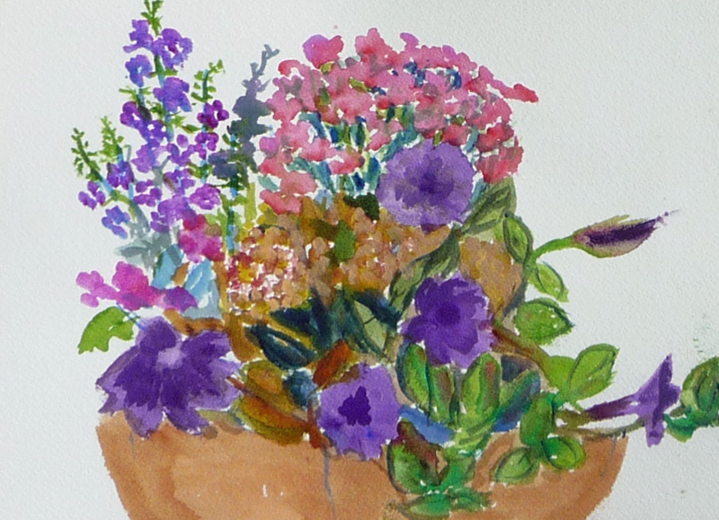
Or this study in purples, from intensely blue lobelia to velvety petuniuas....
Finishing up with an assortment of succulents. Is it any wonder that artists throughout history have been drawn to floral still lives?

Mohammed's managed to capture the very essence of winter with his pine tree and reindeer. And his style is perfect to convey the cold snowy atmosphere.

Look closely at the exercises below. Spring explores complementary colors in the rainbow arcs, then uses the knowledge she gained to paint the infamous paper towel on the sheet below. She goes on to get a perfectly neutral gray swatch, along with the famous "skin color match." Best of all is the extra-curricular fish. The warm color and expressive brushwork are just lovely.

Mark relies on brushwork to depict the sports equipment below. There are three objects, necessitating a second sheet of paper as he paints a boomerang, football and frisbee—things that fly through the air. (Pat actually tested the boomerang for Mark. Let's just say she needs some practice.)

Another one of our favorite exercises—the three way fruit. Lydia chose a lemon and painted it very wet, very dry and in combination. Her favorite? Drybrush, as it perfectly captures the texture of the fruit.

Sara continues with her self-portrait, skillfully using the wet/dry techniques and color skills discussed above. We love the warm colors she's chosen, the wonderful shadows and highlights around her hair, and are riveted by her gaze.

We can't say the same about Elaine's portrait...yet! We like the nostalgic, summery feel, but we are eagerly looking forward to seeing eyes on her subject.

And we end as we began... with a touch of patriotism. Glen's striking portrait is from a TV screen capture, but it's so much better than the inspiration image. He's carefully used value and color to create a depth of field that tells a story and focuses on the center of interest—the piercing eye.

Save the dates!
We have a couple of dates for you to save, so grab your calendars, phones or PAs. You won't want to miss either of these events.Sketch date. You may remember back in spring when two of our artists participated in an open sketching session in a beautiful neighborhood church, St. Gregory. We have some great news. They will be having another such session on Saturday, August 15 from 11:30–2:30pm (unless pre-empted by a funeral or other occasion). This is a great opportunity to sketch or photograph a truly magnificent architectural treasure. Keep watching this spot for more information and plan to join us. You'll truly enjoy yourself.
Art Exhibit. It's come to our attention that we haven't had an actual bricks-and-mortar art exhibition since 2010. Hard to believe it's been that long, but it must be true. Scroll back through the blog and you won't find any group shows before October of 2010. So we hope to remedy that situation. We have formed a committee and are looking to mount a show in October of this year.... just in time for Chicago Artists Month.
So what does this mean for you? If you want to see some fine art, mark your calendar and keep watching this space for details. If you are in our class, you have a week to think about (and do) a few things:
- Decide if you want to participate in the show. If you do, be prepared to let us know on Saturday and furnish your name (correctly spelled, of course) to the committee.
- Decide if you want to help in any way. Again, let the committee know. No matter what your skills, we'll find ways to utilize them!
- Think of names for our exhibit. The Chicago Artists Month theme for this, their 20th year, is The City as Studio. Seems perfect for what we do.... now we just need a catchy title for our show. Bring your ideas on Saturday or leave a comment here.
Enjoy your summer! And see you next week.
No comments:
Post a Comment