Sunday, March 16, 2025
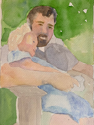
Pitchers and pictures of Quinn…
I added some dubious elements to the top one. I’m not sure it’s finished but I’m finished with it. The bottom one I’m just going to leave alone for a while.
Again, not sure Quinn with flowers is done.Her hands could use a little love. It’s an odd pose. Her head looks either too big or maybe she looks too old still. The bottom one is a redo of an early painting. Itsstillawork in progress….after looking at Elaine’s work I’m thinking that I need to go in with more paint and less water early on. This whole layering thing just always looks pale. Interesting that my non human paintings get plenty of color but my humans always seem about to fade away….
Subscribe to:
Post Comments (Atom)


I am really into your teapot series. They are all so lively, light-fille and active. I am also a big fan of your people. I like the soft dreaminess of the bottom painting. It gives it a quiet intimacy that loud, bold color would destroy. Ben's face is lovely, as is the drowsy weight of the child--it reminds me of Mary Cassatt's sleepy children. I think you intuitively "get" the saturation you need for each subject.
ReplyDeleteThe first one is crowded and a bit messy. I like the second with its well-ordered manner. The vessels look like ideal shapes that we can never glimpse from Plato's cave.
ReplyDeleteHer head is too big. I think it is her small shoulders that make her head look too big.
Oddly enough….agree with Ken. Really like number two.
ReplyDeleteYea, what you added to the first teapot painting looks like a big "No" slash mark. Rather than enhancing the painting, it tries to cancel the whole thing out. In comparison, the second one looks just fine, thank you very much. Yea, Quinn looks too squished in. That's the trouble with trying to create a painting to fit into a pre-existing frame. Well, your pots are saturated colors because they are in real life. And your portraits are softer because they are. No problem there.
ReplyDelete