
Done.

Done.
Done
.
Done. But I’m going to do maybe a couple more of these. I like how this turned out.

Still working on this. Looks kind of apocalyptic but really it’s just a sunset…there’s something I like about all these paintings…maybe it’s the combo of orange and blue!
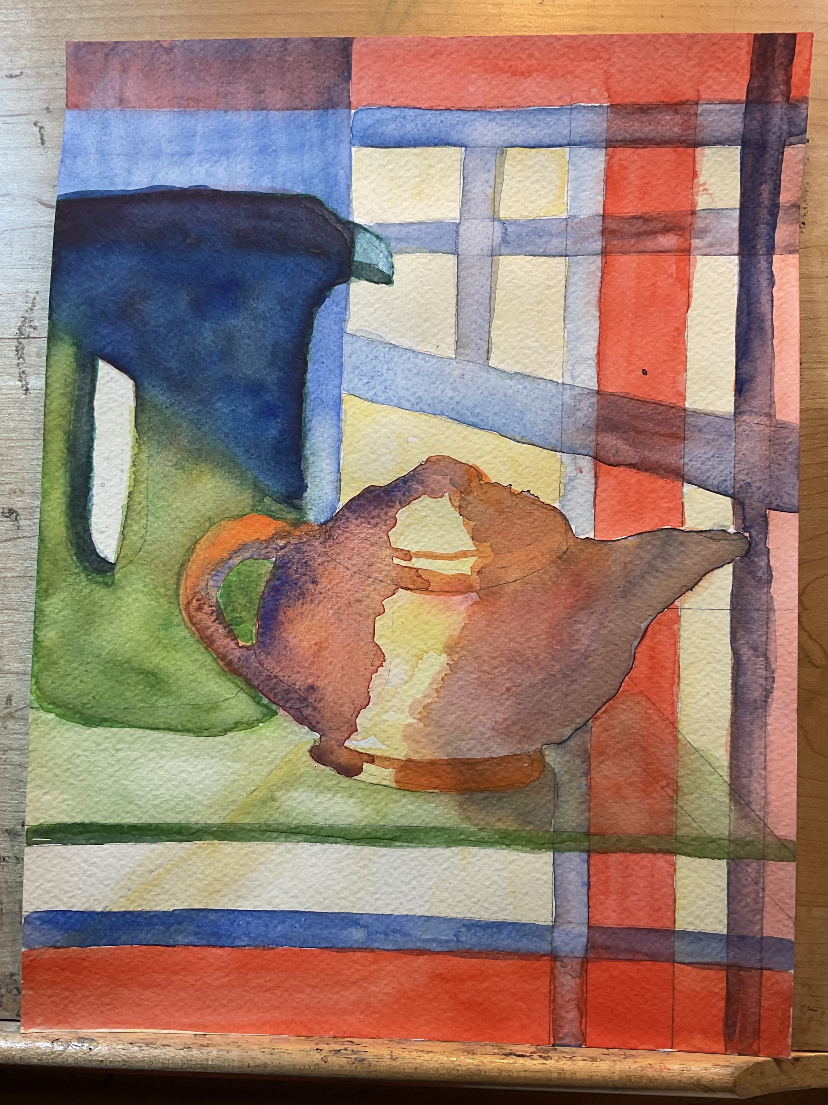
What a collection! You've really got that inside/outside contrast in the first one. And your use of color really makes every bit interesting. The teapots are intriguing. Love the composition, the shapes and the colors. Love the way the glass shelf grounds the second one and the cropping on the third one. That sunset is magnificent--and even more so in person. You may be right about the orange and blue--those complementary colors really work.
ReplyDeleteYou finished the window view just as I hoped you would. It’s great. I think that the sunset needs some more definite lines. It looks more like an explosion. Everything else looks really good to me.
ReplyDeleteYour paintings were beautiful to see in person yesterday. They seem a little less brilliantly colored on the blog, especially the first and last ones where the high contrast values really shined and shimmered. The compositions, colors, shapes and negative spaces are so strong and work so well together in all the paintings. And the tiny trio of in-between teapots is inspired.
ReplyDeleteNow the colors of drapes and chair not so vivid. You might have muted or just taken the focus down. I like the last one of teapots.
ReplyDeleteHmmm. Instead of the viewer looking out at the tree, now it looks like the tree is peering into the house. Which is nice.
ReplyDeleteTough those red and blue lines confuse me, I think it's ok. Looks like the teapots are having a confab. "Oh I just hate the way she lifts her pinkie when she pours from me, as if she is the star of the show and not me.
That sunrise/set looks like an explosion. It is too vertical.