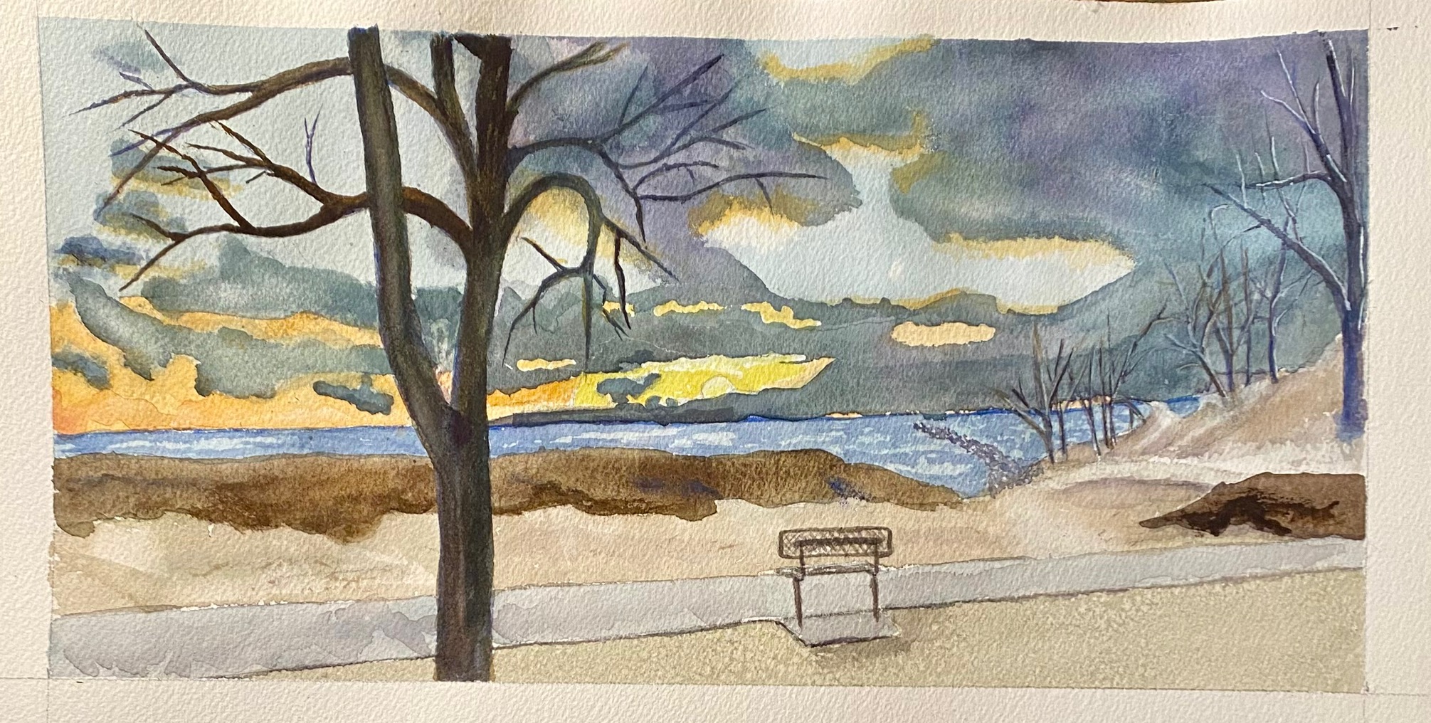
I did a little work on the beach scene. Can’t remember what I did but I did something.
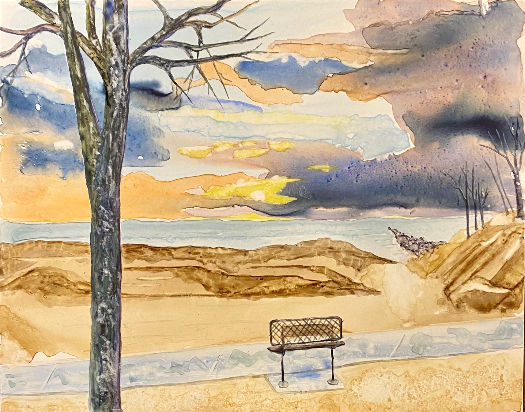
Then I decided that it would be a good subject for Yupo so I did that. Yupo did some strange things and I did some strange things and I liked it but missed the panorama view. I just bought some 6 X 15 Yupo paper and it will work great for panoramas.
Then I did a quick pen and ink with watercolor of a plant that’s been sitting on my kitchen table for weeks and I thought I’d get it before it was no more.

Perspective is wrong but it was really quick. I could work on this some more.
I think in the yupo one the impression that the clouds are moving is much more apparent. I like that quick little plant sketch. It looks like you intentionally did it with an inaccurate perspective. I like that attitude.
ReplyDeleteI love the clouds on the Yupo. You really got the colors of the sun reflecting as the clouds are moving in. I also like that plant. It looks like a quick impression, but there's also a delicacy about the line and color that works well.
ReplyDeleteOh yeah. I worked on the tree on the coldpress version.
ReplyDeleteYou balanced out the composition with the extended branches on the first tree painting and it looks even more lyrical now. The Yupo has some interesting areas, like the clouds and sky, the shoreline. The tree and park bench look rather stiff in comparison. I do like the flowering plant sketch. It's lovely in its simplicity of style and color. The perspective is no problem at all and actually adds to its overall charm.
ReplyDeleteI like all three. The delicacy of the colors is really nice in the cyclamen painting. I like the sky and the texture and colors of the tree in the yupo painting. But it seems like the sand shoreline needs something to bring it up to the same level as the tree and sky.
ReplyDelete