I painted this pic of my granddaughter, Jillian, but I didn't like the quality of it. Everything was in the right place but it wasn't art. On140 #.
Then I tried a quick self portrait on the bad paper and didn't like it. I tried to fix it but the paper was so bad that it went bad after the tiniest bit of scrubbing. There are compositional problems too but I'm not going to attempt to fix it. If you look closely you will see the damage to the paper that is similar to the skin damage on my head.
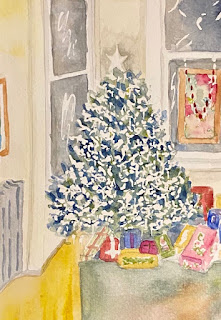
So then I went back to a better quality sketchbook with 140 # paper and painted my front room. I'm inspired by Sara's interiors. I kind of liked the tree and little else, but it was a quick sketch and painting and I learned a little something too.
So then I tried a tool called the Lucy which mimics what the old masters used. I am not an old master and I had a very difficult time using it. I think it will be helpful under certain conditions. But I did this in the good sketchbook after manipulating the image from the Lucy projection. Also a very quick sketch and painting.


Props on that Xmas tree! I like the way you left all those highlights — very festive scene. Both portraits of your granddaughter have their moments but the second one is more realistic— what a beautiful smile she has. I like your portrait too, very painterly, capturing a pensive moment. You just need some variation in the sky behind you, or paint it up more to look like a crown — which was my first thought (why is Alan wearing a crown...)
ReplyDeleteSomeone's been busy! I want to hear more of your thoughts on the Lucy this afternoon. I like all your portraits. While your second portrait of Jillian is more active, there's a lot to be said for the smooth flat first version. It looks like it was inspired by Japanese woodcuts. Once Sara mentioned it, I can't unsee your crown! I think my favorites are the last two. The tree is delightfully sparkly and that bowl of fruit is incredible. Everything that needs to be said with such an economy of color and brushstrokes.
ReplyDelete