Greeta took this picture of me in Mississippi and called it Pondering the Pandemic.. I just liked the composition and the colors. Watercolor on 140 lb paper.
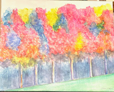
I keep trying to paint this red maple treeline over at the highschool around the corner from my house. I love the photo but I haven't been able to do it justice yet. I hate giving up on this because it's big but I am going to start over the next time I do it. This is watercolor on gessoed stretched canvas.


I agree about the first one. It's beautifully composed and the limited palette really adds to the contemplative mood of the piece. I know what you mean about the second one. I've taken some photos and done some studies and just can't get the vibrancy and crispness I want. I think part of is is the support. For me, gessoed canvas tends to mute the colors and make things feel more pastel and vintage. I'll bet you get what you want on Yupo.
ReplyDeleteYou are probably right but I do love the bottom third. It was exactly what I wanted.
DeleteI like Alan among the fenceposts, but I can't help but think it would be better on yupo. When you have a yupo and some other media painting of the same image, I always like the yupo best. Actually when I first looked at you among the posts I thought it was yupo. and when I learned it wasn't my first thought was it would look even better if it was.
ReplyDeleteIt's a complicated and interesting composition with all the zig-zag angles and struts of one color and then the organic shape of blue in the center. The way the figure is simplified works so well with all the nuances painted in the railings. And the background trees, sun and shadows are sublime.
ReplyDeleteI agree, the line of autumn trees aren't quite there yet. They seem rather subdued and stiff. Perhaps you haven't made your mind up yet how you want to go with them...more simplified and abstract ala Alex Katz perhaps, or more luxurious and varied...
I like that composition, or maybe it’s the contrast between the simplified figure and the colors and textures of the complicated background. Very well painted and I think the composition even reflects the title — we’re surrounded by complications that defy understanding....the trees are very Wolf Kahn! But I think you need stronger value contrasts...
ReplyDelete