Thanks to Pat & Elaine for the suggestion to darken the window “frame” on this painting from last week. It helped immensely.
And thanks to the positive comments about the “resist” sunset painting last week, I did a quick sketch combining oil pastel and watercolor. I really like the effect on the tree branches.
Now this is full tilt Wolf Kahn territory! Like Elaine, I bought an inexpensive set of “water soluble wax pastels” — funny how great minds think alike! My set is a cross between crayons and watercolor pencils. They make a crayon like Mark and you can spread the color around by brushing over with water. Like watercolor pencils, they work well by dipping the crayon inwater and then drawing. Lots of rich color but drawing with them is like drawing with a crayon.
This “homage” to Bonnard combines watercolor, oil pastels, and water soluble wax pastels. I drew with the oil pastels (which are really hard to blend), painted over it with various shades of blue watercolor and then added some water soluble wax pastels at the bottom. It’s pretty off the rails. I still like the mixed media approach but I haven’t found the right mix yet...all of there are 4 x 5 ish...
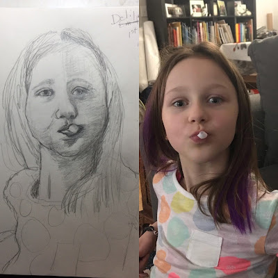
Finally here’s my portrait of the week. I’m feeling sort of mixed about the drawing (a result of too much mixed media?!) I think it resembles her but I didn’t capture the sass — her attitude, which is what makes the photo, imo. But I just can’t figure out why. Suggestions welcomed!


Oh yes! The sunlight just glows on the first one. I have the same reaction as you about mixed media—I'm not sure I'm getting the right mix. And sometimes, I get started and forget to switch. I think you have a good balance on your second tree painting, though. Anyway, I'm with you about the difficulty of blending oil pastels; still, you've gotten some exquisite blends on the Bonnard/Kahn painting--particularly the moon and the shadow side of the building. As for the rest, I always love your trees and your sketches. I can't see much off on the sketch, but she does feel more calm and placid. I think it's in her eyes; the photo eyes seem a bit more bulged out—like they are personally engaged and daring you to comment.
ReplyDeleteYour experiments are wonderful, Sara. I especially like the "homage," it looks magical and all the media works so well together. You're fearless! I think her eyes need more emphasis (and notice the one to the right is a little off). Emphasizing that twist of her body and neck might get the sassy gesture down...
ReplyDeleteTest
ReplyDeleteOMG Nora moved right out of toddlerhood into full time little girl. I think her eyes have to be more open and the fullness in her face “puffing” has to be higher up to capture her expression.
ReplyDeleteWatching people in my class at Old Town do pastel was fascinating. They needed way more room for their supplies and easels and it was a real mess. But they could go in at the end and get the light.
It’s not Nora! She is my friend’s 8 yr old granddaughter! Children’s faces are so challenging because they have no wrinkles or other landmarks!
DeleteI’m glad it’s not her!! That was way too quick🙄
DeleteI like the way you captured those last rays of sun touching the top of the trees
ReplyDelete