Cuba's been in the news lately and we're nothing if not timely. We start with an urban landscape by Bill, featuring a corner in Havana, Cuba.
Madeleine, too, paints her recollection of a trip to Cuba. Here is a lovely beach, as seen from a passing tour bus.
Travel seemed to be a "thing" for us today—talking about it and painting it. Madeleine finished her painting of a church from Istanbul. There is actual gold paint here, but it's overshadowed by the luminous shaft of sunlight coming through the open door. Sorry, the photo just doesn't do this justice. Take our word.
And now we're in Turkey, as Madeleine begins to paint a ghost city. These ruins are beautiful in the reference photo—you'll want to keep coming back to see how this turns out.
Moving to Paris and Ellen's impressionistic take of a scene near Montmarte. It just feels Parisian, doesn't it?
Bill's painting is similarly composed, but the style and location are very different. This Michigan bridge features fall colors and uses descriptive brushstrokes.
Even closer to home is Bill's Uptown sunset. He's done two versions and we can't decide which we prefer. One is more mysterious; one more detailed. One seems nearer; the other more of a long view. Either way, we love the basic elements—layers of sky and city.
Tony's travel painting is from a resort where he chose to contrast the lush tropical foliage with the stone architecture behind. Here's another painting we can't wait to see finished.
Speaking of tropical, Rosemary paints a Painted Bunting. She's actually seen this bird in person (in Costa Rica) and says it truly is as colorful as the painting. Watch for her to add background foliage and water in the foreground.
Susan revisits her tropical birds and, in the process, segues into our second major theme—people. This South American travel painting features Susan and her husband looking at toucans. Coincidentally, they are also dressed like the toucans. We love it!
Ellen's self-portrait also has a delightful element of humor. She's wearing an inflatable hat that she got as a Christmas gift. We love how happy she looks and also the masterful use of color pathways.
Sara's large dual portrait is coming along nicely. Both likenesses are spot on, thanks to the studies she did. And notice how she also uses blue to guide the viewer's eye through this painting.
Another dual portrait, another blue color path through the painting. Must be something in the air! Now all that's left is for Elaine to add final touches to the background.
Vivian's paintings are more of a diptych than a dual portrait, but they are right on theme. She's gone back and added some bold touches to a portrait she thought was finished last time. The added contrast and modeling really make a statement.
Here's the second of the "large" portraits. Both of these are taken from life sketches Vivian made. They are greatly enlarged here. In the process, Vivian has made them monumental archetypes.
Ken's abstract is another painting that looks so much better in person. We love the sinewy foreground shapes that hint at spring and new life. Not to mention that they move like the braid in the painting above.
While we were on break, Ken took a mosaic class. It inspired the following abstracts, as well as taking him back to his roots. The gridded pattern on the left feel like the very first drawings Ken did. The three elements on the right are his mosaics; the bottom two were stained glass. You can tell, can't you?
.... which takes us to this painting. More patterned, and with the three separate mosaic elements more closely aligned with the main pattern.
Madeleine is taking inspiration from different media as well. Below she tries to recreate her iPad drawings in watercolor. It's harder than it seems! We love the elegant simplicity and wish you could see the way she's used mediums to create texture. The red flowers, for instance, look like they are varnished.
Bill's going abstract too, adding more elements and more colors to his painting.
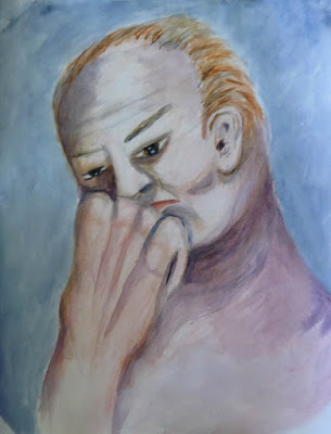
When we last left our intrepid artists, our teacher wanted us to use the break to paint a "bad" painting. Remember that? That's okay, not all of us did either. Bill actually tried to paint one (below). The blurriness is all from bad photography and has nothing to do with being a bad painting.
The rest of us either forgot, didn't get around to it, or misunderstood. Susan and Sara searched their archives to find "bad" paintings. Sara didn't bring hers to be photographed. And Susan's (below) is only "bad" because it's six years old and she feels she could do a better job of it now. It's a scene from Stockholm, Sweden and Susan feels the color palette is more tropical than Scandinavian.
As you might have guessed, the point of the exercise was that it's really, really hard to paint a bad painting. None of these are actually "bad," are they? Point made!
Enjoy the weather and see you next week!


No comments:
Post a Comment