Saturday, October 22, 2016

October 22, 2016

It was a perfect fall day today.... crisp, sunny and colorful. A perfect day for painting. You'd think Ken would be beginning a new series featuring Cubs or flying Ws or something of that nature. But no—Colonel Cobb is hard at work on his corn series. And each painting is better than the last. We all love the kernels here. And they are just yellows and purple. Behold the power of the complementary colors!


Alan is also a big fan of the yellow/purple combination, even though his produce of choice is the onion rather than corn. He's back to his favorite paper here, Yupo, after a period of experimentation.


Let's take a quick look at some of Alan's experiments.  Remember back when Steve was trying the watercolor canvas? He gave a packet to Alan. Results below! Alan kept the same subject and the same colors. Here, he uses the canvas as is. Look closely to see the canvas texture.


Here, he's coated the canvas with gesso for a smoother, cleaner result.


Finally, Alan paints a city skyline at sunset. He especially likes the canvas for its ability to lift cleanly.


Alan turns to illustration board here to start this painting of a barn nestled in the Michigan woods. It's cold pressed board and especially designed for watercolor; it yields much better results than the cardboard-y illustration board he tried a few weeks ago.


Bill finished this soft watercolor of the Irish countryside. It seems minimal in color, but look closely at the range of colors Bill used to create this effect—especially the gray stone.


From Ireland to Sheridan Road, Bill's architectural study moves from stone and gently rolling hills to steel girders and dark glass. He's equally successful at both.


Back in Ireland, Madeleine paints another of our favorite subjects—people. This dual portrait silhouettes full length people on a bridge against hills and a clear sky. We love the jeans!


Elaine's painting touches many of our themes. It's a portrait; it's an experiment; and it's set in a vacation location. This little cutie is basking in the warmth of a San Diego winter. The paper is new to Elaine, but she's liking it so far.


First time self-portraits shouldn't look this good! And yet, Isaac's painting would make an experienced portrait artist proud. Painted from a small camera reference photo, he's created a large painting with lovely highlights, shadows and color choices. He's handled all the "hard" bits with ease and to top it off, it looks like him!


Ellen has missed a few sessions (life happens!), but she's finished her gondolier. Remember how she started with yellows and other warm colors? Very few yellows remain visible, but there is a resulting golden glow that we love.


Sara is also hitting all our sweet spots with this vacation self-portrait. Great color, great composition. So many things could go wrong with the intense blocks of color and black—yet Sara handles it with aplomb. Look at the tiny sliver of color from the red cup against the monochrome right side. Brilliant!


Back to one of our favorite themes, Sara paints a still life of produce—heirloom tomatoes in this case. The colors and highlights are spot on and this simply says summer to us.


Look closely to see the produce in Greeta's painting. She's gone back to darken some of the walls in this witty painting of a still life.... being painted as a still life.


Having conquered produce, Greeta's moving on to livestock. This summery painting of a family of cows on a beach uses Greeta's favorite set of complementary colors, blue and yellow/orange.


Gotta love the way we think in series and love to experiment. Glen revisits his carousel horse but on cold-pressed paper. He's much happier with the paint handling in the sky and modeling on the horse. We agree!


We've noticed an increased interest in birds lately. And when they look as incredible as Steve's, we are not surprised. This is based on a small reference photo and we can assure you that the bird really is this color! And we love the contrast between the richly colored and textured bird and branch against the suggestion of a tropical backdrop.


Surely you didn't think you'd escape fall without another painting of autumn leaves! But did you expect one as lovely as Susan's? The colors, skyholes, and calligraphic branches make this painting quintessentially autumn.  These trees are on Ashland Avenue in Chicago in case you want to visit.


Wondering what our newbies are doing on the last day of the term? We're here to tell you that they are doing amazing things! Erika introduced us to dragonfruit in the painting below. We're both intrigued and impressed with the beautiful colors, brushwork and background.


We love Pia's still life below. The grapes are shiny and lovely. The composition snuggles the fruit into a nest of fabric. And look at the fabric! It's so richly colored and beautifully textured, we want to touch it. It looks like suede, doesn't it?


It's the last class of the term, but we'll be back next week, beginning with no break! Our newbies will graduate to old masters and we're hoping to see them back. They are amazing!

Those of us who attended Bill and Madeleine's opening reception at the Ten Cat last week had a wonderful time. The weather was perfect and we spent a lovely afternoon in the garden, enjoying good art and good company. What could be better? If you want to see the art, it's still up in the windows of the Ten Cat. Drop by—the address is 3931 N. Ashland Avenue in Chicago.

Oh, and one more thing.... go Cubs!


Saturday, October 15, 2016

October 15, 2016

We almost had a full house today—probably because it was too gray and gloomy to do anything else. Also because the Cubs game doesn't start until 7. Either way, we all win as we'll be able to see some wonderful watercolors. We were back in our circle and back in the studio today. We're going to try something different today and view our art alphabetically by artist, starting with Alan. He's finished his portrait of a summer carwash. We love the car and we love all the textures.


In another attempt to explore texture, Alan painted some tulips on a piece of masa paper. Different parts are painted on each side of the paper. It's an interesting process—the paper is crumpled, soaked, flattened, painted on one side with leaves, pasted to watercolor paper and finished on the other side of the paper.


And here's the last piece of masa paper Alan ever plans to use. While he may not be fond of the paper, we love the effect he's achieved here. The reflections are beautiful.


Bill is also painting architecture. Here, he's added a foreground to strengthen last week's composition. We are impressed with how wise his choices were. The colors are lovely and the layering in the foreground feels like a rich oil painting.


Bills' back to Ireland here—and back to perfecting painting stone. Look closely at the stone house, stone walls, fences and rocks. You'll see all the wide range of colors he's used to get to these soft greys. Now, we're looking forward to all the lush Irish greens still to come.


You'd think Elaine would be painting grey stone, too, but no, she's painting portraits. We like the way she's focused on the important bits—the kids—and only described as much of the background as needed to establish place. We also might have chosen a different flavor of ice cream than multi-colored neon, although these two seem happy enough.


Here's one to examine closely for a variety of reasons. Glen imaginatively paints a carousel horse breaking free against a circus background. Look at the colors—they are perfectly suited to the whimsy of the scene. And the mane and tail are softly flowing in the breeze. Love it!


Greeta's painting livestock too, but her cows are real. And they are lounging on a beach in California. We are enjoying these tremendously and are glad Greeta's discovered cows!


Greeta is featuring another of her specialties, fruit, in this soft, sweet scene. Zoom in to see the soft pearly gray walls and the delicacy with which she's handled this scene.


Isaac's teacup takes center stage, along with the tulip balanced across it. We love the addition of the window and how the light is shining through the leaves. The teacup is beautifully shiny and the warm dark background is a great choice.


You can't tell from the images here, but Isaac's gone from a small painting above to a large self-portrait below. The green is masking fluid, so don't get distracted! Look instead at the bold application of sepia. It is granulating and spreading to perfectly describe the face planes—just look at the chin and neck. We can't wait to see this progress.


Ken—or as he's now calling himself, Kernel Cob—is finishing up his corn series below. This is number 12 in the series and is the most abstracted of the series. It definitely feels like autumn with the warm, rich colors.


...But then Ken visited a farmers' market, bought a few ears of corn, and fell in love all over again. Here, he's peeled back the leaves to reveal the kernels, perfectly suited to his mosaic style. We think there may be at least 4 or 5 more corn paintings to come! (PS—he arranged, lit and photographed the corn and then he did eat it!)


Look at all the lovely greens! You can tell Madeleine is painting Ireland. In fact, you can see her and Bill strolling through the countryside. We especially love the trees in the background.


This building and street scene are quintessentially Irish, aren't they? Madeleine is documenting her trip with some incredible paintings. We're convinced these paintings will evoke more memories than any photograph could.


Here's another wonderful vacation picture. Sara paints herself sitting in a barn doorway in Wisconsin. What can we say about this? Beautiful composition, vibrant colors and skillful modeling—this evocative painting has a very Wyeth-like feel.


Yes, it's beautiful, tropical and colorful—must be Steve! Another hint? Look at the texture on the feet and the branch. We can't wait to see the dark feathers go in and applaud Steve's background choice. He has given us just enough detail that we know exactly what we are looking at, but not enough to distract from his subject.


Susan was at a funeral last week and, like many artists, used her art to come to terms with her grief. In the end, though, this is not dark or depressing, just a simple documentary. We love Susan's style of collaging the story elements.


Coming after the painting above, Susan was determined to paint a "happy" painting. Here she is also trying her hand at a field painting. She's going to do this again, larger. We concur!


Our newbies are at different stages—working on various exercises and cranking out the extracurricular paintings. So follow closely. Here is Erika's giant leaf. She's including the original just in case you find it as incredible as we do! Notice the texture, the veins and, again, the background! We all seem to be getting backgrounds right this week.


Erika is moving on to a pair of pears, using complementary colors. Another interesting background choice!


Luciana has the "giant fruit" concept down pat. You can't see any background at all... just the gourd. And she has the colors spot on, not to mention the textures and the groove at the right.


Here's she's moving on to the wet/dry exercise, combining wet and dry strokes in the same florals.


Luciana's flowers are beautiful! They'd make a good fabric, wallpaper or even a greeting card, wouldn't they?


Pia uses wet-in-wet (actually, more like wet-in-damp) to create the soft edges of this sunset. And look at the reflection! The colors, the blending and edges are amazing.


Yes, it's the giant fruit. Pia has painted a pumpkin. Besides spot-on colors, she's added rich texture to the stem and fruit. This is "giant fruit" done right.


Having nailed the exercises, Pia moves on to extracurricular play. She's a master colorist and we love the bloom at the top right.


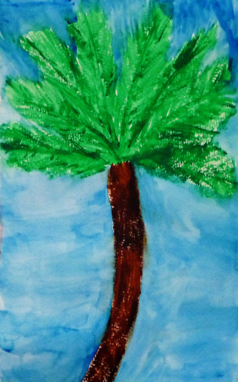
Look at the textures in the palm fronds and bark. Pia has this down! We're looking forward to next week!


Today is Bill and Madeleine's opening reception at the Ten Cat, from 4–7. And at 7, it's the Cubs game! See you next week for a report on the opening and good news about the Cubs game. Maybe we'll all be painting Ws as well as flying them!

Saturday, October 8, 2016

October 8, 2016

It's a perfect crisp, clear fall day today and we were painting, chatting and enjoying ourselves tremendously. We're in a newish space (to us) and are still figuring things out ...like Showtime! We tried something different today. We stayed in the studio and presented each painting on a single easel with each artist choosing the next artist to exhibit. So, in that order, we begin with Ken's corn series. Just as the season is ending for the corn, it seems to be winding down for the painted corn. The colors are warmer and more autumnal and the corn field is more abstracted.


Next up was Bill, also with a field, but of Irish cows. He's added to the foreground and focused even more on the cows by use of complementary colors. It's a beautifully atmospheric Irish day.


Similarly atmospheric, but miles away from Ireland, Bill is painting an Uptown skyline. The colors are Sargent's and there is a distinctly Turneresque feel, too.


Madeleine has finished her Dublin rowhouses We love the "same-but-different" pattern, not to mention the precision and intricacy of the painting.


In this Irish scene, Madeleine uses similar patterning (a row of boats instead of houses), but chooses to place them against softly defined water, skies and hills. The lush background perfectly complements the sharply detailed boats.


Sara has added beautiful color to this beautifully composed scene. The colors vibrate like Wolf Kahn's and the painting feels like Wyeth. We can't wait to see how this turns out... even though Sara says it's just a study, we love it.


Elaine has (finally) moved to the faces and is almost finished with her dual portrait. Except for the pops of color in the children's clothing and ice cream, this is a very subdued palette for such an exuberant subject.


Marva has just finished sketching and begun painting another natural masterpiece. The subject is a verdant park and we're already getting a sense of the final from the small corner she's started with. No one does foliage like Marva!


Isaac's still life is coming along beautifully. The cup and saucer have the feel and shine of porcelain. The spill of light from the window on the subject against the warm, rich background gives the feel of a Vermeer, but featuring a tulip instead of a woman.


Glen's autumn leaves are lovely! They capture all the colors of fall as the leaves seem to dance across the surface. In particular, he's managed to capture the sharp, clear light that says fall—not an easy task!


Greeta has done another of her wonderful fruit paintings. This time, she paints pears... but these pears are far more beautiful than the dull grocery store variety. They sparkle; the colors are inspired—even the shadows. Zoom in and see.


Greeta has relegated her fabled fruit still life to a small part of this painting. She's maintained her delicate hand at color blending. Like Isaac's, this painting skillfully draws on Vermeer but the light modeling the subject's face comes from the light bouncing off the still life instead of a window.


Alan's almost finished with his "onion" series. In this painting, he experimented with illustration board as a surface. While he didn't like it, we love the outcome. It's festive and celebratory and much more beautiful than you'd ever imagine onions could be.


And speaking of experimenting.... just look at Alan's latest. It's on standard watercolor paper, but that is where the "typical" ends. Look closely at all the texture! The trees use alcohol drops and sprays to create the mossy, bark-like feel. The ground owes its texture to salt (but not typical table salt! It's large and flaky and looks like shaved parmesan). The water is masked out for now, but come back to see how this turns out!


Did you notice all the references to past masters? We owe that to Greeta who brought in a book called Awash in Color, filled with wondrous watercolor art.  Also, to Sara, who reported on a visit to a watercolor museum in Wisconsin. Makes us wonder why aren't there more watercolor museums? Or more watercolors in existing museums?

Mark your calendars! It's getting close to ..... 

Group Art Exhibit at Ten Cat

As you know, October is Artists Month in Chicago and our very own Bill and Madeleine Settles are having an exhibition at Ten Cat. You can see the art throughout October, but you are also cordially invited to the  opening reception. Mark your calendar—this is a great venue and we always have fun. Details below:

Madeleine Settles and William Settles
Recent Watercolor Paintings


Exhibition: October 3–29, 2016
Opening Reception:

Saturday, October 15, 2016, 4–7pm
3931 N. Ashland Avenue, Chicago


See you next week!