Saturday, September 17, 2016

September 17, 2016

You can tell it's fall and back-to-school season. We have a full house and some of the fastest, most productive newbies we have seen. Not to mention there is news of upcoming exhibitions. So let's get started right away. First off, we have to apologize to Marvelous Marva. She's back and painting a beautiful, peaceful beach scene. Unfortunately, we don't have a photo. Come back next week.

Meanwhile, in a similar peaceful, quiet vein, here is Steve's snow scene. We hope we aren't frightening anyone. There is still some time before we have to worry about facing this. But from where we are viewing this, it's beautiful, isn't it?


As for the rest of us, we are busy documenting our summers instead of looking forward to winter. Ken Ten continues working on his corn series. Here he finishes the quartile progression. We love how he's integrated his interest in mosaics into his watercolors.


More quartile cornstalks; here they are so abstracted they almost look like a bamboo forest.


In this beautifully delicate painting, Ken patterns the corn leaves with stripes and fills the background with a mosaic pattern that looks like a conservatory.


More stripes, more mosaic patterns, complementary colors. Who would have guessed corn stalks could be so interesting?


Closing in on the end of his series, Ken begins another striped leaf painting. The stripes really work to emphasize the undulating nature of the leaves.


If there's corn, can cows be far away? Greeta begins this sweet-faced cow against a hazy summer sky. We love the cowskin and can't wait for the face to appear.


Another quintessential summer scene by Greeta. Can't you feel the fun running through the sprinklers? We love the water, the concrete and especially the position of the boys as they dodge water droplets. Greeta's favorite part? The shoes! And we like them too.


In this portrait, Greeta was inspired by the shadow cast by the subject's hair on his shirt. Remember that shadow exercise? This is what it's for!


Turning our attention back to Ken's corn, we can't help but noticing how closely corn stalks resemble onion leaves. We love our produce, don't we? Here Alan begins a series inspired by an onion field. Can you believe the incredible detail he manages to get using Yupo?  These onions are on a table.


These onions are hanging from the ceiling.  We love the details and the complementary colors. And yes, that's Yupo!


Although he is truly a master of Yupo, Alan painted this portrait of his grandson on regular watercolor paper and proved he's equally adept using this ground. We love the fun expression!


To shake things up a bit, Alan switches to a landscape. We are in awe of the texture he is able to describe on Yupo. Zoom in and see what we mean.


Ellen continues to fine tune her gondolier. There is so much to see here. The complementary colors, the composition, the shadows. She's also officially the first to try the Winsor & Newton watercolor paint stick for the stripes on the shirt. She's used them to great effect and inspired others of us to try them soon. 


 Susan found an old sketchbook and repainted a view of the Yangtze River below. We are all about complementary colors today. Look at the sun against the purple mountain. Lovely!


And here is Susan's original Yangtze River painting from five years ago. It's smoother and less textured, but what's interesting is that both were painted from a line drawing in her sketchbook, not a photograph. So both are equally valid remembrances.


Bill is also documenting his vacation. Here's an Irish street that inspired a bit of debate about color saturation and balance, as well as how the success of a painting (in terms of accuracy) can ultimately only be decided by the person who was actually there.


Another sketch inspired by a shadow! Bill painted this Irish building because he loved the shadow it cast. He's calling this a sketch and we hope to see it again.
 

Madeleine is also documenting a vacation in Ireland. This intimate, texture-filled shrine is all that's left of a church dedicated to St. Bridget. We're eager to see this finished.


We do love to remember our vacations, don't we? Sara finished painting a cottage in Northern Wisconsin. This is small—the size of a postcard—but exquisite. She credits Pat with pointing out the mauve in the roof. We love the way Sara uses greens and purples throughout this little gem.


Another vacation painting, more complementary colors.... Elaine paid a visit to the Art Institute of Chicago (which just so happens to be the world's best museum) to see After the Fall. Before she entered, she happened to look up and see a pigeon sitting on the lap of one of the stone carvings. This is merely a sketch—she's not thrilled with the results of wet-on-wet on Masa paper.


And did we mention our newbies? They are speed demons! Each of them finished both of the first exercises... and managed to do some extra credit paintings to boot. Fast and good... they will be worth watching. We'll start with the exercises. Here's Elizabeth's color wheel (done with only three primaries)...


 ... and a color wheel/plaid spectrum as she explores hue, tine, tone and shade.


Erika uses waves on her plaids, giving an easy feeling.


And here's Erika's color wheel. Yes, those are only three colors!


Luciana added a twist to the color wheel. First, she used the tube colors for the secondaries. Then, she went back and mixed from the primaries. The mixed secondaries are actually much richer and more beautiful. And to the right, she's added water to full strength paint. This feels so very watercolor-y—and she's discovered blooms!


 Here's Luciana's plaid. Notice how she's beginning to experiment with wet and dry?


Pia's plaid and color wheel are on one sheet. We love the richly saturated way she paints. Zoom in to see the way the colors move in the plaid.


Finally, Pia's exploration of hue/tint/tone/shade. Lovely, isn't it?


Following are Luciana's extra explorations. We love the wavey color tests...


... as well as these delicious, watery swatches.


These stripes look like a flag.


Luciana only used one color (well, turquoise with a touch of rose in the lower right) to describe these misty mountains. 


Elizabeth did some watery explorations, too.


... as well as painting observed details from windows, doors and more.


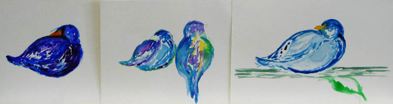
 And as if that weren't enough, she moved on to animals and birds. 


Upcoming events!

See who inspires us.
As you may recall, we planned to bring in paintings, books or screenshots of artists who inspire us. Many of us did, but we just didn't have time to discuss. So come back next next week and see who we admire. This should be very interesting!

You're invited to.....

Sulzer Library. If you are near the Sulzer Library on Wednesday, September 21, drop in to see a group show featuring Erika.

Autumn Open Sketch date.
It's an open sketching/photography session on Saturday, September 24 from 1:000–3:00pm at St. Gregory the Great Church and we are invited! Bring your cameras, sketch pads, pens and pencils. A docent will also be on hand to answer questions.

     Where:
     St. Gregory the Great Church
     5545 N. Paulina
     Church entrance is on the corner of Gregory and Paulina;
     one block west of Ashland and one block south of Bryn Mawr

     When:
     Saturday, September 24
     1:00–3:00pm


Group Art Exhibit at Ten Cat.


As you know, October is Artists Month in Chicago and our very own Bill and Madeleine Settles are having an exhibition at Ten Cat. You can drop by most of October to see that art, but you are also cordially invited to the  opening reception. Mark your calendar—this is a great site and we always have fun. Details below:

Madeleine Settles and William Settles
Recent Watercolor Paintings

Exhibition: October 3–29, 2016
Opening Reception:

Saturday, October 15, 2016, 4–7pm
3931 N. Ashland Avenue, Chicago


Saturday, September 10, 2016

September 10, 2016

Summer is over and we are back—with so much new to share that we'll get right to it. Keep reading to greet returning friends, meet new friends (we're excited to say we have four new students), and get news of upcoming exhibits. Oh, and one more thing—Pat, our teacher, had a little "welcome back"
twist.  She gave us all nicknames. Some were alliterative, some were rhyming; all were funny! Now, let's get to it.

First up.... Bodacious Bill, back from a vacation in Ireland, as you can see from all the paintings. We love the water, the stone buildings, and, of course, the many varieties of green.


Can't you just feel the atmosphere here?


We are especially enamored of the water here.... although the sky and trees are also beautiful!


Here's the only painting where anyone had a question. We all loved the composition and the beautifully drawn perspective. But some questioned the green trees, if any such shade existed in nature. Bill (and others who had visited Ireland) assured us that reports of the many shades of green were not exaggerated at all. This shade exists... and it's spectacular!


More Irish green.... this time, Bill paints a horserace. He's developed a fascination with horses. We may be seeing more soon; we can't wait!


Finally,  this work in progress is a street in Ireland with a lovely cafĂ©. We love the watercolor feel and the brilliantly minimal use of colors.


Are you tired of green yet? We certainly aren't! Next up is Maid Madeleine—so nicknamed probably because she too just returned from Ireland, wore a beautiful Sherwood-forest-green top, and painted the many shades of Irish green. Notice the different cast to the greens in her palette, though. Unlike Bill's clear hues, Madeleine's greens have a golden hazy feel.


Another Irish scene by Madeleine, this is classically composed and wonderfully deep and atmospheric.


But Ireland is also about the people. Here Madeleine paints locals at a pub....

 
 ... along with her grandsons (and travelling companions). If you can't guess at the destination from the caps, the background gives it away.


Isaac, the Master of Icons, is back. Here he is working on composition, combining a tulip and a teacup (no, it's not an Irish cuppa). The yellow is where he's masked the subject while he works on the deep, rich background.


We're also delighted to have Glen back. In fact, Pat was so delighted she forgot the perfect nickname she had and blurted out Giddy Glen. We'll correct that when she remembers his "real" nickname, but meanwhile, we are giddy with joy at his painting below. We love the combination of a girl with balloons on Bourbon Street. And the colors just make us happy.


Sassy Sara just spent some time in northern Wisconsin. Here she is painting the cottage she stayed as a thank-you to the hostess. It's a beautiful house and a beautiful painting. Makes us want to have her over for a visit!


Rebellin' Ellen also spent time in northern Wisconsin and managed to see the Northern Lights. Here are two exquisite paintings, one with stars looking like fireworks against the brilliant colors....


...and another with more movement and fewer stars. Both are beautiful and both are accurate.


And here, Rebellin' Ellen is beginning a painting of a gondolier (not from northern Wisconsin). Interesting to note is that she begins with all the light warm colors. We know she'll be adding darker, richer colors and are eager to follow her process.


This riot of color is Sunny Susan's documentation of our Sketch Club outing. We met at Steve's backyard (and yes, it is that lush and verdant!) and had a wonderful time. You can see Ken enjoying himself sketching.


You may wonder if we got the right painting below. But rest assured it does belong to Aloha Steve.... the very same Steve with the tropical paradise of a garden above. Not far from the garden (but half a year away), is this exquisite winter wonderland. The soft colors and crisp clear air take our breath away.


Elaine, who looks for Excellence, also is painting close to home. Below she finishes a sketch of a detail of a neighborhood church. Despite sticking to a minimal palette and testing a different sort of paper, there is a lot of detail here. If you're interested, the paper is Masa paper. It has a very interesting texture—very soft, yet very strong. Sort of like the anti-Yupo.


Upcoming events!

See who inspires us.
Today, talk turned to what makes a "watercolor" painting. We decided to bring in paintings or books or screenshots of artists who inspire us. Join us next week and see who we admire. The only criteria are that the artists have to be watercolor artists and relatively famous (or at least not totally obscure). Should be interesting! We will also correct any nicknames that were mis-remembered.


You're invited
October is Artists Month in Chicago so keep your calendars handy!

Next week we'll give you more information on Bill and Madeleine's show at Ten Cat.

Meanwhile, you are cordially invited to an opening reception of an exhibit celebrating Hispanic Heritage Month. It is curated by Erika, one of our new members. The show will be at a coffee shop near the Patio theater and will run from September 16 through October 16. You are invited to the opening reception. Details below:

Perkolator; A Shot of Art
Friday, September 16, 2016, 4–6pm
6032 W. Irving Park Road, Chicago


Friday, August 19, 2016

August 19, 2016

Sketch Club is Going Virtual for August 20, 2016


Tomorrow is the Air & Water Show, which will mean noise, crowds, parking problems and closure of the Lily Pond. Also, it looks like we may be rained out. Too many issues!

So...instead of meeting physically on August 20, we have pledged to draw at home (or somewhere) and then take photos and share. See you there.... virtually!


Wednesday, August 10, 2016

August 6, 2016

We had a wonderful time sketching Steve's magnificent garden.

We'll be skipping this weekend (August 13), but will meet again on August 20 at North Pond. North Pond is north of Fullerton, between Cannon and Stockton,  west of  (behind) the Peggy Notebaert Nature Museum.

All are invited! And feel free to comment if you'd like to specify a particular spot you're interested in.

Monday, August 1, 2016

July 30, 2016

It's our last day of class before summer break and we all painted magnificently—as if we were actually being graded or something! Settle back with a nice cold drink and see if you don't agree. And if you stick with us, you'll be rewarded with an invitation to join us for Sketch Club. But first, we compare and contrast Alan's two versions of a rusted antique car. One is painted on Yupo; the other on traditional watercolor paper. We can't decide which we like best. The Yupo is perfect for capturing the textures of rust and old paint...


... while the traditional paper allows for a sense of space in the grass and background foliage. Alan says the Yupo was more fun to paint but we still can't choose a favorite. We like them both!


Greeta's quick study evokes the same sense of rustic Americana... probably because she's chosen to picture a girl with her pet goat. Greeta's intent is to paint people as easily as she paints fruit; after all, she has no "fear of fruit." We think she's on her way to succeeding admirably.


You can't tell from the online sizing, but Greeta's painting of five boys in a boat is much larger than her small sketch above. This has the same idyllic feel of a lazy summer day; we can even feel the gentle movement of the water and the boat.


Ken's painting is also large and it's also the essence of summer. This corn painting emphasizes the quartile divisions even more than previous versions. This one seems almost musical as it moves rhythmically from fluid to staccato.


Susan also paints summer flora. This is a flower garden in a Chicago senior center. We love the curving paths and the explosion of flowers, beautifully painted en masse. 


 Rosemary is also inspired to paint summer's flora and fauna. Her stylized bird and flower actually feel like embroidery. Simple, sunny and very classic. She's also experimenting with masking fluid, as you can see.


Another bird, but much more intricately handled. Madeleine's added a warm grey concrete street and patio and, in the process, taken this painting to new heights. Notice how that one touch united all the elements.


Madeleine's back from an Irish vacation and bravely tackled this painting of Irish rooftops. We admire her skill in perspective drawing and are already loving the shadows as she adds color. We can see what drew her to this scene.


Bill, too, is inspired by Irish cityscapes. Here he paints the distinctive rooflines and chimneys as seen from the Guinness Brewery rooftop... how quintessentially Irish!


The only thing green in this Dublin cityscape is the lamp post. Bill eschews the typical Irish landscape for this rugged city view of rowhouses, graffiti and a single man.


In the same vein, we invite you to look closely at the next three paintings. All three seem quiet, subtle and minimal in their use of color—but look closely! You'll see much more color than you'd expect and you'll see how limited color palettes bring out the best in some of us. Elaine, for instance, is using only two colors for everything from warm brick to cool glass and stone.


Sara is also using soft colors for her self-portrait below. Unlike Elaine, she keeps her values close, and yet she's achieved a deep, rich painting.


Remember Steve's vibrant, tropical merman from last week? He's gone to the other extreme here... painting a winter scene. In what is basically a white painting (snow-covered trees against a cool winter sky at the end of a snowy path), look at all the soft subtle color he begins with. There's yellow and pink in the sunset and blue and violet shadows defining the foreground. This is going to be beautiful.


Upcoming events and important announcements:


Sketch Club. Our informal sketch club is back—and you are invited to join us! Here's how it works: Beginning August 6 and continuing until our break ends in September, we'll meet on Saturday mornings. We'll meet at 10 am and sketch for the next two hours or so. Here are the details:
  • Who: You! This casual meetup is open to anyone with a pencil and paper and an urge to sketch
  • When: Saturday mornings, 10:00am
  • Where: Different places every week. We'll post a list of sites here. Feel free to join us when and if you can.
    On August 6, we'll sketch Steve's gorgeous back yard.
    Address: 5622 North Kenton, Chicago
It's fun, relaxing and very casual—join us if you can.

Save the date! We know it's early, but we also know how quickly your calendar fills up. In September, our own Bill and Madeleine will be showing at Ten Cat Tavern. There will be an opening reception  and you'll all be invited.Watch this space for details!

 And with that, we say goodbye until our next class begins on September 10. See you!