Saturday, November 17, 2018

November 17, 2018

It's officially winter! The snow was coming down while we painted some of the most exuberant, color-drenched paintings of the year. Except for Ken! Ever the iconoclast, he begins his new series with two colors, sepia and indigo, that perfectly define a cold, wintery night—okay, there may be a touch of ultramarine blue in there, too. His new series documents November 20, 2015. Here is an early snowstorm he experienced from the Irving Park Brown Line platform. You can actually feel the cold and the driving snow, can't you? Thankfully, the train approaches.


Sara's finished her autumn painting...just in time, too. None of the colorful leaves remain in this view through her kitchen window. We love so many things about this—the colors, the contrast between the structured lines of the window and deck rail and the softly abstracted foliage, the diagonal line of the sky which adds energy to the composition—pretty much everything, in fact. 


Steve takes us back to summer as he adds foliage behind the flowers. Notice how the aerial perspective of the leaves adds depth. It feels like the greenery goes back forever.


Susan's landscape is from a different hemisphere and a different season. This is a ranch in New Zealand. She memorializes this view from a restaurant where she enjoyed lunch, after a hike and a sheep shearing. What great colors and what an incredible view!


Tony finished his portrait of a friend in Greece. The colors and composition are perfectly and deliberately placed and remind us of Hockney's use of color and shape.


Moving on, Tony explores new content and color, as you can see. He's painting a bug on a rose and using darker, brighter colors. The complementary colors are perfect for Christmas, too! 


Ellen's getting ready for Christmas... and continuing her experimentation, too. Here, she's done a lot of subjects and used a variety of papers. We begin with an overview of her work today as she compares paint on paper towels, watercolor paper and rice paper.


Here, she paints pine cones on all three surfaces. (We like the rice paper best as it seems to best show off the colors and provides just the right amount of absorbency.)


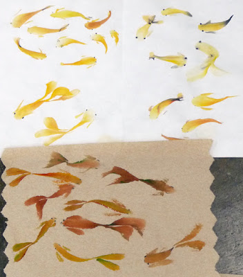
Here are some of the most fluid goldfish we've ever seen. They have a different feel on the different papers, but the bottom (paper towel) has nine fish and so it's lucky as well as beautiful.


Here are orchid grass and bamboo strokes...


... and here are mums. Zoom in to see the beautiful effect Ellen achieves with one stroke of a brush that's been loaded with more than one color of paint.


Elaine T. is trying to paint more transparently. This landscape features minimally elegant brush strokes and clear color. Transparent? Yes! Beautiful? Absolutely!


As if the landscape weren't enough, Elaine T. also painted this rocket ship. Again, she set a goal of transparency. And it's amazing how she was able to get such a dark background and still have it look transparent. Success!!


You may have recognized the space ship above and wondered how Elaine T's Flash Gordon portrait turned out. Don't worry! We wouldn't forget to show it. Zoom in and study this masterpiece in lighting. See how the radium reflects onto all the other surfaces and how every detail is lovingly attended to. This brings back some wonderful memories!


Elaine O has finished her portrait too. But instead of radium green, this has the pink glow of the Barbie aisle at the toystore. Pat, our teacher, joked that this looks like entering a red period...and if you look at our work today, it seems more than a few of us are leaning toward red (Steve, Tony and Elaine). Well, it's a great antidote for the grey skies.


Dana managed to do three small eye studies. All three of the eyes below are different colors, different orientations, and different emphasis. But all three have wonderful detail and highlights and sparkle. Look at this straight on view of a smiling eye....


... this brown eye seen slightly from the side...


 ... and this icy blue eye almost in profile. This is amazing work!


We'll be off next week, celebrating Thanksgiving. Know that you are some of the people we're most thankful for and we look forward to seeing you again on December 1. Meanwhile, Happy Thanksgiving!

Saturday, November 10, 2018

November 10, 2018

All the snow has melted and it's a glorious day. But we know that winter can't be far behind. Deep in denial, Steve is using his new split primary palette to paint these lovely flowers. The addition of the complementary leaves makes us think of booking a Hawaiian vacation.


Sara's landscape is a bit more seasonal as she finishes her fall scene, as seen through the gridded surface of her window. Also, note how the deck rails provide additional structure. And in each pane is a view of softly abstracted foliage. We love the contrast... and Sara loved treating each pane as a separate small picture. Brilliant!


Ellen has been working on actual small paintings and they are equally brilliant. Once again, she's using her Chinese brush and techniques to paint mums. They look gorgeous in a group, but take a closer look at each one. The colors and brushwork are incredible.


Brushwork is also on display here in Ken's last cat in the Not That Damn Cat Again series.... except it may not be the last after all! Yes, Ken's taking a break but may return to this series for 2-4 more. And then look for a show at (where else?) Ten Cat. Meanwhile, look at the lovely fur texture he's achieved here.


From kittens to small children.... sounds like a day of internet videos, doesn't it? But no, this is Elaine O's sweet portrait. She's almost finished painting this adorable little girl in her adorable little tutu and t-shirt, concentrating on the toy in her hand. Come back next week when we're hoping to catch a glimpse of her cute little face.


Here's a whole nother kind of cute! Elaine T's Flash Gordon features brilliant color-mixing, lighting and magnificent modeling of a very handsome man. Seriously, zoom in to savor all the details of this tour de force. Every detail is skillfully painted without a single misstep. Elaine T was going for the feel of a vintage poster, and she's got it. We are eager to see the final.


Tony is also into portraiture. This is the face he began last week. We are impressed with the level of personality he was able to achieve in such a subtle painting. Just look at the facial planes and the intensity of his gaze.


In another portrait, Tony pulls out to show more than the subject's head. In the process, he's telling us a lot about his subject's character and his joie de vivre. Again, Tony does all this with a subtle palette that he makes the most of.


Susan's back from Australia and New Zealand with a sketchbook full of memories (and future paintings). Like Tony, she's placed her subjects against water. Here, Susan and her husband enjoy a romantic moment as they gaze out to sea in Melbourne. Those posts are all that's left of an historic building and they are the perfect path to the sky with its perfectly placed golden swirl.


Marva's sky is magnificent, too. Look closely to see the impressionistic brushwork and delicate colors. She's still adding foreground, but the sky is the real star of this show.


We've saved the hunger-inducing subjects to act as dessert. Isa has added texture, shadow and intense color to her pumpkins and detail to the cinnamon jar. She's also added a diagonal background element which defines the tabletop and takes the composition to new heights.


Dana took part of the class time to paint her snack. Yes, these apple slices and almonds are making us all hungry; in fact, Dana herself had to stop and eat these goodies before she finished.  Who says healthy and nutritious can't also be beautiful and colorful?


As if that weren't enough (painting and eating her snack in a single session), Dana also produced this multi-level color wheel. It features tints, tones, shades and hues and it's pocket-sized so it can easily serve as a reference. 


It's not too early to consider giving yourself a holiday gift. Class dates for next year are set and registration is open. Check your calendars and think about it. After all the holiday madness, you'll want to be part of our fun and relaxing group. Spring I and II (seriously, that's what they call it) dates are:
  • January 26 — March 9, 2019
  • March 23 — May 11, 2019 (off April 20)
For registration information—come on, you know you want to join us—visit Truman College Continuing Education.

Saturday, November 3, 2018

November 3, 2018

We know you're waiting for paintings of the beautiful autumn leaves—and we won't disappoint you! Sara painted this impressionistic beauty while looking out her back door. And we can assure you that the colors are even more spectacular in the actual painting than in this image.


From the riot of shapes and color above, Sara moves to this highly organized and gridded scene. This is also looking out her back door, by the way. We love the sun-drenched wood of the deck supports and can't wait to see what lies beyond.


Steve has finished his triad-testing and is taking his official new palette for a spin with an actual painting. And what better subject than this lovely floral? The composition is exquisite and the colors are complementary (notice how the lichen-covered branches tend toward green?). We're eager to see how this progresses.


Interestingly enough, Ken's last painting in the Not That Damn Cat Again series looks like a tree! He's using indigo and sepia to paint the dark fur-like texture down the cat's nose. This is another one where you'll want to come back to see the outcome. It promises to be as beautiful as the rest of the series.


Just as an added bonus, we thought you might want to see Ken's sacrifice sheet. Most of us use a small scrap, but Ken's using a full sized (15 x 22) old painting to test for the fur colors and patterns.


The rest of us are into portraits (not cat portraits, but actual people). Elaine O. begins this sweet portrait of a little girl playing. We like the way she's so prominently positioned in the frame and the way she's foreshortened.


Elaine T. is working on portraits, too, but this is no sweet little girl. Yes, it's Flash Gordon and the painting is getting better all the time. We love the solidity and muscularity of the figure. And we are impressed by the way the radium fire gives the reflected lighting on the body a perfect reason for being.


Tony's back and he's into portraits too. He began this character-filled painting of a man he met in Greece. Look carefully at how the subtle colors clearly define the planes of the man's face.


Here's another portrait of a man by Tony. But this time, he's gone back to using water-soluble ink in a calligraphy marker and adding shading by adding water to the lines. He's also added two touches of watercolor—perfectly placed.


 Tony's been busy experimenting with his "water-soluble ink" technique. Here's another portrait with color pulled out of the black lines of the drawing to model the shape of the subject. 


We simply love this one! Tony did this graceful hand study with only ink and water. We love the technique and the elegant way the elongated hand is posed.


And, just for fun, Tony did this "color wheel" using his black ink with some red watersoluble marker.


Dana finished her plaid. Admittedly, she's starting with more colors than usual in her palette, but this is more than the sum of its colors. It actually seems to move, doesn't it?


From there, Dana works on a color wheel, starting again with more distinct lines and clearer labels.


And, as if she hasn't already done enough, Dana did this tiny portrait. She added watercolor to a pencil drawing, which is how she was able to get the incredible texture you can see if you zoom in.


Come back next week for even more watercolor excitement. Happy painting!