Saturday, May 13, 2017

May 13, 2017

Just as we're all getting in the groove with exciting new themes and stories, the term is over! But there's good news. We're so thrilled about these new developments that we're sure the enthusiasm will carry over until we begin again in three weeks. For now, we begin with Bill, engrossed in his new push to paint portraits. Here, he's re-done the same man he did last week. Note the intensity of his gaze and the beautifully rendered clothing.


Followed by another portrait. This one is of Dionne Warwick. Again, we love the light and shadows on the face and hands. As in the painting above, there is something timeless about the subjects. You can't quite place them in any era, can you?


Like last week, we couldn't resist putting our subjects in a story. Picture the two people above facing each other and in a relationship. What is their story? Bill's abstract below?


As opposed to this abstract of Bill's. It's so festive and happy. We think it calls to mind a ticker tape parade or a graduation with mortarboards being tossed in the air.


And here is the couple's therapist! Actually, it's the latest in Elaine's series of People I Don't Know, but it could be a therapist. He's got that interested "Tell me more" look. And yes, she's using only three colors (so far), but they are deeper and warmer colors than usual. One more thing.... look closely at the diagonal grid lines. They are a drawing aid that several of us are trying out to achieve more accuracy.


We're thrilled to have Steve back. He's also using a grid for the first time. Here are two sketches. In one, he uses a 1/2" grid; on the right, it's a 1" grid. These are figure studies, designed to fit some unusual frames he's found. And we're glad to note that he's planning to use the Hawaiian rocks to create his own paint again!


Following is a perfect example of how to use a grid and how to paint a portrait—the right way. It's time for Sara's annual birthday self-portrait. She starts with a photograph and grids it, preparatory to a series of studies.


First, she uses the grid to do an accurate pencil sketch.


Then, Sara uses one color to do a value sketch....


... before moving to a full color study. The benefit is that as Sara does multiple studies, she becomes more and more familiar with the subject, freeing herself to concentrate on other things. Look at the way she's managed to model her features and clothing with layers and blends of soft color. 


Tony is also painting portraits in a series. He's finished his WWII veteran; we love the composition, the colors and the background, but Tony isn't perfectly satisfied with the face.


... so Tony is doing a study of the face (below). The colors are very minimal, but already we love what we're seeing in the modeling of the face and the expressiveness of the features, especially his eyes.


Tony also worked on his fields of lavender. The additions are subtle, but really enhance the feeling of distance. We can't wait to see it finished.


We feel the same about Tony's Chicago landscape. Viewed from the top of the Art Institute, this sensitive painting features some of the most iconic landmarks, beautifully composed.


Ellen is back from a vacation and she knocked out this quick study of Bryce Canyon to commemorate her trip. Just look at this extraordinary sketch. Everything about it is perfectly suited for the subject—the colors, the warmth, the brushstrokes defining the landscape features. It's a little jewel.


We couldn't let Mother's Day go by without a beautiful mother-and-child, could we? Ellen paints this delicate portrait of her newest grandchild. It's soft and subtle and the very essence of watercolor. It feels very much like Mary Cassatt.


Another of our favorite themes is the vacation scene. Madeleine finishes this colorful painting of Mexico. Between the colors and the textures, this feels like such a happy place!


In a change of pace, Madeleine began this cooler, more northern maritime scene from Ireland. Look closely at the lovely greens and the dry-brushed rocks. All that's left is the water—and that's Madeleine's specialty, so it will be worth the wait!


Susan's painting touches on many of our themes—it features water and splashing children in Los Angeles. Notice how lively the children are. And the wet-in-wet colors. This is the very spirit of happy summer fun.


You were probably expecting us to say that summer means corn and show you the next in Ken's Corn series, weren't you? Well, you'd be wrong. The Corn series has abruptly ended and Ken is returning to his first love.... cats. Here's a study of a cat's eye, where Ken loosely applies striped brushstrokes to the fur.


And here's the painting, where he moves to pointillism instead of stripes. The painting seemed to call for it! But notice the way Ken uses a grid to draw his subject?


Finally, we know you were wondering about Beth, our newest artist. Here's her graduation painting and it's magnificent. The carrots are perfectly textured, as is the romaine. The pepper has the color and waxy sheen of a pepper and the deep green velvet makes for a perfect fabric background. What does this mean? She's an amazing artist and we'll be thrilled to have her come back as an old master.


As we've been hinting, we'll be back on June 10 and hope you'll join us then. We'll have more portraits, more grids and more vacation scenery—all the themes we've been exploring.

Meanwhile, we're taking up a "daily creativity" challenge. We can do anything we want (paint, draw, write poetry) for any length of time (as little as 5 minutes), but we'll try to do it daily. Come back and see what's happened!

Upcoming events and important announcements

Open Sketch date. You're invited to join us on Saturday, May 20 from 12:00–3:00pm at St. Gregory the Great Church. Artists, writers, architecture buffs and anyone curious about the church are invited to spend some quiet time for sketching, painting, photography or contemplation. A church tour guide will be present for any with questions.

      Where:
     St. Gregory the Great Church
     5545 N. Paulina
     Church entrance is on the corner of Gregory and Paulina;
     one block west of Ashland and one block south of Bryn Mawr

     When:
     Saturday, May 20
     12:00–3:00pm

Saturday, May 6, 2017

May 6, 2017

The rains have finally ended! It's cool, but at least it's sunny. And so is our mood. We arrived happy and ready to paint. We begin, appropriately enough, with Sara's painting of sunlight spilling through her house. This is probably one of Sara's best ever, highlighting her masterful color work. Look closely at the color gradations and how she relies on color, not value, to suggest dimension. Look at the exquisite details, like the midground shadows, the background view and foreground, from the sun bleached floor to the intimately lit left wall and the brilliant swath of color at right. And it's even more beautiful in real life.

Yes, Sara continues to paint every day.  As you can see, she's done a lot of work on the painting above, but she's also finished this delicate study. We love the shiny blue vase and the refined lace, perfectly focusing on the yellow forsythia.


Ken's painting is far more robust, but it's also a plant. Yes, if you've been following along, you know it's corn. Here, he's introduced new elements—they're either eyes or peacocks hiding among the corn stalks. Come back to see which!


Beth's painting fruits, not vegetables, but her paintings are equally vibrant and exciting. Look at this grapefruit—you can see the rosy undertint and the texture. The calligraphic marks add the perfect touch.


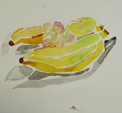
Beth seems to have found her niche painting fruit. This wonderful study of bananas and grapes has it all—delicate colors, elegant calligraphic line, subtle gradation and a lovely economy of brushstrokes. Especially fine is the way she's left white space between the brushstrokes.


Susan finished her celebration of spring with this layered floral study. She's focused on the redbud branches in the foreground, painstakingly detailing each flower, while giving us just the right amount of background information. The colors are beautiful; the angles of the stairs and rails move us through the painting. This says spring!


Bill uses the same device, but to a different effect. Here, the branches are not the focus, but a veil that invites us to look through at the grasses, water, city and sky beyond. The colors and textures are beautifully subtle and we love it. 


Bill then switched to a multi-media abstract, using graphite to add tone to his watercolor. He also scanned the original and changed scale on a home printer before adding color.


As if that weren't enough, Bill did a portrait, too. Seeing the benefit of painting people he doesn't know personally, Bill is beginning a series of Strangers to Me. We can't believe he did this in only half an hour—he conveys a feeling with a minimal palette and brushwork, especially in the clothing. 


Yes, Elaine is still doing her People I Don't Know series. The benefits are obvious. Because she doesn't know her subjects personally, she's less invested in making them look like them; she just needs to make them look like people. This is number six in the series and it really is great practice in painting portraits and capturing expressions.


Steve is hard at work on his Hawaiian mud-man, finishing it today. This is something we're hoping will turn into a series. He's grinding up chunks of dried Hawaiian mud to use as pigment as he makes his own paints. Then, he uses them to paint Hawaiian scenes. With only four rocks, he has created a wonderfully retro world.


We are fascinated by people, aren't we? Tony begins a portrait of a 95-year old war veteran from the WWII Battle of Crete. The painting commemorates the May anniversary of the battle where Greek forces valiantly fought against a Nazi invasion. The composition is superb and the colors are lovely. We are anxious to see the painting finished... and to hear more of the stories Tony shared.


Tony also painted this field of lavender in Provence. So simple, yet so evocative.


Madeleine began this brightly colored travel painting. This is Mexico and she adds a touch of pen and ink to the brilliant colors. We are already enamored of the green clapboard, the tin roof and the planters. We can't wait for the next bright colors to come in!


We had a little fun with Bill and Elaine's paintings today. We noticed that they both have strongly expressive faces and we decided that they told the story of the end of a relationship. We moved them around and added Bill's abstract between them to signify the relationship itself (it's complicated!). Well, okay, we thought it was funny at the time.


Special thanks to Sara for researching this fascinating tidbit—something else in the "you had to be there" category—Just to set the record straight on chicken egg color: there is no correlation between feather color and egg color. It depends on genetics, although chicken earlobe color often correlates to egg color. Yes, it's true; chickens have earlobes—see sources below.

http://msue.anr.msu.edu/news/why_are_chicken_eggs_different_colors

Who knew? Come back next week for more portraits and more fun!


Monday, May 1, 2017

April 29, 2017

What a weekend—cold and rainy all weekend. You'd think it would be perfect for a watercolorist (being so full of water and all), but NO! Those of us without family commitments and trips spent a lot of time and effort trying to protect our paintings from the elements. We also spent a lot of time revisiting sunny vacation trips of yore. Here, Madeleine finishes her bird, perched on some rocks in sun-drenched Spain. Aren't they beautiful?


And then, Madeleine painted this simple graphic travel painting. This would be a great travel poster—we love the use of black and white, the minimal color blocks and the expressive sky.


Bill has also finished his painting of rooftops in Spain. Notice the bright, hot colors and the inspired use of complementary colors (purple and yellow) for shadows and highlights.


From the rooftops above, Bill switches gears (and perspective and colors and temperature and mood) for this cool layered scene. The distant skyline is lovely—well worth the viewer's trip through the trees, across the foreground and the water.


Susan has also begun a painting using the device of looking through a veil of flowering trees towards a stairway. Of special interest here is the way we can see how she plots out the bones of her paintings. Look at the perspective lines of the background keeping place as she begins to develop the branches.


Of course we're painting flowers! It's spring, after all! Susan painted this grouping of potted flowers. Especially interesting is the way she leaves white space to make the lacey flowers sparkle against the colorful background.


What would our "flora" section be without corn? Ken is beginning the painting based on the study we saw last week. We like the blue stripe defining the center rib of the leaf. It adds structure—and an interesting shot of color.


Not content to wait for Saturday to paint, Sara continues her daily painting. Here's an orchid from her sketchbook. Even in a sketch, she masterfully blends colors—just look at the leaves, dirt and pot.


Moving indoors, Sara brings the same color sensibility to her deep perspective painting. Get closer to marvel at the Bonnard-like patterning.


Steve is letting his materials dictate color for him. Moving along on his Hawaiian painting, he's ground up more Hawaiian mud for the sand. In a brilliant touch, he's achieved the texture of sand by the way he ground his pigment. Ingenious!


Elaine added some finishing touches to her portrait below... and then spent a good bit of time pondering the background. Specifically, what kind, what color and/or if she should add one at all. While she'd love to use a dark background to bring out the light edge of his face, it feels like anything more might be too much. Feel free to comment with suggestions.


So, instead of continuing to stare at an empty background, Elaine began another of her People I Don't Know portraits. So far, she hasn't gotten much farther along than a sketch and a light wash of color, but come back to see how she progresses.


See you next week!