Saturday, September 27, 2014

September 27, 2014


Another beautiful day! Warm and sunny, with the crisp, clear autumn light that makes you want to pick up a paintbrush and memorialize the beautiful colors all around. And that's just what we did... except for John, who chose colored pencils to add even more layers of color and story to his drawing. So, it's the same effect, just a different medium. Look and explore.


Abla, too, turned to drawing. But she chose a pencil and eraser to produce this lovely monochromatic drawing.


Lest you wonder if we've all lost our autumn mojo, rest assured we haven't. Here Abla finishes her majestic landscape. Look closely at the camel and people she's included to indicate scale.


Mohammed's landscape is just as vast and deep, but totally different in feel. The ice floes add to the icy feeling, while the pattern complements the mountain walls and draws us beyond. 


Elaine is painting large, too. And while her subject is man-made, not natural, it's equally majestic.


Hector also uses limited colors, but returns to nature for his subject matter. Below he abstracts a tree trunk, capturing the very essence of the bark in a painting that feels distinctly Australian.


Speaking of abstract art, where is Ken? Well, you'll have to come back next week. He had to leave early... before we could get a picture of his painting. Unlike Susan. Susan had to miss class today, but she got up early to paint this plein air view of a street performance in Andersonville. Then, she dropped by to share with us before going about the rest of her day. Now, that's dedication!


Our new students are giving Susan some serious competition in the "fast and prolific" category. Here, Madeleine paints three paintings of a Honeycrisp apple in one session, along with a colorful shadow. (Her model, by the way, was the star of the class.)


Bill, too, does three paintings of the same subject in three different styles (wet, dry, and a mixture)—all in one class. His shadow painting demonstrates his mastery of the use of complementary colors.


Oscar, too, is speeding through the exercises, color matching some difficult colors...


...finishing his color wheel, and fine-tuning his marinescape with a soft blanket of mist. These newbies are not just fast—they are good!


But here's one old master with nothing to worry about. Sara's painting invites you into her world. You don't know what to do first—admire the jewel-like mingled colors or relax and bask in the gentle glow.


Here's another color wheel painting that keeps you engrossed for a long time. Vivian added a gentle background to this perfect combination of realism and fantasy.


And if there's a cat, can a bird be far away? Here's the hummingbird from last week, transformed. Ellen is perhaps our most fearless painter. As you can see below, she's never afraid to add bold, saturated color. Here, it's a perfect complement to the beautifully transparent layered petals.


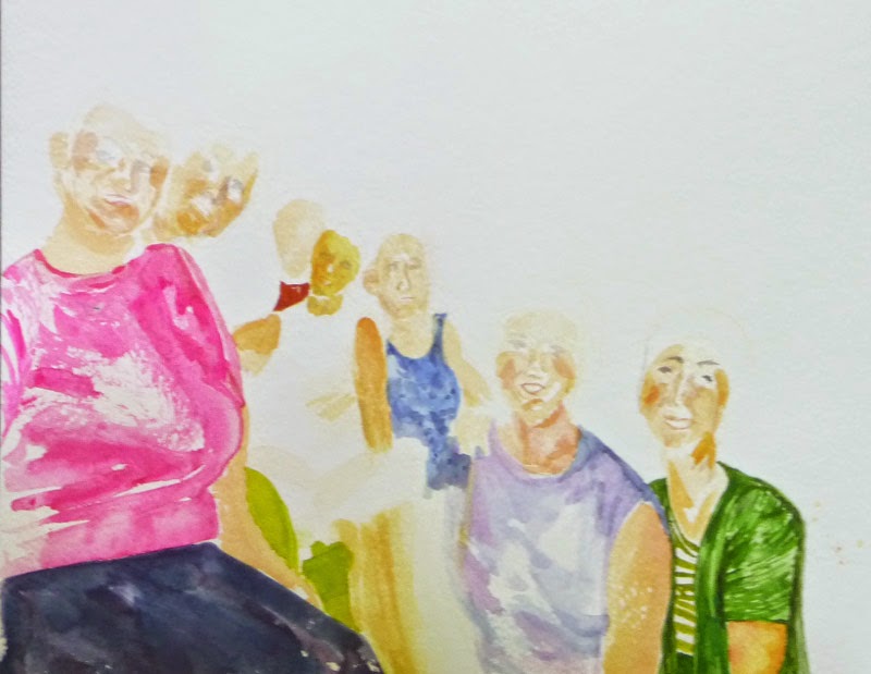
There was no artist of the day today! Our library table was empty, so we had to draw inspiration from each other—but, as you can see, it wasn't hard.

Reminder—next month is Art Month in Chicago. If previous years are any indication, there will be a plethora of gallery openings, exhibits, public art, and studio open houses. Block out some time for art and see you next week!

Saturday, September 20, 2014

September 20, 2014


We're only back three weeks and already we are experiencing the mind meld that seems to overtake us, so we all begin to paint in themes. Sure enough, we're all painting flowers, friends and facades... not to mention felines! (After all, what would the internet be without cats?) So we start with a cat—but not just any cat. Here Vivian continues to fine tune her colorful cat/sewing machine mashup. This gets better and better every week, doesn't it?


John's drawing is another mashup, full of people and stories. It also gets more detailed every week, yet John says he still has a way to go.  


Ellen finishes two paintings this week. In both cases, she makes some bold choices to fill an empty quadrant of the paper. Here she starts with a group portrait and adds a rich background.


And here, she seamlessly adds a hummingbird, perfectly complementing the flowers and filling the empty space. On both of these, drybrush adds movement and life.


Susan also revisits an old painting, adding people to give a sense of scale and story to a painting of the devastation to a Philippine village the morning after a typhoon.


 Susan continues with her series of flowers. Here she has a grouping of orchids....


... and a bouquet of roses.


Sara revisits her summer backyard, but this time, she mixes colors on the paper rather than the palette. This creates beautifully rich and transparent layers of color.


Hector, too, blends color wet-in-wet, producing this animated study of beach grass with a very limited palette.


Ken moves from the beach to the city center to create this exuberantly colorful cityscape.


Who would have guessed that he starts with a monochromatic underpainting?


Elaine too is continuing her limited palette exploration of a lovely church facade.


Abla is working on a large painting, too, filling her paper with color and texture. We love the way she handles the sandy mountains and the water.


Mohammed is also working large. But while his scene is as expansive as Abla's, his is cool and frosty. Another contrast is the flat graphic quality that only seems to add to the depth of the painting.


Finally, our new people are the most prolific group of painters we've seen since Susan! Here Oscar works on this third color wheel and fills the rest of the paper with an extra credit marine scene.


Bill zips through the color matching excercise....


... and does a much better job exploring complementary colors than the camera could capture here.


He even finished the famed paper towel, before moving on to the skin study below.


Madeleine's complementary color/paper towel and skin studies are elegantly simple, 


...and she cleverly incorporates her color matching swatches into the exercise. These newcomers will be old masters in record time!


Artist of the week. The library table featured a wealth of riches today. Pat brought in three of her oldest art books, including Bonnard and Mary, Mother of God. They were all thin volumes, full of art plates but with little text. Ken brought a much thicker tome about Seurat and the making of the Grande Jatte.


Quote of the week. "I worship the siennas." —Ken.
(There is nothing to be gained by trying to explain this one!)


See you next week!
 

Wednesday, September 17, 2014

September 13, 2014


It's one of our favorite times of year. There's a nip in the air and it's really starting to feel like "back to school" now. It's time for paintings of foliage, bursts of color, plaids and color wheels—all of which we're excited to show below.

Our newest "old master," Hector, was inspired by the lone tree outside our solarium window sporting fall colors. So he started with a practice sheet to test his brush strokes. But what a practice sheet! The energy and composition are incredible. This one is worth signing and framing as it is. We can't wait to see how the final painting turns out.


Here's the beginning... aren't all the fall colors beautiful?


Sara's inspired by trees and nature, too, but her trees are very different. They have the languid feel of soft summer light. It makes you feel relaxed just looking, doesn't it?


Susan, too, takes her subject matter from nature, but she focuses on flowers instead of trees. And despite the vibrant  showiness of the bouquet, her major take-away was the importance of the baby's breath.


Abla and Mohammed are also into nature, but they both showcase vast vistas painted with exquisite color. We'll be watching these closely!


And now for something completely different. Elaine moves to urban landscapes—closely viewed and with a minimal color palette.


But we can't refrain from color for long. In what's turning out to be a class favorite, Vivian's adding color to her cat/sewing machine. Eat your hearts out, Magritte and Dali and all the rest of you conceptual geniuses!


Ken also adds vibrant color to his cityscape, transforming brick, stone and glass into magic.


Which brings us to our newest students, learning all about color and color theory. Can't you see the similarities between Ken's (our "oldest master") cityscape and Kristen's beginning plaid below? These exercises are beautiful as well as educational! 


If you've been following us for any length of time, you'll know that the plaid is followed by the color wheel. We're always excited to see how different people use the same instructions, paper and colors to come up with such beautifully different results. That's why we're grouping them.... so you can better compare and admire. Here, Oscar and Kristen use only three colors to create a complete color wheel.


Madeleine and Bill do the same.... but with an every-so-slightly different starting triad.


... and they move to the next in our seemingly unending series of color wheels. This one introduces the color black—along with experiments in value, tint, tone and shade.


Artist of the week. Ken stocked our library table today, starting with a book about the ever-popular Monet. And making its return was a book about watercolor in America. This thin volume has paintings throughout American history—works by O'Keefe, Wyeth, Hopper and Homer and more..... This is a really inspirational book and many of us were caught taking down names of artists we wanted to learn more about.

See you next week!
 

Saturday, September 6, 2014

September 9, 2014


Welcome back! It's been a lovely vacation, but we're back and ready to work.... well, maybe not right away. We will admit to spending a little time catching up with old friends and meeting new ones. But then, as you can see, we were right back in the swing of things. Our brushes didn't miss a beat.

We start with the essence of vacation—fairs! And Abla managed get in some painting, too. Here she tries her hand at acrylics while visiting a fair.  


 ...before returning to watercolors for these lovely "vacation" paintings of grapes in fall and a tropical island. Notice the details and the movement. You almost feel like you're there.


Meanwhile, Mohammed also turns to landscapes, except he is still in the sketching phase. The vast scale of the scene is already intriguing.


Sara also concentrates on nature, but her focus is more urban. She uses color and value masterfully to examine the quality of light on a flowering tree at twilight...


 ...and early morning summer sun and shadow in her garden.


Notice how we're all drawn to the pinks and greens of summer? Ellen is no exception as she paints flowers...


... and friends. The same pinks and greens look as lovely on people as they do outside.


Coincidentally, Susan is also painting flowers and people. Here is a lush bouquet of flowers against an almost abstract background, followed by a beautifully composed hospital scene. Notice the rich colors in the whites of the linens and lab coats.


John's into people, too, as he fills in his colored pencil masterwork. Every one of the paintings, objects and characters figures into the story of the writer at the desk. This should probably come with a legend!


What would fall be without newbies and plaids? Most particularly, the plaids of some of our newbies. This is always exciting as they use the same colors and tools, yet manage to create such different plaids. Bill and Madeleine's turned out so well that we imagined them as fabric.... madras shirts maybe.


And lest you think plaids are just for new students or back-to-school uniforms, here's Ken with a totally urban landscape. The grid-like skyscrapers and windows have an abstract plaid quality. The addition of the signage is inspired.


Here's the beginning of the next painting in Ken's series. The soft sienna/ochre underpainting may be a bit deceptive, though. Sure it looks soft and delicate right now, but watch this space as he adds color and pattern.


Same for Elaine. Like Ken, she's also into urban landscapes. Interestingly enough, even though they both chose similar subjects and start painting in the same way (light washes of color), we predict that they are going to part ways when they start adding color. Ken will go for technicolor, while Elaine will probably stick with the two colors she's started with below. We'll see.


And here's a brainstorm—tired of waiting for paint to dry, Elaine's gone ahead and started a smaller study of the subject above so she can work on one while the other dries. Good thinking!


A disclaimer. You may have been blown away by how prolific we seem to have been... especially with all the catching up and chit-chatting we had to do. In the interest of full disclosure, however, we feel compelled to admit that some of these were done while we were on break. But that's okay—we're still as good as you thought (just not as fast).

See you next week!